Resources

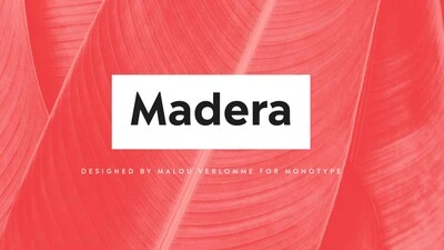
Malou Verlomme’s Madera is a fresh addition to the popular geometric sans serif font genre, intended as a go-to typeface for branding and visual communication.
Learn more
Font stories Meet Madera.

Malou Verlomme’s Madera is a fresh addition to the popular geometric sans serif font genre, intended as a go-to typeface for branding and visual communication.

The perils of piecemeal font licensing.

Whether you’re a startup that recently hit the big time or a legacy brand with offices around the world, a messy font library can cause major headaches.
Learn more
Expertise The perils of piecemeal font licensing.

Whether you’re a startup that recently hit the big time or a legacy brand with offices around the world, a messy font library can cause major headaches.

Tencent

If you’re using a messaging app in China, chances are it’s owned by Tencent. See the brand identity and typeface that is helping Tencent expand to new markets.

Learn more
Case studies Tencent expands global presence.

If you’re using a messaging app in China, chances are it’s owned by Tencent. See the brand identity and typeface that is helping Tencent expand to new markets.

Sagrantino

Sagrantino is a non-connecting script that traces its roots back to hand-drawn letterforms, and the connection between pen and paper. Named after the Italian wine, Sagrantino is bold and full of flavor, while embodying a sense of freedom and fluidity. Its quirky character shines at larger sizes – making it perfect for headlines, posters, or anywhere type is needed to really make a point. The family is available as OpenType Pro fonts, and has an extended character set that supports most Central European and many Eastern European languages.

Learn more
Font stories Introducing Sagrantino.

Sagrantino is a non-connecting script that traces its roots back to hand-drawn letterforms, and the connection between pen and paper. Named after the Italian wine, Sagrantino is bold and full of flavor, while embodying a sense of freedom and fluidity. Its quirky character shines at larger sizes – making it perfect for headlines, posters, or anywhere type is needed to really make a point. The family is available as OpenType Pro fonts, and has an extended character set that supports most Central European and many Eastern European languages.

Paula Scher

In the latest Type Mixtape from the new issue of The Recorder, Paula Scher walks through some of her favorite typography projects from her iconic career.

Learn more
Expertise Type Mixtape: Paula Scher.

In the latest Type Mixtape from the new issue of The Recorder, Paula Scher walks through some of her favorite typography projects from her iconic career.

Amariya

Created with screen reading in mind, Amariya’s sculpted, understated elegance is specifically designed for long-form copy in Arabic, Urdu or Persian. Its open shapes and streamlined forms are tailored not just to the digital world, but the flow and rhythm required by someone immersing themselves in words.

Learn more
Font stories Introducing Amariya.

Created with screen reading in mind, Amariya’s sculpted, understated elegance is specifically designed for long-form copy in Arabic, Urdu or Persian. Its open shapes and streamlined forms are tailored not just to the digital world, but the flow and rhythm required by someone immersing themselves in words.

Caecilia

The making of the serif typeface PMN Caecilia from first sketches to usable fonts took more than seven years. Designed by Peter Matthias Noordzij, it is the child of a time when font technology changed rapidly, not knowing which development the next day would bring. Eventually it was released in 1991 and quickly turned into a quiet tip for designers; not overused, and yet selected for prominent applications. Today, more than 25 years later, Noordzij adds a sans serif companion to his first type family and equips it for today’s needs.

Learn more
Font stories The story of PMN Caecilia Sans.

The making of the serif typeface PMN Caecilia from first sketches to usable fonts took more than seven years. Designed by Peter Matthias Noordzij, it is the child of a time when font technology changed rapidly, not knowing which development the next day would bring. Eventually it was released in 1991 and quickly turned into a quiet tip for designers; not overused, and yet selected for prominent applications. Today, more than 25 years later, Noordzij adds a sans serif companion to his first type family and equips it for today’s needs.

SST

The SST font tackles a central challenge of branding – universality. The SST superfamily supports more than 90 languages including Japanese, Thai and Arabic.

Learn more
Font stories SST : a font for everywhere.

The SST font tackles a central challenge of branding – universality. The SST superfamily supports more than 90 languages including Japanese, Thai and Arabic.

Scotiabank has long used Frutiger as its brand font. But as they expanded to new digital channels and regions, font licensing became too complex. Until now.

Learn more
Case studies Simplified font licensing for Scotiabank.

Scotiabank has long used Frutiger as its brand font. But as they expanded to new digital channels and regions, font licensing became too complex. Until now.