8 reasons why you should pay for fonts.
I have a confession to make. I’ve been a designer and writer passionate about typography for 20 years now, but I’ve rarely shared this with anyone: In college, there was a disc quietly passed around to everyone in our design program. Written on that disc in black Sharpie marker were the words “The Full Fonty™” and it contained hundreds (likely thousands) of font files.
If I recall correctly, this disc was made by a visiting lecturer who worked at an advertising agency and it was slyly passed to one of my peers with a wink and a nod. The fonts were stolen. And we all knew it. Regardless, we all used the heck out of those font files in the following years for our school projects. After all, this was before easy file sharing, when fonts were difficult to purchase and many were prohibitively expensive. To us broke college students, this was GOLD.
In my defense (there isn’t really a defense for stealing), at the time in the early 2000s, there was no FontStand, no Future Fonts, and no Monotype Fonts. Trial fonts or student discounts were not yet a common practice for independent type foundries.
So yes, I admit that I started my design career using pirated fonts. Since then, I have met and worked with hundreds of type designers and have happily changed my ways. I now get a small thrill when I buy a new typeface for a project because I know that money helps keep the designer making new work. And if you’ll indulge me, I’d like to try to convince you to spend some of your hard-earned money on quality typography too.
You’re buying software.
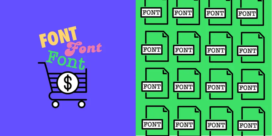
Let’s get basic for a moment: What exactly are fonts? Well, simply put, fonts are software. And when you purchase software, you are purchasing a license to use that software. Just like buying an app on your phone or using the built-in operating system on your computer, you are obtaining a license to use them on your device or on a website.
Licensing fonts can be confusing at first, but it really doesn’t have to be. The license that you purchase is typically for a certain number of devices or number of monthly visitors to a website. If you’re a designer working on a website that you will eventually handoff, you can buy the correct license in advance or inform your client of which license to purchase. Planning for this in advance helps you avoid issues in the future and keeps everyone on the up-and-up, giving them one less thing to worry about.
The fun thing about fonts is that if you purchase a high-quality typeface, you get extremely good value for your purchase. In fact, I have fonts that are over 10 years old that still work perfectly in modern applications—while I’ve probably had four or five phones in that same timeframe.
Fonts are (made by) people, too!
Before I went to design school, I genuinely never gave any thought to fonts. I knew they were things that I could choose from the drop-down menu of Microsoft Word, but I certainly didn’t know that fonts were made by people.
But yes, fonts indeed are made by people and I’m happy to report that fonts are made by some of the most wonderful people who are passionate about their craft and have put years of hard work into every typeface they design. These designers are worth compensating for their hard work, expertise, and creativity just like any other artist. Like licensing a song for a video or a stock photo in a design, fonts are no different and should be treated the same.
Support when you need it.
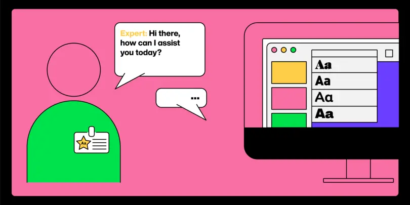
Although it may not be the first thing you think about, when you buy a font, you are also purchasing product support if you run into issues down the road. Perhaps after using the font for a while, you notice it is missing a glyph you really want or that you need to typeset something in another language. You can reach out to the designer and ask if they have drawn that glyph or considered a specific language extension. The ability to dialogue with the designer themselves is often a productive conversation on both sides and can make your work better.
Multiple weights and good kerning are valuable.
Another subtle feature of quality fonts is a well-considered range of weights. With free fonts, often I’ve found the bold is too bold and the regular is too light. High-quality fonts often have multiple weights to choose from, which is extremely helpful when you need an ultra-light weight for elegant display use and an ultra-bold for big impact. I’m always thrilled when I see a typeface designed with a Regular weight, a Book weight, and a Medium weight. This gives me the power to make my typesetting or logo just right and the type can do the heavy lifting for me.
With low-quality fonts, there are often issues with kerning—the space between individual characters. If the kerning wasn’t thoroughly adjusted, you’ll notice awkward gaps between letters that become extremely noticeable when you set headlines or create a logo. This often means more time fighting the font instead of letting the font do the work for you. Annoying at first, this quickly becomes a waste of your time and money, which is ironic for a free font, isn’t it?
What is the difference between free & quality fonts?
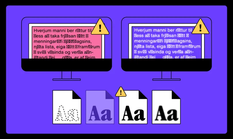
It’s no secret that there are many websites out there where you can download fonts for free. There are just as many websites where you can find “Alternatives to X Font.” But as someone with 20 years of design experience, I can say that every free font I’ve used has quickly let me down in one way or another. Perhaps the font didn’t have a character I needed (like a 1/2 fraction or a © symbol) or it lacked an italic style.
As with many things in life, you get what you pay for. Often using free fonts means that you’re copying the work of others who have chosen the same path. Although it’s not always wrong to follow a well-worn visual style, using the same free fonts makes your work easier to ignore and skip over—not usually what you want.
Setting yourself (or your client) apart.
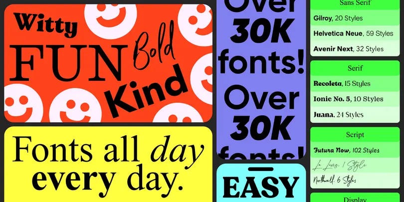
As you’re designing for yourself or for a client, setting the logo, design, or website apart is part of making you and your brand unique. Typography is capable of a huge range of visual expression based on what typeface you choose. From friendly and approachable to authoritative and definitive; type can help reinforce the traits that you need to express.
Let’s talk about a font that everyone seems to want to copy (there is even a documentary film about it): Why should I pay for Helvetica when I can get this free font that looks pretty much like Helvetica? It comes down to utility and knowing that the fonts will perform at their best. Free fonts often don’t measure up; they don’t have the full complement of glyphs, the spacing isn’t well considered, or the font files are incomplete.
Lessons from the real world.
Here are two examples from my own design practice that clearly show where high-quality, paid fonts made my work better:
In my first design job out of college, I was working for an advertising agency and designing a large brochure with a huge amount of copy and multiple charts and tables. The type selection was left up to me and I chose a typeface that I am still quite fond of, FF Scala Sans designed by Martin Majoor. Laying out that complex brochure, I needed a typeface that could handle everything I threw at it, from complex charts to the fine print legalese that lawyers are so fond of including. I quickly understood the value of a quality typeface: Scala Sans has multiple weights and a condensed width that was critical for fitting hundreds of SKUs in a single table on a single page. It also had all of the currency symbols that were required and the fraction symbols that the copywriter needed to be included.
More recently, I was designing a metal ruler as a part of an annual gift package sent to clients and there was a need for well-designed fraction symbols to fit the mathematical precision of Pitch Sans by KLIM Type Foundry. If a different font was used that did not have fractions designed, the ruler would simply have felt less personalized and less official—ruining the feeling of the gift completely.
Support your local type designer.
So the next time you’re choosing fonts, consider spending a bit more time and bit more money to purchase a typeface that is unique, created by an expert, and gives you value over the long term. That way, you don’t need to rely on a sketchy disc of fonts of questionable origin from 2003 and you can feel good about supporting the artists that make your work better.
This article was written by Doug Wilson, a designer, writer, filmmaker, and cyclist, living in Denver, Colorado. Doug has worked with brands like Starbucks, Herman Miller, and Virgin Mobile, and presented at The New York Times, NASA Goddard, Condé Nast, TypeCon, and TYPO Berlin about design, technology, and typography.


