


Choosing the right type for your project.
“How do I choose the right typefaces?”
“What should I think about when I’m choosing fonts for a project?”
“Why do you choose certain fonts for certain projects?”
“I have a project that needs some fresh perspective, how can I use type to make it stand out?”
These are all questions I’ve received as a designer who has a particular love for typography over my 20-year career. At times, it has been difficult to put into words, so I’ve sat down to write out my personal and professional process when it comes to choosing the right typefaces for a job.
It’s not rocket science, but it does require thought.
If you’re reading this, I’m going to speculate that you understand the importance of choosing the right fonts for a project. Otherwise, why would you be looking for advice on how to choose the right typefaces on the internet? ;-) With this assumption in place, let me share with you how I personally choose typefaces.
As a disclaimer: There are no big secrets here, no giant revelations from my 20 years of design and type experience, but this might be helpful to see how someone else goes about the process of narrowing down the options. Once you start giving focused thought and deliberate time to choosing fonts, your choices will get better.
What are your technical requirements?
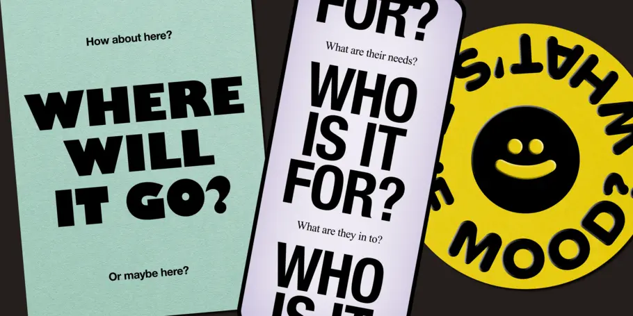
As with all design projects, I always start by defining my limitations, boundaries, and asking questions. Are there specific requirements for the application of your fonts? Do you need type mainly for giant billboards or for the tiny legal requirements at the bottom of a television ad? Are you designing something meant to be read on screen or on paper? Is your product a mobile app user interface or a long-form article or printed book? Will you need specific language support now or in the future?
From my experience, I’ve found branding and design projects have a myriad of applications; from both large display to small, ancillary text. In this case, I suggest choosing a typeface that has multiple optical sizes specifically designed for various type sizes. A font with optical sizes has slightly different designs for large display, medium headlines, and small text. All the optical sizes work in unison to make the type look similar and consistent in all sizes of application. There are different names for the optical sizes based on the type designer, but usually there will be a “display,” a “deck,” and a “text” size which you can simply think of as Large, Medium, and Small and apply them accordingly.
Personally, I am a big fan of using monospaced fonts for any small information or for displaying any data. Monospaced fonts are fonts where every character has the exact same width and it immediately gives the feeling of logical, rational information. I use them all the time for photo captions, legal details, and any time I need to show data or facts in a compelling way.
Finally, consider your audience and how international your product may be (or become). If your users will be reading or using the fonts in multiple languages, make certain the language support and accents are included in the fonts you choose. Speaking from experience here: You don’t want to get halfway into a project with a certain font and then realize it doesn’t have an umlaut or the circumflex above the correct characters and then you have to go back to the drawing board for a new typeface. Let’s not waste our time, shall we?
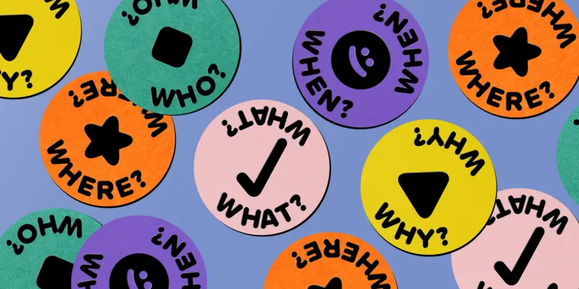
Who is your audience?
Related to language support, I always ask myself who will be using my designs or product: Is the audience demographic young or old? Tech-savvy or just starting to learn? Using the most up-to-date devices or slightly behind the technology curve? Are the users from a specific geo-location or will they be worldwide?
As you would likely assume, designing for an academic journal will have a different visual aesthetic from stickers that you could apply to TikToks or Instagram Reels. If you’re looking for a typeface that feels up-to-the-minute and on-trend, make sure to check out the Monotype 2023 Trends Report to see worldwide trends and visual styles. If you need a more “classical” approach, consider a serif like Cotford from Tom Foley and the Monotype Studio, Macklin from Malou Verlomme and the Monotype Studio, or John Downer and House Industries’ Paperback.
If you have an existing brand style guide, obviously you’re going to need to stay within those guardrails, but don’t despair — there still may be room to experiment! Over my career, I’ve been surprised to see how much I could push brand guidelines by making educated choices or using the existing typefaces in unexpected ways.
Another tip: To make sure I’m not just copying what everyone else is doing, I often create a quick mood board of what other people have done in the similar space. Designing a new brand for a tech company? I would *plead* with you to not just use another geometric sans serif! If all of your competitors are using one thing, try out the complete opposite to set your product apart. Did everyone recently jump on the “wacky, ’70s, groovy, Patagonia-esque font” bandwagon? I’d say instead choose something expressive that sets your design apart
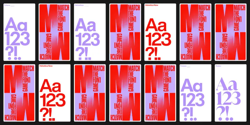
Choose contrast.
Choosing typefaces that contrast each other is my go-to approach when finding the right fonts. Choosing Helvetica and Futura (two sans serifs) is not enough visual contrast for me, even though they are technically different (Helvetica is a neo-grotesk and Futura is a geometric sans).
My best idea here is to find typefaces designed by the same person, and choose a serif and sans from them. Designers have their own approach to type design and this can often be seen between designs of very different obvious style. Even when two fonts are in very different genres, I’ve found that there seems to be a harmony between the designs because the person that designed them is the same. This of course isn’t true for all designers or situations, but it often helps me narrow down similar-looking typefaces.
Choosing a serif and sans pair is nearly infinite in its possible complexities, but my go-to tip is to choose a serif design with a lot of weight and contrast in the strokes (thin or thick serifs with contrasting stems). Once you’ve chosen the serif, find a sans serif face that you like and use it at a lighter weight than the regular weight. This thinner weight of a sans can be used to dramatic effect at larger display sizes, which is a bit of an unusual approach, but it will give a touch of freshness to the design.
Build your family.
You’ll find many guides to creating a typeface pair, but I like to create a trio of typefaces for maximum flexibility to mix-and-match at will. Choosing a trio of display, text, and micro information gives you plenty of room for both establishing a solid typographic foundation as well as giving room to play.
As an example of choosing typefaces from the same designer (or in this case, two designers), I would choose something like this trio from the talented designers at Process Type Foundry: Colfax for display work, Elena for body copy and longer reading, and the monospaced font Recipient for captions, legal copy, and data visualization. If you don’t feel that a fully monospaced works in your design, I highly suggest something like Operator which has the visual styling of a mono but is still proportional and attracts slightly less attention to itself.
It takes practice.
One thing that I don’t want to gloss over is that choosing the right typefaces for projects takes time, practice, and experience. If you don’t choose a good trio of fonts right off the bat, don’t get discouraged! I still struggle with font pairing and selection, and I’ve been doing this for almost 20 years. As with most worthwhile things in life; the more that you do this, the better your perception of type, your judgement of pairings, and your choices will be.
Best of luck and ONWARDS!
This article was written by Doug Wilson, a designer, writer, filmmaker, and cyclist, living in Denver, Colorado. Doug has worked with brands like Starbucks, Herman Miller, and Virgin Mobile, and presented at The New York Times, NASA Goddard, Condé Nast, TypeCon, and TYPO Berlin about design, technology, and typography.


