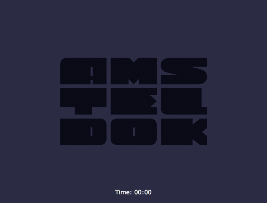
The world’s first variable font logo for WPP.
Graham Sturt, Creative Director at VBAT Amsterdam
In an innovative and dynamic approach to the new Variable font format, Fontsmith (now part of the Monotype Studio) and Dutch branding agency VBAT created a responsive logo font for Amsterdam’s new WPP campus — a logo which changes according to interaction and time, as people move throughout the space so do its letterforms.
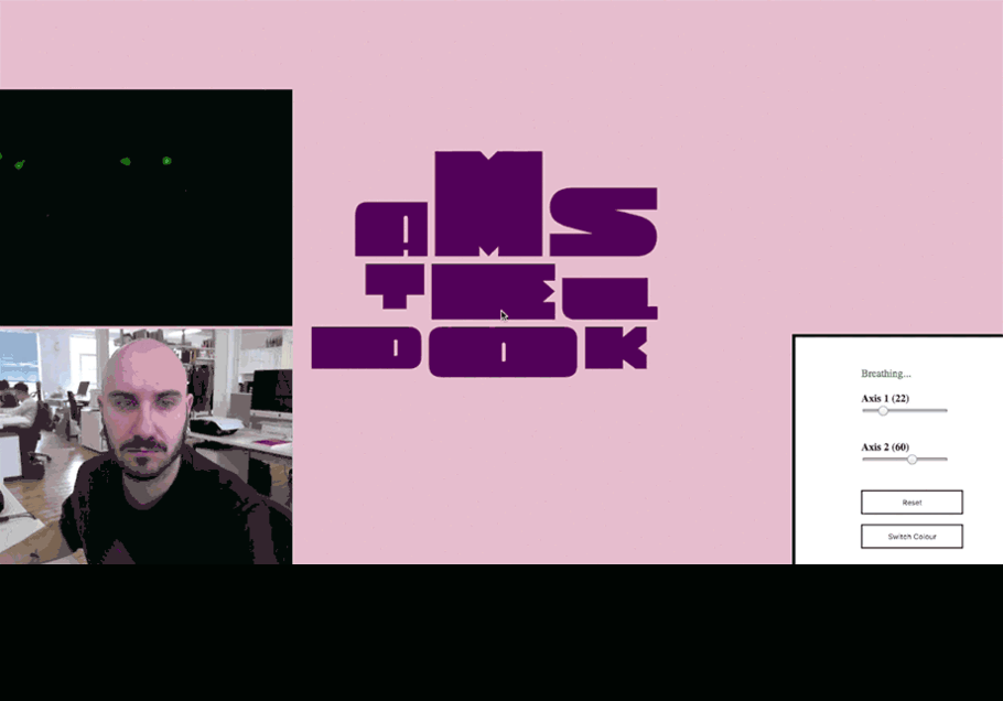
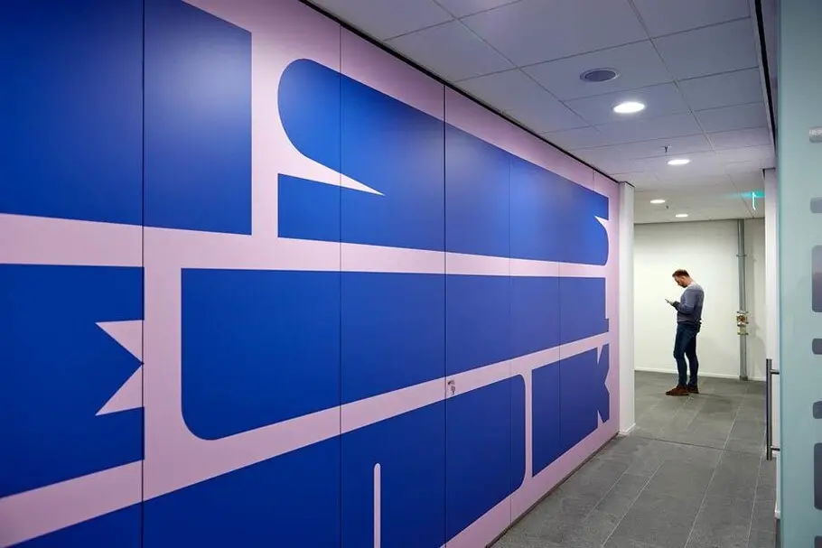
The logo shape shifts with different human gestures; while its colour palette gently changes according to the time of day and night – all reflecting the creative concept of the building and those “breathing” creativity within the space.
The team was commissioned by VBAT in late 2018 to refine a modular logo that drew on influences from classic 20th century Dutch design — modern, experimental and bold. Together we questioned whether there was an opportunity to develop an interactive and responsive typeface, a show piece artwork that played on the type’s modular flexibility. Variable fonts are the next big thing in typeface design, and whilst there has been a lot of experimentation with adaptive weights and widths, we wanted to look beyond and create something truly responsive and unconventional. As designers we wanted to bring a new take to new technology, to create a practical font with experimental properties, something that has never been seen before.


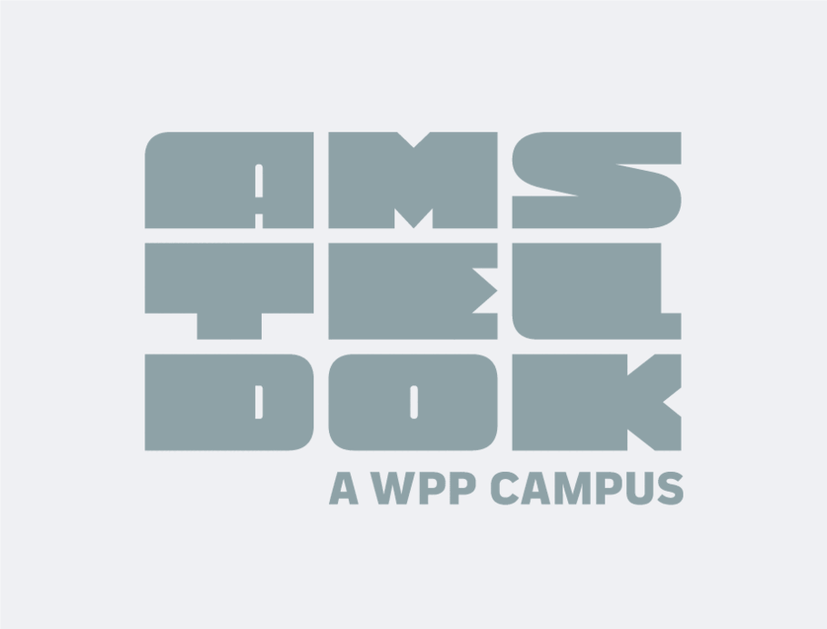
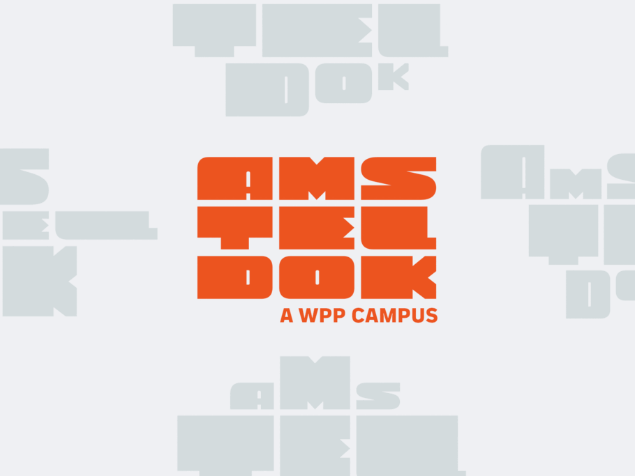
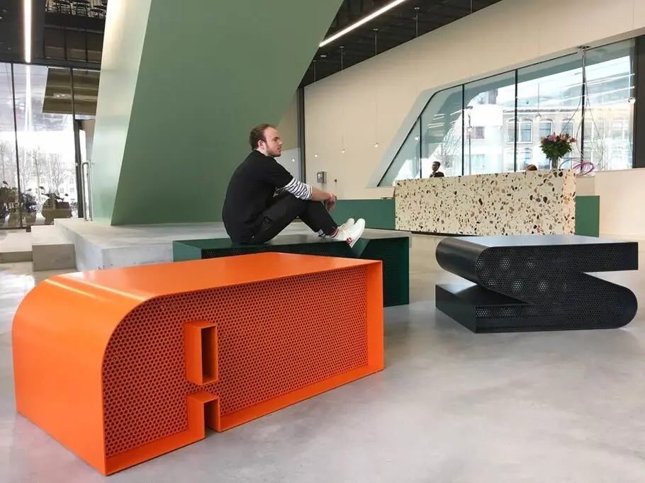
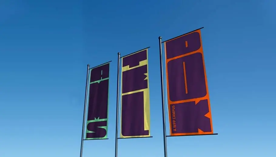
There was a clear vision that the logo’s type could be pushed beyond a static logotype, it could adapt to interior and print applications; becoming a system for wayfinding cues throughout the building. The previously derelict Rivierstaete building had been completely renovated to create an innovative workplace for 1,500 WPP agency staff in the city. VBAT developed a flexible and adaptive identity for the new campus which they renamed Amsteldok.
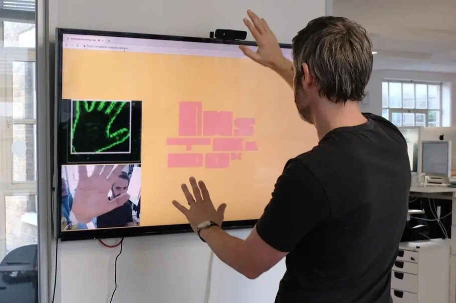
The Amsteldok letters form a morphing, fluid variable logo font that responds to user interaction via a heat mapped camera. So as people move through Amsteldok’s reception area, the font adapts too, empowering everyone to have fun with the logo, bringing the identity to life to create a more physical and immersive brand experience.
Graham Sturt, Creative Director at VBAT Amsterdam said: “With this WPP Campus branding project there was a very high creative ambition from day one. Bringing Fontsmith onboard at an early stage meant we could easily develop and refine the typographic ingredients based on our initial creative concept. This also left us plenty of room to explore how to push the creativity even further, resulting, amongst other things, in the world’s first variable font logo.”
Fontsmith’s senior type designer Pedro Arilla worked on the project and described the logo as: “a living entity: it’s always ‘breathing’ (even at rest like us); responding to people and movements in real-time. The letters react to the surroundings and to one another within the constraints of their grid, while still maintaining consistency as a distinct, recognisable and playful brand mark.”
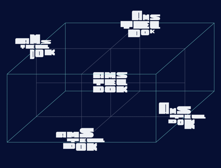
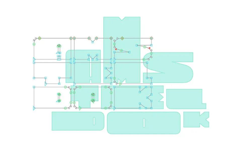
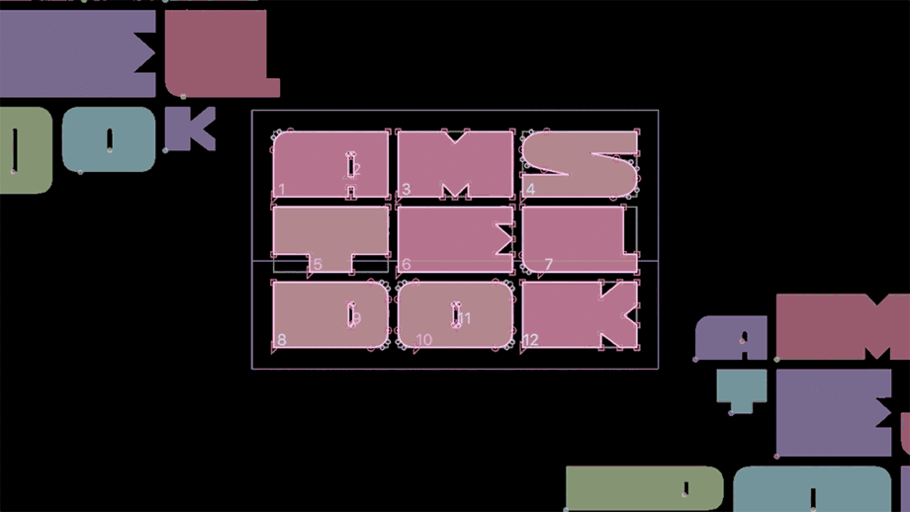
The logotype was created by initially experimenting with the letter proportions, while maintaining the core essence of the mark. Several final versions became “font masters” which could then be interpolated and blended to create a huge number of new variations. We then worked with developer Carlos Sánchez to create a responsive software that would animate the logo fonts design axis on screen according to people’s movements.
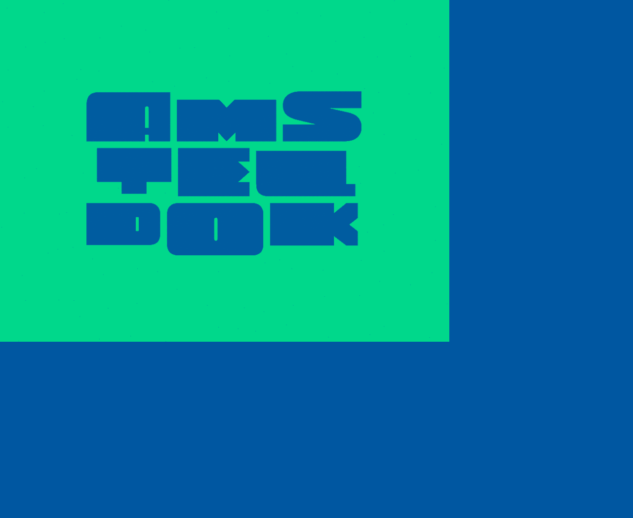
We wanted the work to embody the brand colour scheme but we also wanted to build in another function, an idle state colour scheme that allowed the logo to reflect a sense of time. We created a colour scheme that adapts every 40 minutes, following the sun’s journey throughout the day – shifting from hues of blue at night to yellows in the day.
VBAT is currently in the process of developing a set of visual identity principles to be used across all global WPP campus locations, using Monotype’s FS Industrie typeface family.


 for Duolingo.")