New custom type family for MotoGP™, the biggest motorcycle road racing competition in the world.
—Nuria García, MotoGP™ Brand Identity & Design Coordinator.
MotoGP™ is the top division of the FIM Road Racing World Championship Grand Prix. It’s the oldest motorsports championship (racing since 1949) and visits a total of 16 countries across four continents every season.
MotoGP™ is the best motorcycle racing show on Earth, featuring the best riders on the planet riding the most technologically advanced and fastest prototypes in the world. Fontsmith (now part of Monotype) collaborated with Dorna Sports (The MotoGP™ commercial rights holder) to design a vibrant, premium and charismatic typographic identity.
Dorna Sports are a forward-thinking client who understand the value of, and invest resources in design, technology and communication. MotoGP™ is a global show broadcasted worldwide where the protagonists are the riders but also the bikes, the circuits and the fans. Everything about the competition is cutting-edge, entertaining and adrenalised. Dorna wanted to evolve the MotoGP™ visual identity for a fresh new look going into the next decade. Season 2020/21 is being launched with a brand-new typographic system.
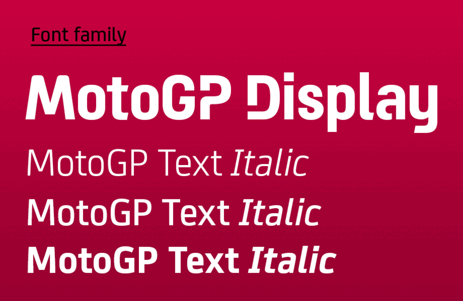
Font family
MotoGP™ uses a wide range of communication channels, with a focus on digital platforms and TV. With that in mind, the main goal was to capture the indomitable spirit of MotoGP™ and translate it into letter shapes that would render perfectly on screen.
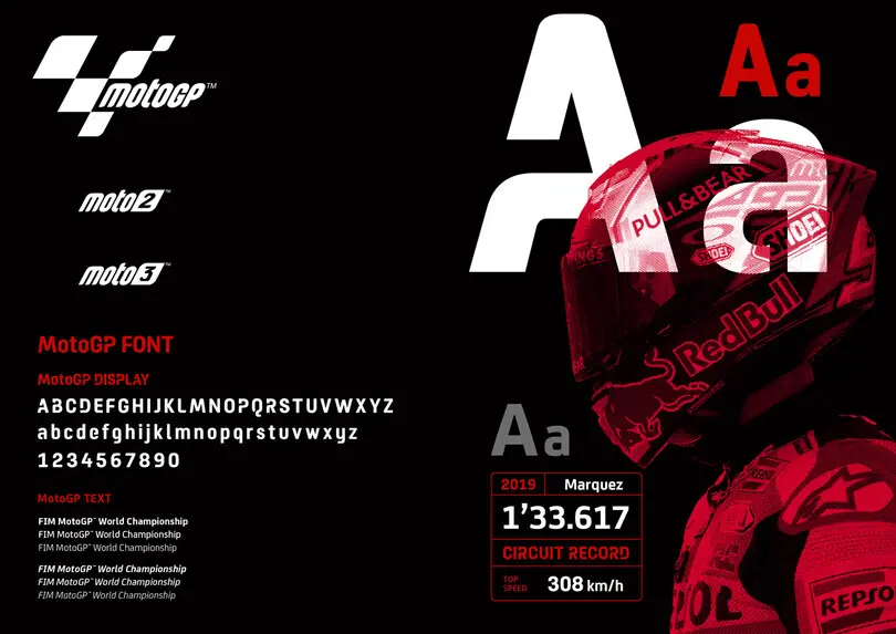
The Fontsmith design team began by exploring what was needed for the new type hierarchy and determined that a font family structure of 6 text fonts and 1 display style could be used to create a versatile type system, enabling clear infographics and punchy headlines.
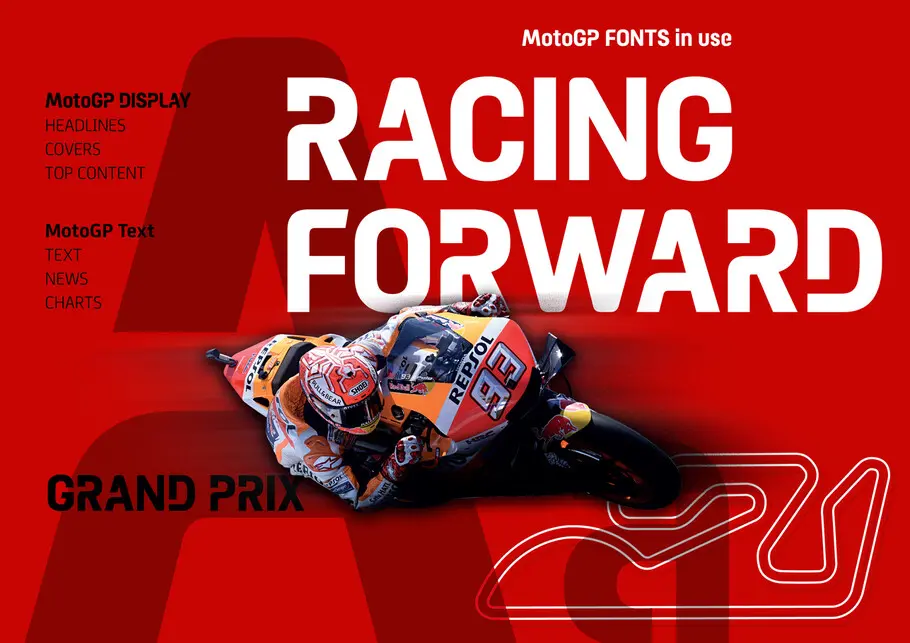
MotoGP Display
Every custom design project starts as an exercise in how to encapsulate a brand voice in a typeface. MotoGP™ is a fearless, striking and fierce competition. We wanted the MotoGP Display face to be spikey, angular, curved and sharp — an eclectic mix of visual mechanisms to trigger an absorbing medley of feelings. The display style of a type family allows the most room to show the typographic personality of a brand. And we wanted to take advantage of that.
As a first step, the typeface structure of the display font was drawn for on-screen optimal performance. The approach was to build a boxed skeleton of very clean and simple shapes. This construction method facilitated the pixel arrangement on screen and therefore helped the letters to render clearly. Once we had a solid base, we were ready to design a tailored suit for it — and bring the brand’s personality to the design.
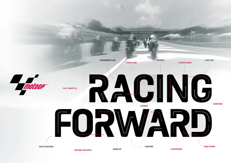
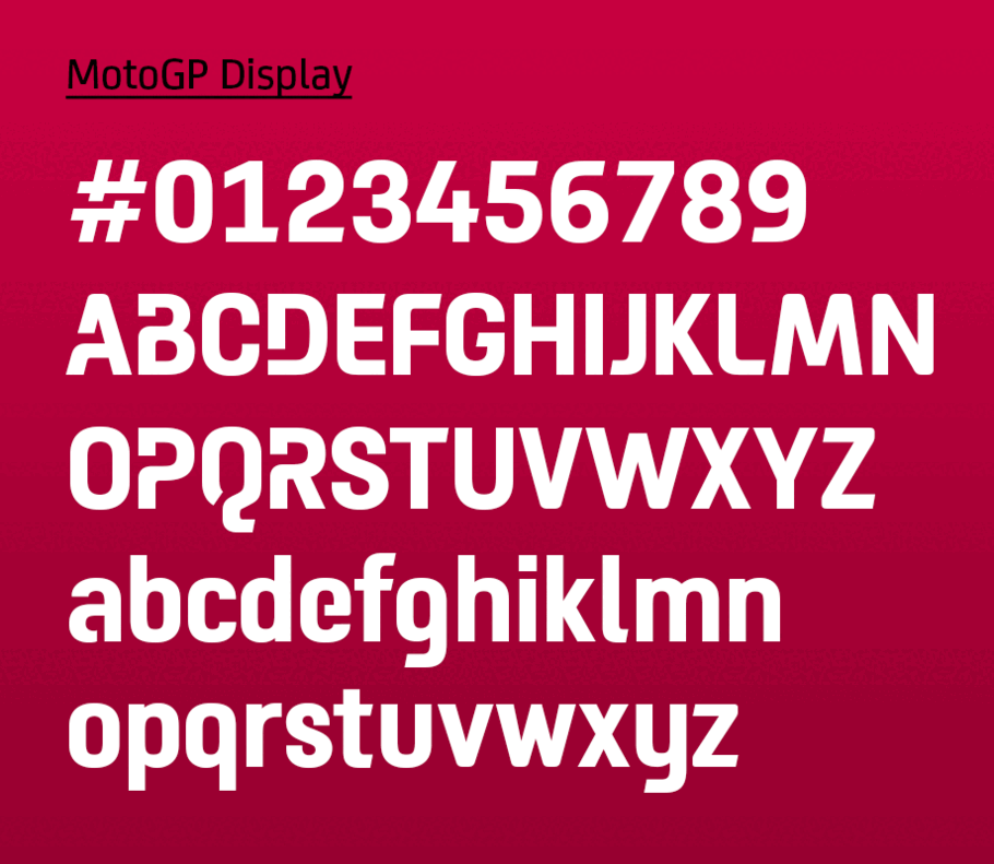
We looked at the heritage of the competition and applied nuances of circuit design and open track shapes to some of the characters (like the uppercase ‘Q’ and lowercase ‘e’). Starting with a subtle curvy frame, we incorporated the personality of human-designed curves and the beauty of a motor-like visual aroma into the design. The figures are a good example of bringing the tension of circuit curves to the character shapes. The numbers are beautifully simple at first sight, but a closer look reveals a subtle nod to the racetrack curves.
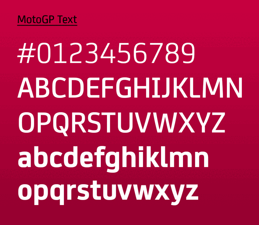
MotoGP Text
MotoGP Text is based on FS Joey. This Fontsmith typeface was originally developed to be highly legible on-screen, including at very small sizes. It is corporate and not too quirky, but still has a strong character of its own, which made it a perfect starting point for the new MotoGP text font family.
Clarity is crucial when displaying a lot of information on screen. Ranking tables are full of names and timings and while the display typeface has to shine, the text cut must be appealing and very legible. We sharpened the corners, made some shapes more legible (e.g. ‘g’) and more modular, clean and sporty overall (e.g. ‘8’). The text font family consists of 3 upright fonts and 3 italics.
“Creation of the MotoGP™ fonts has been a smooth journey from the very beginning thanks to the experience and professionalism of the Fontsmith team at each step,” said Nuria García, MotoGP™ Brand Identity & Design Coordinator.
“To have corporate typeface is a great achievement for our championship because it will be a common element in all the applications of the brand and will contribute to its strength. We are very satisfied that Fontsmith managed to capture the “spirit of racing” in the personality of the typeface. We hope to make the typographic family grow in the future and keep our partnership with Fontsmith for many years.”
Nuria García (MotoGP™ Brand Identity & Design Coordinator).
The new MotoGP™ brand typeface is ready to ride and race. We can’t wait to see it being used in one of the most exciting sports competitions in the world.
Update, April 23:
Playstation just released a trailer for its upcoming MotoGP game, using the font designed by Fontsmith. Check it out:


