Strongly worded letters: Typography and modern protest.
At its core, type is a storyteller. Letterforms deliver a message. And such messages are perhaps at their purest in the form of community-led designs for protest.
While many of those who create signs and banners for marches and demonstrations might not call themselves graphic designers, that’s exactly what they become when putting letters on placards. Each sign is a snapshot of a broader story, a message that’s both highly personal and that articulates the thoughts of a wider movement. They’re created in anger and in sadness, and distill exactly what the best design is all about: igniting change.
“Eliminate false distinctions.”
The history and development of printing and font technologies have played a huge role in shaping how protest materials are made and messages disseminated. During the mid- to latter half of the 20th century, tools like screen printing presses became more widely available than ever, and offered a perfect crossover between the arts and activism.
Certain sites made names for themselves by taking quick-turnaround, affordable commissions for campaigns, such as the Poster Workshop in Camden Road, London, which was open from 1968-71. Offering a walk-in service for the likes of striking workers, civil rights groups, and liberation movements such as the London Squatters Campaign, the collective ran the workshop with the aim of encouraging responses to a flurry of political and global issues like workers’ rights, the Troubles in Northern Ireland, and the Vietnam War.
Design styles, as well as the methods that produce the final designs, are also part of a historic lineage. Take the feminist movements that occurred around the 1960s and ‘70s: Many images seem to draw directly from the communications of the Civil Rights movement occurring in the same era. Artist Lucia Vernarelli used a woodblock style in her prints similar to that used by Emory Douglas in his designs for the Blank Panther Party.
However, to step outside of the creative industry bubble, it’s not necessarily helpful to use the label “design” in the context of grassroots protest movements. Academic Dori Tunstall has written extensively around how the principles of design anthropology can be applied to community organizing. In a 2016 essay published in the WCCW’s Feminist Organization’s Handbook, she states that it’s vital for people to “eliminate false distinctions between art, craft, and design” in order to negate the “hierarchies” that manage to sneak into even community-based activism.
According to Tunstall, “art-based activism receives higher press recognition and, oftentimes, more financial support” followed by “craft-based activism… because of the perception of grassroots authenticity”; then finally “design-based activism comes last, as it is considered too ‘professional’ for the grassroots but too ‘mass’ for artistic expression.”
She points out that it’s largely a part of European discourse that makes such distinctions: In other cultures, people simply make things without considering what they are, or their place in “the struggle.”
Democratizing design: Community over “branding.”
Over the past decade, we’ve seen a blurring, if not a near-total dismantling, of these distinctions. Since the advent of digital technology, the democratization of creative software tools has allowed a more community-minded, non-ego-centric approach to take root, with designers increasingly creating work that is open-source or freely downloadable.
One of the strengths of the Women’s March Movement, for example, is its lack of branding or a particular visual identity in the way “big agencies” would define them. The movement started stateside in early 2017 in the wake of Donald Trump’s inauguration, and has since grown into a global act of resistance to the American president and his misogynistic comments, embedding itself further into society and government alike.
Among the now-iconic images to emerge from the movement include Hayley Gilmore’s poster “A woman’s place is in the resistance,” bearing bold, red, all-caps lettering, and Deva Pardue’s “Femme Fists” symbol.
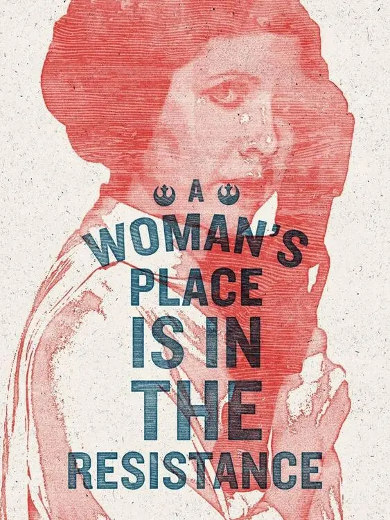
“A woman’s place is in the resistance,” by Hayley Gilmore.
Another icon to emerge from the movement is the “Nasty Woman” t-shirt from self-taught designer Amanda Brinkman. Her design uses simple black letters to turn Trump’s “nasty woman” insult, which he threw at Hillary Clinton during one of their 2016 presidential debates, into a cute and defiant icon on a t-shirt sold to raise funds for Planned Parenthood. “I coupled [the phrase] with this pink heart because I thought that was funny and it was really antithetical to the statement,” she told Forbes. This collection of symbols makes for a plurality of visual “voices,” allowing the Women’s March umbrella to encompass a wide family of causes and organizations.
Design for activism is increasingly taking the form of open-sourced assets, created and disseminated online for anyone to use. One of the most famous recent examples is Shepard Fairey’s “We the People” poster series, which aims “to combat the rising power of nationalism, bigotry, and intolerance” and is free for all to save and use.
“Professional designers see themselves as [relinquishing] ownership or releasing the copyright as they realize the greater impact they can have if they let their work spread—not just through technology, but through protest,” Design Museum curator Margaret Cubbage told Eye on Design. “It’s a big shift, and shows graphic design’s impact in spreading and sharing a message. They want people to actually use it.”
While most protest materials are created in ways that are far from precious—hastily assembled, not usually expecting to last more than one march—the Design Museum’s 2018 exhibition Hope to Nope: Graphics and Politics 2008-18 framed such pieces in the unusual context of a firmly “design” museum setting.
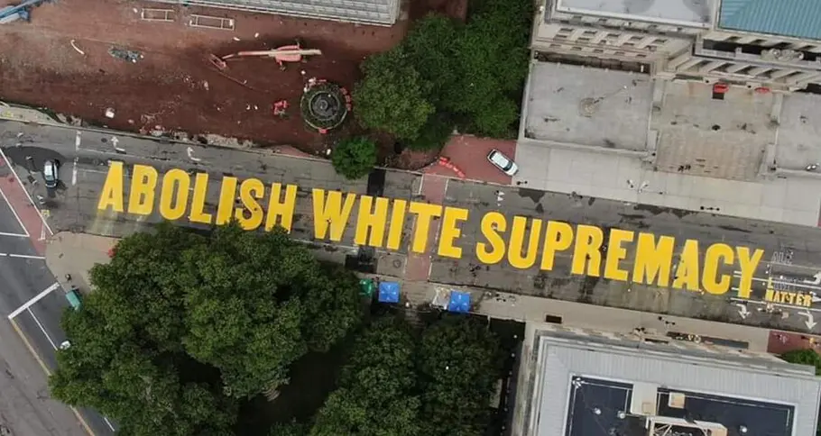
Unsurprisingly, many of the stars of the show were type-centric, such as the artist Dread Scott’s flag in support of the Black Lives Matter movement. The piece replicates a flag flown from the national headquarters of the civil rights organization National Association for the Advancement of Colored People (NAACP) between 1920 and 1938, to mark lynchings of black people in the US. Scott’s flag, created in response to the police shooting of unarmed Black man Walter Scott in 2015, uses the same striking, white, all-caps letterforms contrasting a black background, reading “A man was lynched by police yesterday.”
The artist has described his work as having a number of purposes: highlighting the role of police shootings in the past few decades in “terrorizing black people,” just as lynching had in the past; creating public discourse around such racist actions; and providing a symbol of hope for change.
While the exhibition highlighted the expansive opportunities typographers and designers have to make an impact, it also touched on their limitations. As one of the exhibition’s curators, Lucienne Roberts of GraphicDesign&, told Eye on Design back in 2018, “So much graphic design supports capitalism, in a broad sense, and I guess that makes a lot of us ask questions around the value of what we do. Making work that’s more socially inclined makes us feel we’re contributing something more meaningful, and to an extent that’s true.” (It’s an interesting point, pointedly satirized by the Oddly Head poster, which also featured in the show, that reads: “Slogans in nice typefaces won’t save the human races.”)
Social sharing platforms have also become essential instruments of protest, and are a crucial aspect of the democratization of design in activism. Illustrator and university tutor Sam Rowe created a simple site for people to upload their own Black Lives Matter protest graphics for others to use, and also created his first font—a display typeface called Revolt. Billed as “an angry font for angry people,” Rowe intends Revolt to be used for protests and marches, saying that “it was conceived and designed in anger and should be typed as such,” and that “racists, fascists, and other purveyors of hate may not buy or use this font.” It can be downloaded for free, or users can pay any amount they like, with all money raised split equally between UKBLM and The National Bail Out Fund.
And in some cases, the fonts themselves can be a form of activism—exemplified by the work of Vocal Type. Founded in 2016 by Tré Seals alongside his Maryland-based eponymous studio, Vocal Type was initially born of frustration. Seals was searching online for inspiration for an identity project and realized, again, that everything he saw “looked the same.” Perhaps, he reasoned, this was because of designers’ “obsession with grids and perfection,” but in reality, it largely boiled down to the industry’s racial homogeneity.
Martin, by Vocal Type, was inspired the Memphis Sanitation Strike of 1968.
Looking into the stats, Seals found that only 3 to 3.5 percent of all practicing designers in America are Black. This discovery suddenly made him understand why such a “singular perspective” both in approach and design aesthetics has dominated. “A lack of diversity in terms of race, ethnicity, and gender, has led to a lack of diversity in thought, systems (like education), ideas, and, most importantly, creations,” Seals says.
Further inspired by encouraging words from Dr. Cheryl D. Holmes-Miller, the author of a PRINT magazine piece titled “Black Designers: Still Missing in Action,” he set about creating a type platform not only founded and creatively helmed by a Black man, but one that sells inherently politicized typefaces.
Broadly speaking, Vocal Type’s aim is to diversify design by creating typefaces that highlight a piece of history from a specific underrepresented race, ethnicity, or gender. Each release is a vital story told through design’s most intrinsic building blocks: letterforms. These include Martin, named after Martin Luther King; William, named after activist W.E.B. Du Bois; and Ruben, inspired by the National Chicano Moratorium movement, which protested the Vietnam War. Vocal’s most recent release is Marsha, named after Marsha P. Johnson, a Black transgender woman who was one of the most prominent figures in the Stonewall uprising of 1969.
Video Credit: Kay the Kreator
Grab a marker and start writing.
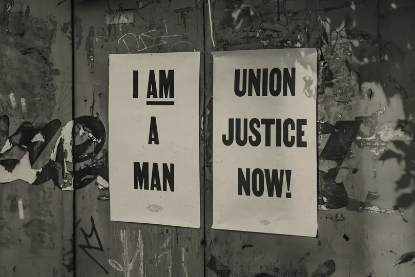
Today, the widespread availability of digital design tools means it’s increasingly easy for non-designers to make flashy protest materials. But handwritten signage works in powerful ways, and performs a different role than “good” graphic design characterized by technical wizardry and polished, professional fonts. Nothing captures the passion and spontaneity of protest like handmade signage. Often the urgency behind a protest means you just have to grab a marker and start writing, and for the most part, the typography of protest today remains staunchly in the handwritten camp.
It’s noteworthy that handlettering retains such a potent and prominent place in protest, considering today’s activism exists as much online as on the streets, with graphics and typographic slogans proliferating as socially shareable (and pleasingly virtue-signaling) gifs, digital posters and so on. As The New York Times put it, referring to the Occupy Wall Street demonstrations of 2011, “given the handwritten cardboard signs that have become the signature of the Occupy movement, you wonder if there is still a role for the poster in making messages go viral today.”
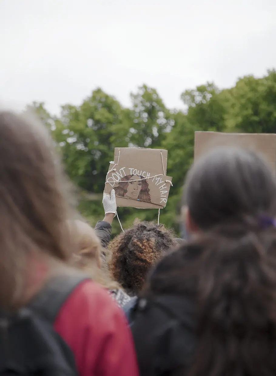
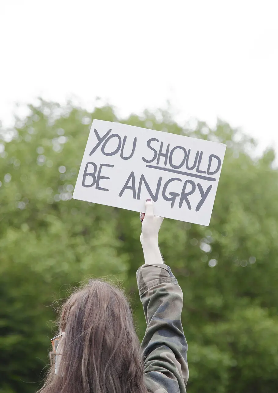
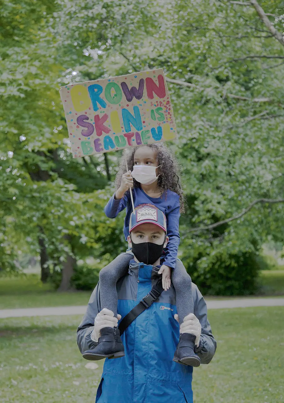
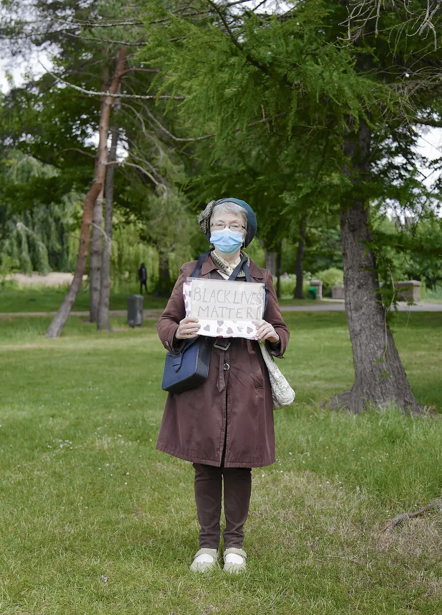
As Dori Tunstall pointed out, these hand-drawn signs are not officially “design,” yet offer some of the most memorable articulations of anger and hope we’re likely to see in any civilian-led protest. They also create lasting impact when photographed: Striking letterforms hand-printed or written onto whatever protesters can find—card, paper, their own bodies and faces, or (in COVID times) facemasks—make for powerful images.
This is something David Holbrook, who photographed one of the recent Black Lives Matter protests in London, can attest. His eye is drawn first to people, he says, then messages, then largely to placards that offer a certain degree of aesthetically pleasing symmetry. “You’ve got a certain amount of catchphrases like ‘Silence is Violence,’ then obviously ‘Black Lives Matter.’ Signs that are completely handmade instantly show that someone’s put their time into it. They can be so expressive.
“The block text means you can really see it,” he adds. “It’s all in capitals, it wants to be heard—you get the impression these things are being shouted.”
Writer Emily Gosling is a London-based freelance art and design writer and editor-at-large at Elephant magazine. She writes for publications including AIGA Eye on Design, Creative Review, and Creative Boom and her book about the creative process, Great Minds Don’t Think Alike, was published by Ilex Press in 2018.
Cover image: Street Mural, Newark, NJ. Set in Martin by Vocal Type. Photo credit: Isaac Jiménez.


