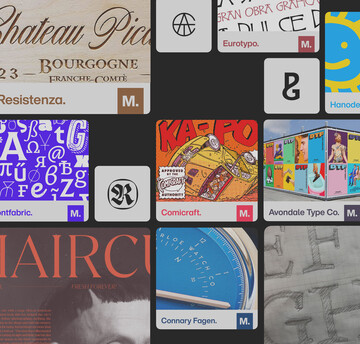
Why font performance matters & how to look for high-performing fonts compatible with your brand.

As your brand identity evolves, chances are you may be feeling some growing pains. You might be stretching as you search for the appropriate vision and brand identity for your evolving brand. We know firsthand that choosing the right fonts matters—font performance is crucial to delivering a positive customer experience, extending their connection to your brand.
You could pick a beautiful font to represent your brand, but if the typeface performs slowly, it will reflect poorly on your brand and can even cause you to lose customers. To top it off, studies show you only have about 5 seconds to reach your target audience. The first few seconds of page load time have the highest impact on conversion rates.
Charles Nix, Creative Type Director
When it comes to font performance, you don’t want any surprises. To make sure the beautiful fonts you choose will work as expected, we’ve identified our type performance knowledge. Here are 5 solutions to fix the most common performance issues associated with fonts:
1. Use small font files
Compressing your font files is key to preventing slow page load times. Fonts for your website need to be digital friendly; as mobile page load time increases to 10 seconds, the probability of the bounce rate increases 123%. You’ll want to select quality, web-friendly fonts with the smallest digital footprint possible.By compressing images and text, 25% of pages could save more than 250KB and 10% can save more than 1MB.
Web-friendly fonts:
- Web Open Font Format (WOFF): a web-font compression technology that reduces file size while maintaining font quality and functionality
- WOFF2: offers all the benefits of WOFF, but with even better compression
- TrueType Font (TTF): a common font format for both print and digital
- Embedded Open Type (EOT): a web-only font format with very limited browser support
2. Minimize the number of fonts used
The fewer fonts, the less data required for download. Being selective with your fonts can also lead to better visual communication – it shows your consideration and consistency as a brand. Using the same set of consistent fonts across your platforms will help create brand recognition with the consumer, and is proven to increase revenue by 33%.
Keep in mind that using fewer fonts doesn’t necessarily have to mean fewer type styles. Variable fonts offer entire families of type in a single font file, which means all the fonts are downloaded once, limiting load times. As such, variable fonts can be great web fonts when you think about choosing fonts for your brand’s web design.
“There is an ROI for typography; typographic spend correlates directly with overall financial success. Excellent typography is a key to successful brands,” adds Charles Nix, Creative Type Director at Monotype.
3. Utilize high quality font files
While the typeface you choose may work beautifully on a 4k screen, it may not render properly on a phone or handheld digital device. This is critical since, according to Google, “performance enhancements are even more important for mobile first customers.” The font you select needs to be easy to read and accessible. Here’s an accessibility visual to see how font size matters.
Once you understand which font files are mobile-friendly, look to a trusted font library that ensures proper licensing, and experiment with different fonts available. Font libraries are a great opportunity to play around with font styles. They also allow for easy filtering so you can easily find serif and sans serif fonts in a wide variety of styles, depending on what you’re looking for.
One successful example of a high-performing font expertly employed is Verizon’s use of Neue Haas Grotesk, which works well across web for desktop, mobile, in-app, and in ad campaigns. The font is legible on all devices, making the brand message clear, consistent, and accessible to consumers.
You’re choosing fonts primarily for web use, but be sure to test them in print too. Chances are they’ll be just fine, but the only way to know is by testing them before your customers do.
4. Ensure fonts are language compatible
The font you choose needs to support the languages of your global audience. If the language isn’t supported by the font, the glyphs may not render properly. Fortunately, high-quality font libraries will list the languages the font files are supported in. You’ll want to choose a selection of fonts or a font family that meets the language needs of your customers. You don’t want to miss out on a potential customer due to a digital rendering issue.
“Your customers see your brand through design and typography. Their experience with your brand is a sum total of the feelings generated by all points of interaction. Type is not a luxury. It is a necessity—a business expenditure with huge implications and impact. It conveys who you are, and when correctly managed, creates goodwill, esteem, trust, and security,” says Nix.
5. Choose from a trusted font library
Perhaps the most important step, you’ll want to source your fonts from a credible source. Using a trusted font library ensures the fonts have already been approved for commercial use, while free fonts run the risk of not being properly licensed. Font libraries will specify the licensing of each font so you can rest assured your website is ready to go. An added bonus of font libraries is that they come with filtering options, which can shorten your font search to the typefaces that meet your needs.
Conclusion
Your brand performance is everything, and typography plays a huge role. A great typeface can help you communicate your brand values before your words are even read. If a customer understands and connects with your brand from their first glance at your homepage, you’ve hooked them in. Choosing the right type is good business—and it’s easier if you already have a library of fonts that you trust.
To get the most out of the fonts you choose, you’ll want to test your fonts for load time, digital rendering, and printing compatibility. Choosing high-quality fonts, minimizing the number of fonts, and compressing font files are all easy fixes to improve your brand’s font performance.
“The shape of language and communication matters—deeply—and design and typography prove their worth daily, in the bottom lines of the most successful businesses on the planet,” concludes Nix.
Remember, font performance is not just for show. Font selection has been proven to increase positive consumer response by 13% when it’s a good match. Next time you launch a rebrand, consider using a font library to get the best results out of the typeface you choose.


