


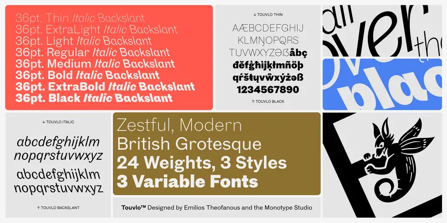
Touvlo: a zestful, modern grotesque with lively flair.
Emilios Theofanous, Creative Type Director.
New from the Monotype Studio’s Creative Type Director, Emilios Theofanous, Touvlo – meaning brick in Greek – is an homage to London and the view from his studio window. A zestful, modern interpretation of a classic genre, Touvlo skillfully captures the spirit of early British grotesque typefaces through playful terminals and lively curves. Touvlo offers an array of styles, from clean uprights to characterful Italics, and exuberant Backslants. Touvlo is available to all Monotype Fonts customers and can also be purchased at MyFonts.
Theofanous began working on Touvlo in early 2018, after moving to London, so it’s been a labor of love. Touvlo was born of a chaotic headspace, with Theofanous aiming to build something new, that would encapsulate all that he carries and all that he’d love to be. The type designer moved to London from France after finishing studies in Esad Type in Amiens, bringing along his Cypriot heritage, Greek language, a terrible French accent, and a whole lot of energy for something new. Touvlo, like Theofanous, is all over the place; combining a variety of past experiences in an idiosyncratic design space, to be reimagined as a timeless voice for years to come. The name of the family, Touvlo – meaning brick in Greek – is an homage to London and the view from his window; that is, quite a lot of bricks.
“I started working on Touvlo soon after I moved to London, and it has been a great companion ever since. Its design changed quite a lot from when I started: it has grown and matured, becoming something more than the initial sketches. One could call us friends. Our relationship has had its ups and downs, but I can’t deny that harnessing Touvlo’s spirit has been an amazing adventure. I am very proud of Touvlo, and look forward to seeing it out in the wild - used in all kinds of scenarios, surfaces, mediums - all over the place!”
The motivation for designing Touvlo was to create a well fleshed out type family with elements of surprise, enough character and voice to perform across mediums and design genres. Grotesque sans serifs have been a staple in printers’ toolboxes and designers’ font menus since their emergence. In a sense, they defy time and have been used well across regions over and over for decades. Sometimes grotesques are trendsetters, sometimes they inconspicuously wait along the typographic spectrum to be used again and again – but they never fade away. Touvlo aims to capture some of this spirit and attitude, becoming not a voice, but the choice for a timeless and unique aesthetic.


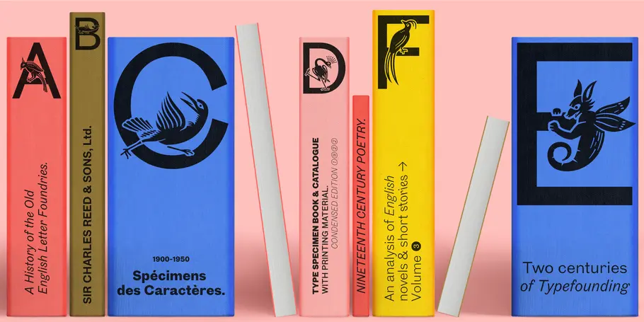
Touvlo was initially inspired by historical sources but quickly transformed into a personal and contemporary interpretation of late 19th and early 20th grotesque designs from British foundries. Its origins can be found in “Specimens of Book and Jobbing Types; Borders, Initials, Ornaments, Etc.” by The Fann Street Foundry, Sir Charles Reed and Sons, Ltd, London: 1905. The Italic grotesque designs in this book follow a more calligraphic style instead of a slanted version one would expect today from sans serif designs, immediately inspiring Theofanous.
Quick historical note, back then the term of a type family, as we interpret the term today, was not well fleshed out. Different styles and weights were added as per need, sometimes with years in between, designed and crafted from different artisans while sharing similar family names. Today we use more streamlined processes, with all the tools and technology we have at our fingertips.


That wasn’t enough though - Theofanous wanted the family to have enough distinction between the Uprights and the Italics, following the path of the historical sources and providing the family with unexpected textures. Being in London, he also had the opportunity to visit St Brides Library, and dive into type specimens of the era from other British foundries, grasp their essence and cultural spirits without aiming for a detailed or accurate historical revival, as Touvlo’s purpose is for it to live today.
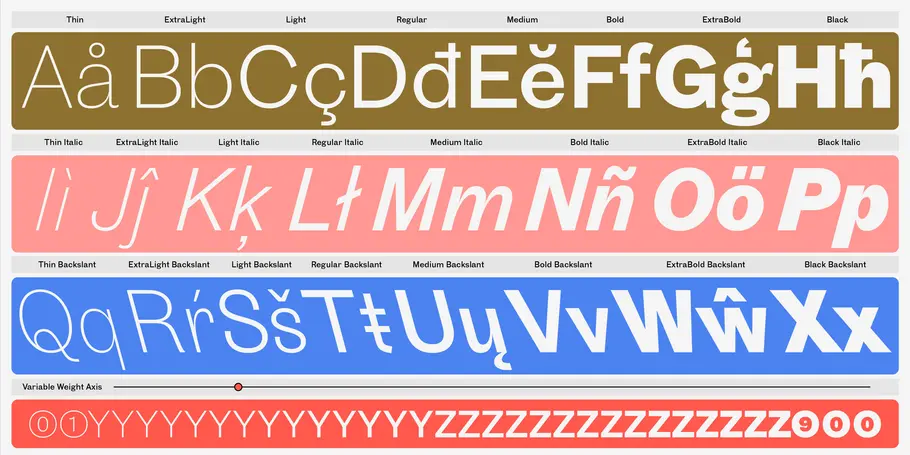
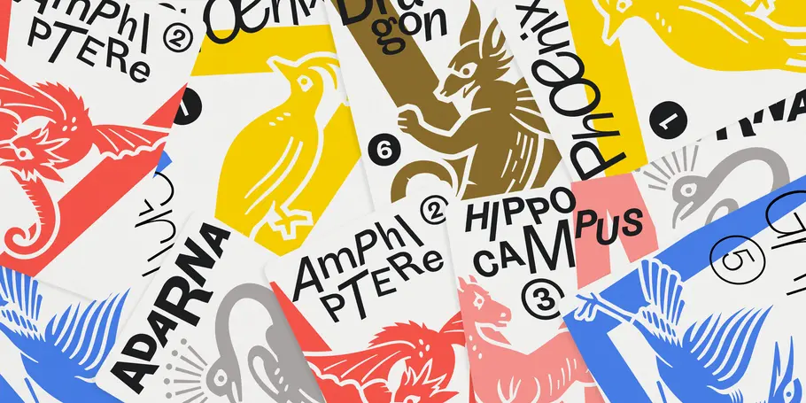
Touvlo offers an array of styles, from clean uprights to characterful Italics, and exuberant Backslants. Its regular upright weights are optimized for long text, with prominent and visible vertical contrast, creating rhythm and texture for comfortable reading. The Italics are designed to be visibly distinct, with narrower proportions and calligraphic shapes, offering brightness and emphasis wherever needed. The Backslants are an unexpected and energetic addition, providing an element of surprise while following similar design choices as the Italics, packing a particular punch. Touvlo’s weights range from Thin to Black, giving it an expressive edge for headlines. Its lyrical Drop caps are the finishing touch, featuring exquisite birds and creatures inspired from ornaments found in type specimen books.
Touvlo has been an amazing journey and is now ready to be launched into the wild; for people to use it, to be surprised, inspired, and create new voices; all over the place.
Purchase Touvlo.
You can try Touvlo on Monotype Fonts for free today, click here for more. All weights are also available for purchase from MyFonts.


