Common font licensing hassles that creatives face (and how to avoid making them).
Graphic designers and other creative team members are usually the primary users of the fonts at a brand, which means they’re also responsible for ensuring those fonts are used properly according to their license.
And while most designers love fonts themselves, the licensing side of using fonts is often less understood.
But as the primary users of fonts, all creatives should have some basic understanding of how licenses work, how to ensure fonts are used correctly, and some common challenges to avoid. This knowledge can save you time and avoid (potentially serious) headaches down the line.
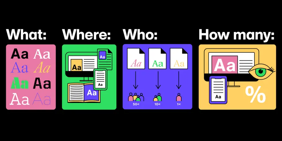
Font licensing 101:
Font licenses cover four basic parameters around font usage:
- What: The weight and style of the typeface
- Where: Literally where you’ll use the font – a website, digital ad, or in print
- Who: The number times a font can be installed on a computer (aka the number of people who can use it)
- How many: For example, web font licenses describe the number of allotted page views, and app and digital marketing licenses set similar parameters.
Scenario 1: The Oversharer.
Generosity is a virtue, but a common mistake is installing a font on more machines than the license permits – often by a lot.
Solution: Check with the license holder at your company to make sure everyone knows what that limit is. And if you aren’t sure, an email to the provider can clear things up quickly.
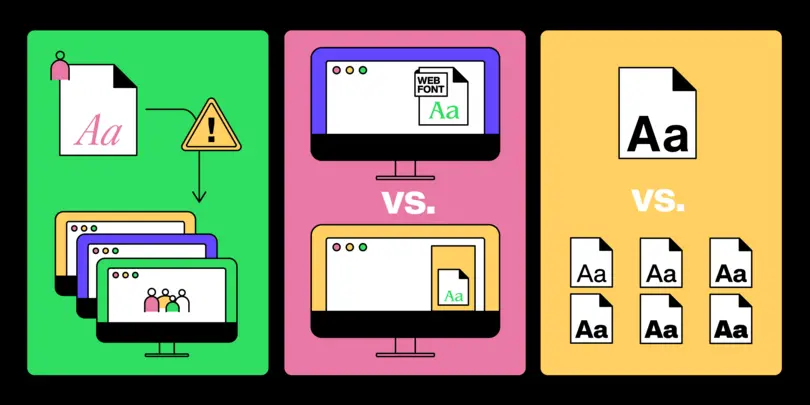
Scenario 2: Caught in the web.
Things get tricky on the web, where it’s easy to mix up web and digital ad licenses (or even desktop licenses and mobile app licenses) and overexpose fonts beyond their allotted impressions.
Solution: Organization and labeling is key to ensuring creatives use the right fonts in the right place, especially when you’re using the same typeface in multiple locations.
Scenario 3: All in the family.
Fonts are often licensed one weight and style at a time, but sometimes creatives will mistakenly use weights or styles from the same family that haven’t been licensed.
Solution: Licensing full families is always an option (and often more cost-effective), but when that isn’t the case, communication and clear instructions for use are essential.

Tick tock …
Solving or avoiding all these issues can eat up valuable time you’d rather spend designing: We surveyed a group of creatives and found that 48 percent of them spent 8 hours or more per week on administrative (that is, non-creative) tasks.
Here are some steps you can take to get ahead of these situations and save time and stress in the long run.
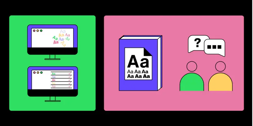
Organize your company’s font library so it’s easy to find what you need.
Label every font clearly, including the what, where, and how many above.
Communicate your company’s font usage policies regularly, especially to new hires.
Get to know the license buyer within your organization, who will ultimately have all the details you need.


