Q&A: Dan Rhatigan talks fine tuning fonts.

In our webinar, Finely Tuned Typography: Sweating the Small Stuff, Dan Rhatigan showed how to make use of OpenType features—specifically ligatures, contextual alternates, small caps, and number styles. He then answered questions from attendees about ligatures, his favorite OpenType fonts, and making it all work in your design tools.
Should you always use ligatures, or are there specific instances where you shouldn’t?
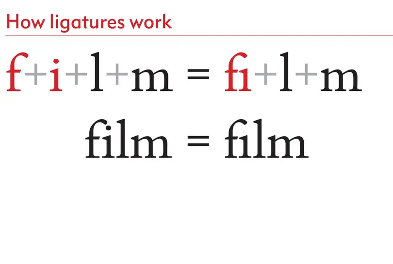
I think it’s a good idea to start out using ligatures and only turn them off if you see a specific problem. If you edit any stylesheet or create it, there are things like ligatures built into the basic character formats so you can set all of these things to be there right at the start—and not just basic ligatures, but any of your OpenType features. These basic ligatures, which affect ‘fi’ and ‘fl’ and sometimes other tricky combinations, are there because they adjust the most common things that can go wrong when you set the text without any adjustment.
You should not use ligatures when you open up type spacing because ligatures smooth out that natural spacing and these characters are drawn assuming you’re sticking to the natural rhythm of text. Luckily, software like InDesign will disable all the ligatures automatically once you track out further than 20 units so that you don’t get any odd shapes. It’s weird to have these tight letters in the middle of text that’s spaced out. So there’s a little bit of a failsafe built in for you.
What types of fonts tend to have OpenType features most often? Is it just pro fonts, or are pro fonts simply more reliable for these sorts of features than other fonts?
If there is a font that has a regular version and a pro version, you can assume the pro version has all of these built in. When pro versions of fonts first came out, it meant that an older version of the font had been updated into the OpenType file format, often with some of these features added. But newer typefaces designed after that era of conversion won’t call themselves pro because they started out as OpenType. Just seeing pro doesn’t mean it’s going to have OpenType features. The only time it’s really clear is if there’s a regular version and a pro version. For instance, Bembo® Book had a basic version and a pro version and it’s the pro version that has all of these built into the typefaces.
When type designers are creating new typefaces or expanding a typeface, and they decide to include OpenType features, is there a standard set of glyphs they’ll always include, like the ‘ff’, ‘fi’, and ‘fl’? Or is it as varied as the type designers out there?
It’s varied because often OpenType features are added based on what is appropriate for the design. The ‘fi’ and ‘fl’ are part of a default character set anyway—they’ve been there all along because they’re such problematic combinations. But if the designer has looked really carefully, you may find additional ligatures, such as the unusual ‘ft’, that is actually a thoughtful response to that particular design.
Oldstyle figures are rare because sometimes they don’t look right if a design is too crisp or too modern. Discretionary ligatures and contextual alternates are also rare. Most typefaces built for serious text usage will very often have both lining and tabular figures, but it’s definitely not a guarantee. I think it’s far more critical that you have that choice between tabular and proportional.
That’s why it’s useful when providers like MyFonts or Fonts.com, or other websites where you get fonts, give you some indication of what’s in there. Because outside of ligatures and a couple of figure styles, you can’t guarantee what’s included.
Can you recommend some typefaces that are more robust for OpenType?
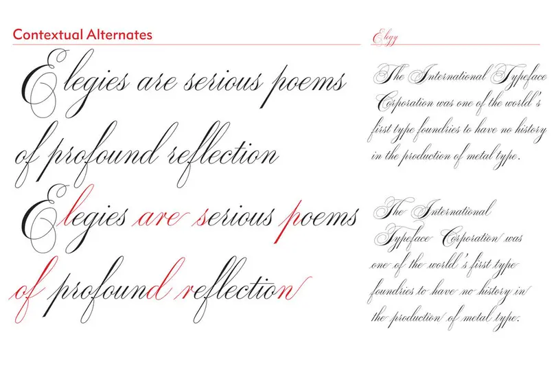
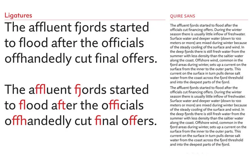
I love Bembo® Book for book text. Quire Sans™, which is a newer design, has a lot of great sensitive things in there, and ITC Avant Garde™ is famous for these features if you really want to go for it and play with your typography. Any high quality script typeface—Elegy™, for example—is likely using OpenType features to get that natural look. Metro Nova®, Joanna® Nova, and Gill Sans® Nova are all packed with these features so you can refine the quality of the type that you set.
Do ask around and see what other people like, and if they think those features have added something to the design and have not just been piled on for no reason.
Do OpenType features behave very differently if the kerning is set to optical?
OpenType features will not behave differently depending on the use of optical vs. metric kerning. Ligatures, as an example, will replace two or more characters, which might otherwise be kerned, with one single character.
There are some things to be careful of, however. As I mentioned, increasing kerning or tracking values by more than 20 units will disable the use of ligatures and discretionary figures in InDesign because their appearance is based on the look of normal text spacing. Also, if you apply optical kerning to tabular figures, they will no longer remain tabular!
Are stylistic sets meant to be designed only by the type creators, or is it possible for users to build a custom version by picking preferred alternate characters?
No, a user can’t build custom stylistic sets. They have to be set up by the type designer because the code for accessing them is built into the fonts themselves.
How can I convince a client to use oldstyle numbers instead of lining numbers when they disagree with the choice to turn them on?
I think the argument is not necessarily one about style, but rather about readability.
Switching to oldstyle figures allows numbers behave like text, which makes it easier to read through the sentences. Without oldstyle figures, numbers jump out because lining figures behave like all-caps in text do: They’re big and loud in the text. So if you want to tone down the text and focus on how the eye scans through all of that information, oldstyle figures will give the copy and numbers the same level of emphasis. That’s the real argument for why oldstyle figures are essential rather than just a style choice.
Most OpenType features are fundamentally about improving readability. Some features are just there to add personality, but most are really about making the typography as readable as possible, whether it’s proportional letter spacing of the numbers or a deft use of small caps or ligatures. Anything that interrupts the eye and makes it pause for even a fraction of a second should be smoothed out if you want to improve the quality of the text. Clients respond really well to words like efficiency when you’re talking about readability or legibility.


