How financial institutions can deliver a seamless experience to their customers.
Fonts play an important role in delivering a smooth experience to financial customers, and also help financial institutions keep up with evolving expectations.
Behind the font: Jessica McCarty of Magpie Paper Works.
Behind the Font highlights the people and process behind the fonts you love and use. This installment features Jessica McCarty, founder of Magpie Paper Works and Rare Bird Fonts.
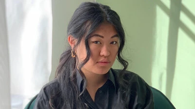
Meet the 2019 Beatrice Warde Scholarship recipient: Blossom Liu.
Ever year, Monotype and the Type Director’s Club (TDC) award the Beatrice Warde Scholarship to a young woman entering the design industry. This year’s winner is Blossom Liu from ArtCenter College of Design in Pasadena, California.
Behind the font: Carl Crossgrove of the Monotype Studio.
Behind the font highlights the people and process behind the fonts you love and use. This installment features Carl Crossgrove of the Monotype Studio.
Mobile or bust: Why forward-thinking retailers are prioritizing the mobile experience.
Retail customers are scattered across a wide range of touchpoints and react with them all interchangeably. However, they’re all linked through the mobile experience.
How financial institutions can build trust in an era of relentless scams.
In an industry where scams are commonplace and no brand is immune, trust is fragile. So, how can financial institutions build it, and build it to last?
Can fonts be sexy? Tell us in the 2019 Font Purchasing Habits Survey.
How much are designers willing to pay for high-quality fonts? Are variable fonts ready for showtime? These are among the mysteries this annual survey seeks to unravel.
How understanding font licenses can simplify creatives’ lives.
Creatives are the primary users of the fonts, but licensing approval typically runs through other departments. Here are a few key concepts all designers should understand.
What’s on tap for Adobe MAX 2019.
Adobe MAX is right around the corner! Here’s a quick look at what we have planned for this year’s conference.
Where digital and physical meet: The future of retail.
The idea of brick and mortar stores has been a hot topic lately. Are they dying? Thriving? Whatever you believe, they’re changing, with an eye toward digital.
Q&A: Dan Rhatigan talks fine tuning fonts.
Type designer Dan Rhatigan discusses the details of fine-tuning fonts and making the most of OpenType features.
The evolution of typography with variable fonts.
With the emergence of variable fonts, design no longer has to be traded for page speed. See how this new technology can transform how we think about web design.
In our on-demand era, creative asset licensing is more challenging than ever.
It’s safe to say that few people, if any, set out to commit copyright infringement. The reality is that most individuals and brands fully intend to pay.
How fonts can help you win the technology race.
As technology raises the stakes for brands, fonts can either level you up or hold you back. A simple, well-organized font system is essential to making sure you can keep pace.
The challenging game of designing for sports.
The World Cup is back, and all eyes are zeroed in on the best football … jersey fonts? We examine the tall task of designing for the world of sport.
Just how neutral is Helvetica?
In many ways the idea that Helvetica is a ‘neutral’ typeface has become a self-fulfilling prophecy. That’s not to say it isn’t, but the neutrality narrative is only half the story.
Fonts: The underrated political campaign staffer.
There’s more to a political campaign than ideology. Fonts and design play a crucial role in conveying a candidate’s personality (or lack thereof), perspective, and potential.
Consistency is the future: A recap of Brand Talks San Francisco.
The 2019 edition of Brand Talks San Francisco brought together leaders in design and branding to hear from brands that have tackled the issue of visual consistency head-on.