注目の記事
Shorai Sansは、幾何学的な形状が特徴のMonotypeの日本語書体です。Monotypeクリエイティブタイプディレクター小林章とタイプデザイナー土井遼太、そして書体デザインの第一人者、中村征宏氏を制作メンバーに迎え開発されました。

7年ぶりにウェブサイトのデザインを変更したTED(Technology Entertainment Design)は、TED TALKで語られる情熱的なスピーチとその素晴らしいアイデアを伝えるのにふさわしい書体としてNeue Helveticaを採用しました。


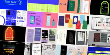
本記事では、さまざまなジャンルの最近出版された書籍や近々発売される予定の本を通じて、現在出版業界でトレンドとなっているタイポグラフィスタイルを垣間見ます。この投稿は、著者と出版専門家をつなぐウェブサイト「Reedsy」の仲間たちによるゲスト投稿です。

今日のブランドは、急速に進化するデジタル世界に対応しながら、パンデミックの最悪の影響からまだ脱しつつある「新しい日常」を乗り越える必要があります。この数年間で、すべての人のデジタルに対する期待やブランドの運営方法が変化し、一部ではビジネスモデルにも影響を与えました。さらに、生物多様性、持続可能性、多様性と公平性、そしてブランドアクティビズムといった課題がますます注目を集めています。これらの要素は、ブランド構築にどのように影響するのでしょうか。これらの大きな変化は、企業が自らをどのように位置づけるか、どのようなサービスを提供するか、そして顧客とどのようにコミュニケーションを取るかに大きな影響を与えています。
過去4年間、私たちはアイルランドのリムリック芸術デザイン学校(TUS)と相互パートナーシップを築くという幸運に恵まれました。クリエイティブ・タイプ・ディレクターのトム・フォーリーとエミリオス・テオファノスは、この一流の美術、デザイン、クリエイティブメディアスクールのワークショップやモジュールに参加しました。今年の学生は、1つの書体のためのメッセージ・プラットフォームを作成し、デジタルメディアまたは印刷メディアでプロモーションするためのマーケティングプランとデザインアセットを構築するという課題に取り組みました。
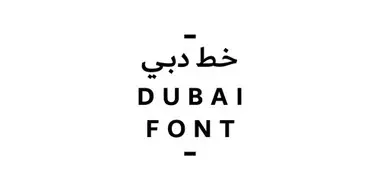
ドバイ市は、MicrosoftおよびMonotypeと提携し、ラテン文字とアラビア文字の両方で、ドバイのエネルギッシュな気質を反映したフォントを作成しました。
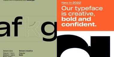
Monotypeは、鋼線の加工およびコーティング技術において世界をリードするBekaertのために、2種類のカスタム書体をデザインしました。大胆で現代的なこのデザインは、同社の長い歴史と産業的な遺産を表現しています。この書体は、Interbrandが主導するBekaertの全社的なリブランディングの中核を成しており、「安全、スマート、サステナブル」という価値のもと、私たちの暮らしと移動のあり方を形づくるリーディングパートナーを目指す同社のビジョンを支えるために設計されました。

MonotypeのTerrance Weinzierlは、ソフトウェア会社 SAP が SAP Fiori のための書体を開発するのを支援しました。この書体により、SAP は2015年にレッド・ドット・アワードを受賞しました。この書体のデザインは、個性を損なうことなくテキストベースのUI環境でうまく機能することが重要でした。新たに開発された書体「72」は、2017年にもレッド・ドット・アワードを受賞しています。
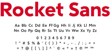
Monotypeは、アメリカ最大の住宅ローン貸付会社であるRocket Mortgageとのコラボレーションを発表しました。このパートナーシップにより、ブランドを現代的にアップデートし、あらゆる顧客体験に一貫性を生み出すためのカスタムフォントが誕生しました。
成長し新たな地域へ拡大していく中で、Orangeはフォントの能力が追いついていないことに気付きました。新しい言語への対応が一貫しておらず、チームごとに異なるライセンスやフォントを使用しており、ブランド認知の低下やライセンス侵害への懸念が生じていました。