Fonts.
Tag: Fonts
10 articles
Tom Rickner, veteran type designer, shares his personal role in the beginnings of type’s most exciting development in decades.
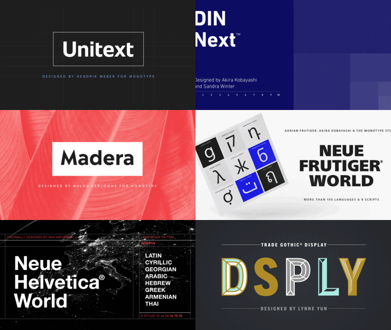
You know what they say, “classics never go out of style.” Maybe this is true, maybe it isn’t. But one thing is certain: When sans serifs took over typography in the early 1900s, they weren’t just a fad. They came to stay.
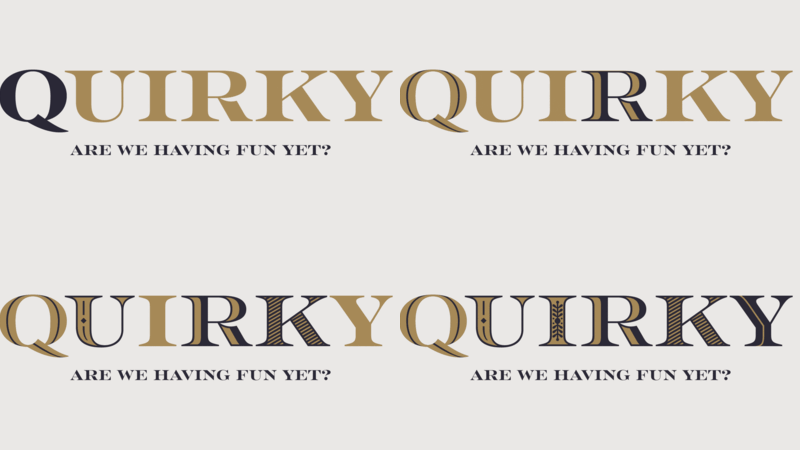
Sans serifs have long dominated the world of corporate branding, but some companies are going for a different look: Fun, funky serifs. What's behind the change?
Sometimes clients just don't care where their fonts come from. Here's why their project (and your reputation) benefit from convincing them it matters.
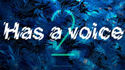
If fonts could speak, what would they say? The second installment of our Good Type series looks at how the fonts you choose impact the voice of your brand.

With HTML5 and web fonts becoming the industry standard for digital ads, it's time to take a look at some web font FAQs.
With so many ways to build HTML5 ad campaigns, there’s a lot to figure out. Here’s some handy tips to help you use Monotype web fonts in any environment.
This first installment of the Good Type series shows how traces of the same forms and styles emerge again and again as fonts are created or revived.

Type designer Dan Rhatigan discusses the details of fine-tuning fonts and making the most of OpenType features.
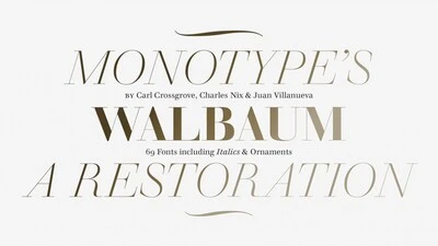
Monotype’s Walbaum typeface is the modern serif font to beat all modern serifs. Freshly restored by Monotype, this updated family oozes charm.