Fonts and luxury brands: Cars.
In part two of our research into the luxury sector and how font styles are used, we look at automotive brands.
Still thought of as a masculine dominated industry we were interested to see if there were any similarities with our last study which was focused on the beauty sector. How do car brands use fonts to convey luxury at the same time as power, speed and precision?
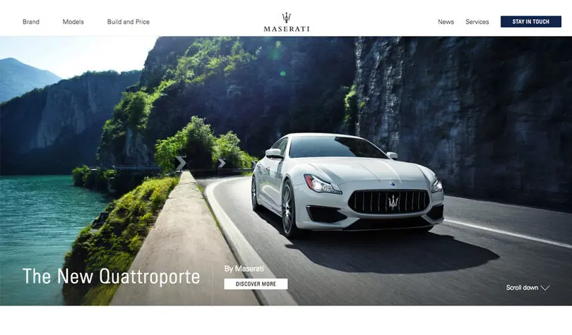
Maserati
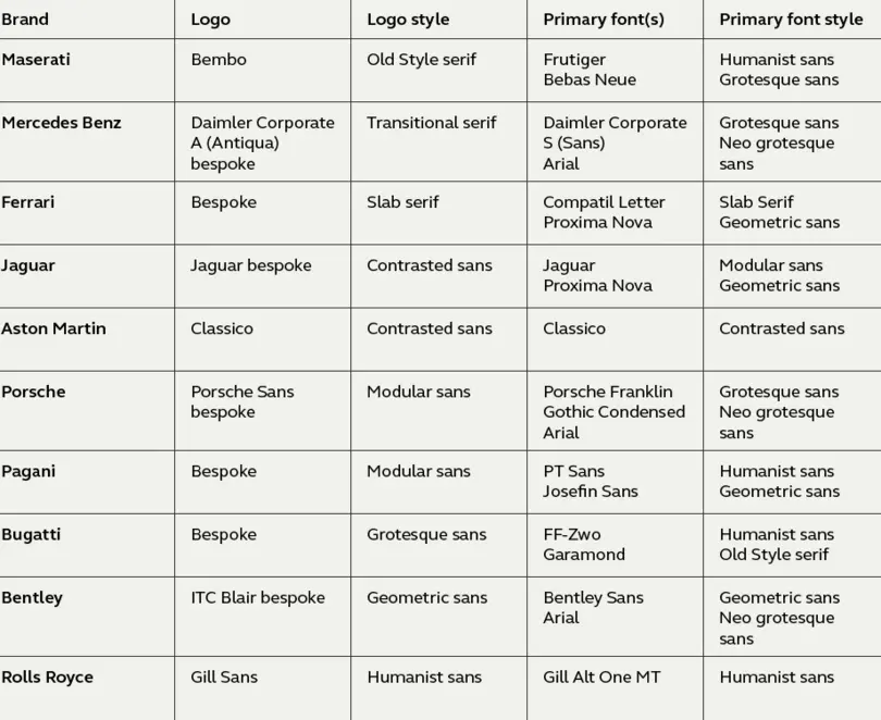
Maserati prides itself on it’s long and glorious sporting heritage. Old style serif Bembo in the logo provides a sense of tradition but the font combinations of Univers 45 (standard) and 47 (condensed) convey a cold and unimaginative tone of voice. They fail to show the personal quality Maserati strives to achieve by delivering a stark, and machine made feel.
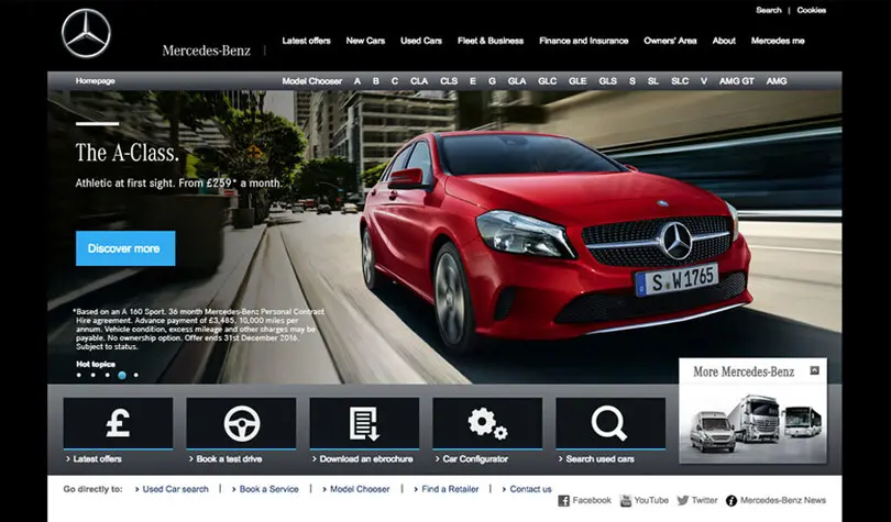
Mercedes
Corporate A is a Modern font style with a high contrast and refined serifs. It is used across all mediums; print, web and signage alongside Corporate S (the sans version). The typefaces look perfectly proportioned, classic, crafted, elegant and sophisticated. Arial is used alongside them for navigation and body copy. Mercedes is the only brand of our reviewed ten which don’t apply all caps type setting at all.
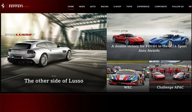
Ferrari
Ferrari is a mishmash of different font styles ranging from Compatil Letter (a slab serif like the logo) to geometric sans Proxima Nova for body copy. Click onto a different heading and the body text changes from Proxima Nova to Lato which is a humanistic sans with rounded corners. There’s also Times New Roman being used across many sections for captions. Not a visually pleasing brand in terms of font hierarchy. Ferrari is one of only two brands of the ten to have their logo set in lowercase (alongside Mercedes).
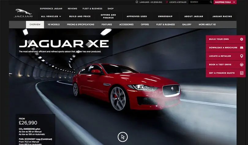
Jaguar
Primary typeface Jaguar is an extended modular sans serif style, echoing the letterform proportions of the Jaguar logo, but with less contrast. It is a bespoke typeface created by us here at Fontsmith with clean lines and bold, strong curves. Logo, navigation and headings are all set in all caps and Proxima Nova is used for headings, navigation and body copy. The perfect balance between strong typography, bold letterforms and dynamic photography. Premium quality throughout.
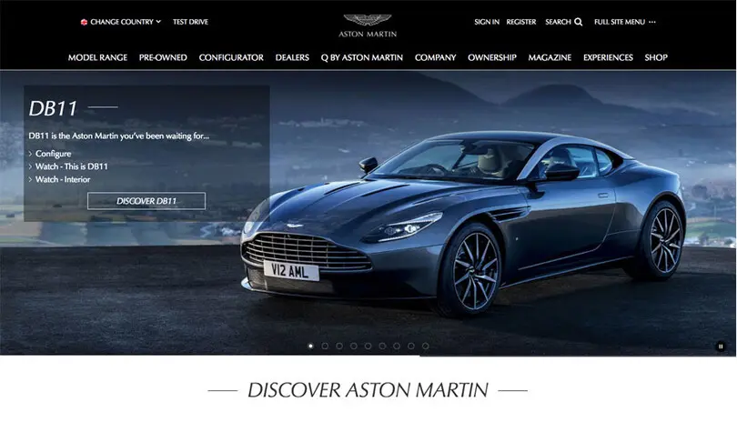
Aston Martin
A British made car that is often aligned with James Bond, and top quality engineering. URW Classico is an Optima variation – a sans serif with a subtle flair at the end of the stems. The overall effect is similar to a serif font in terms of elegance and heritage. Using a single typeface family works well here as there is a sense of unity and cohesion. The Aston Martin typography is similar to many of the brands we looked at in the beauty sector, and all caps are also used for the logo, headings and navigation.
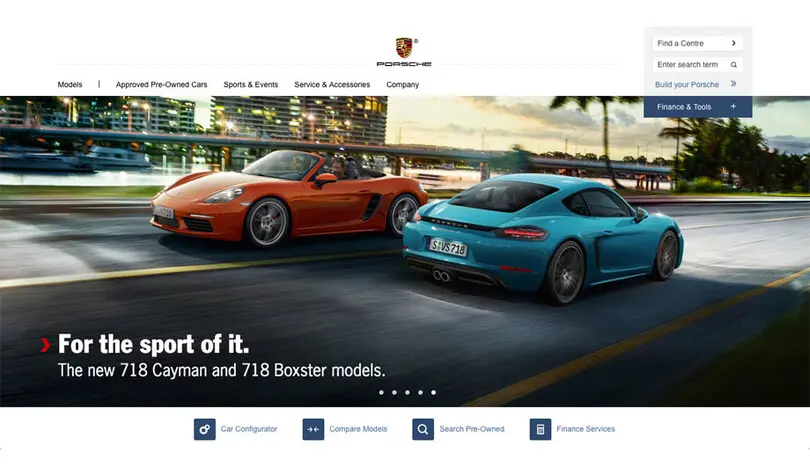
Porsche
The logo and primary typeface are a bespoke modular grid design named Porsche Sans which is also used for the titles of cars and captions. On their website Franklin Gothic is used for headlines. It is hard hitting and strong, and creates a powerful impact (backed up by News Gothic for subheadings). Surprisingly Arial is used again for the navigation and body copy, contradicting their brand image.
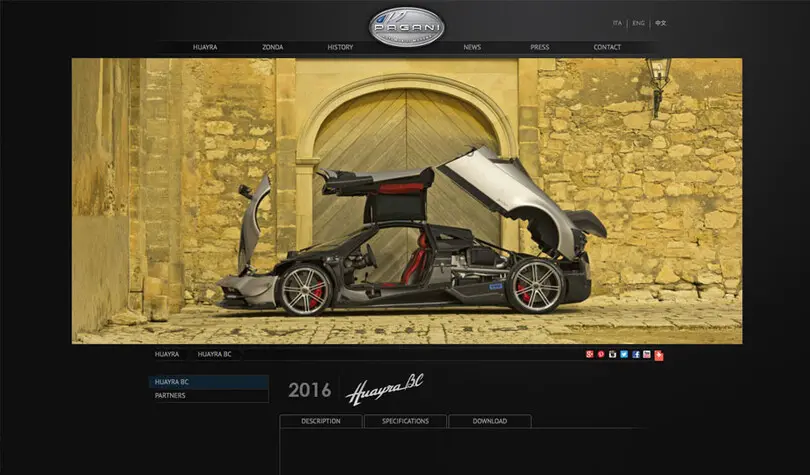
Pagani
A small company that only makes a handful of supercars each year and being handmade they can claim to be the ultimate showstoppers of craftsmanship and engineering. Pagani are using a geometric typeface called Josefin Sans for captions alongside a humanistic typeface named PT Sans for the body copy. These typefaces are not doing a good job of portraying refined handmade craftsmanship – the overall look is more machine made.
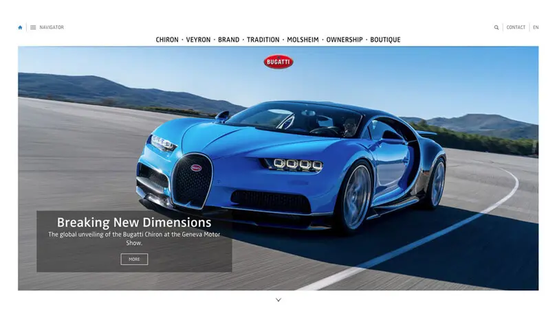
Bugatti
Bugatti are using a humanistic narrow typeface named Ff-zwo. It has a tall x-height, square-ish curves and open terminals. The images sit alongside a pencil-effect script lettering that enhances a handmade craftsmanship quality and sets a personal appeal. The use of Garamond in some sections offers a sense of heritage and elegance.
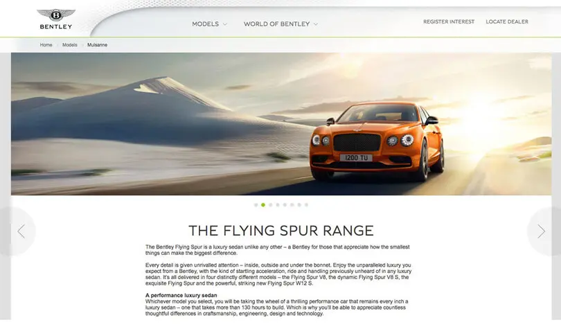
Bentley
Bentley stands for handcrafted luxury and unmistakable design. Bentley Sans is a bespoke typeface created by KMS team which is based on an expanded version of Gill Sans and is mainly set in all caps. The sans font is geometric in proportion but with humanistic overtones and reflects an English heritage with a striking and contemporary look. The use of all caps looks sleek, strong and powerful. Bentley is another brand using Arial for body copy.
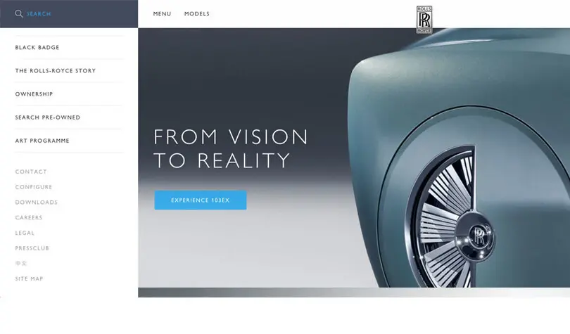
Rolls-Royce Motor Cars
Named luxury car of the year 2016, the typeface used is a variation of the Monotype classic font Gill Sans, mixed with a bespoke serif for the double cap ‘R’. Gill Alt One MT is a renamed version with small changes made to some characters. This humanistic sans is used extensively, and looks clean, pure, modern, british, sleek and elegant. A timeless classic.
Logos
When it comes to logos there is a lot of typographic variation. Old style, transitional and slab serifs to modular, contrasted, geometric, humanist and grotesque sans. In this sector, there is a split in how luxury is visualised, with some brands adopting a sturdy, modern and modular logotype with a low contrast and others using a typeface that has a high contrast to define elegance, heritage and craftsmanship. 80% use an all caps setting and only two are using a serif (Ferrari use a slab serif and Maserati an oldstyle).
Primary fonts
Primary fonts tend to have a strong and robust appearance. Common styles include humanistic, grotesque and geometric (like Proxima Nova or Gill Sans). Serif fonts are rare, only Bugatti using Garamond and Ferrari using a slab serif called Compatil Letter. Half of the ten brands use at least one bespoke primary typeface or renamed version of a font indicating brand investment, they like to be unique and have ownership of their collateral.
For all the bespoke fonts used on the logos and primary typefaces it is core font Arial which is most commonly used on websites. Set as body text by three of the brands (Mercedes, Porsche and Bentley) who have all invested in bespoke typeface families.
Styles
There seems to be a better understanding of the role and importance of typography in this sector compared with beauty. The diverse range of font styles allows the brands to separate themselves apart from competitors much more than the beauty brands we looked at which tended to look quite similar to one another. Each car brand has a long, rich heritage to call upon and tend to use strong and robust fonts alongside bespoke typefaces echoing a feel of craftmanship.
Header image set in FS Siena, our new contrasted sans serif typeface which has been tailor made for luxury brands.