Will the real Futura please stand up?
Monotype’s Futura Now family is a revival and expansion of the famous typeface we all know so well. But do we know it, really?
If you’re familiar with Futura, you may feel like you’ve been surrounded by it your entire life: In signs, in posters, in advertisements, in art. The famous geometric sans serif has played a prominent role in popular culture for the last 93 years.
Futura is how Nike commands us to JUST DO IT. It has defined the look of Volkswagen, Ikea, Louis Vuitton, and countless other brands throughout the decades.
Futura can even be seen on the moon. It’s displayed on the plaque NASA’s astronauts left behind in 1969 announcing that WE CAME IN PEACE FOR ALL MANKIND.
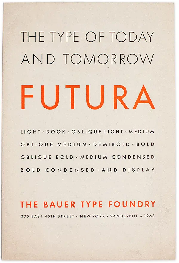
Here on Earth, when we see Futura, what we’re most likely seeing is only an approximation of Futura. A descendant. A wannabe. Some of these Futura-ish typefaces carry the Futura name; some don’t. But they’re all trying to capture the unique look and widespread appreciation of what the Bauer Type Foundry announced in 1927 as “The Type of Today and Tomorrow.”
Though Futura wasn’t the first geometric sans serif when it was released (Erbar-Grotesk came out in 1926; Kabel, in 1927), and though countless others soon followed (and never stopped), Futura managed to ensconce itself firmly in the popular landscape in a way that any brand would envy.
Futura’s past.
Paul Renner designed the “real” Futura for the Bauer Type Foundry in Germany between 1924 and 1926. He believed, in his words, that “[a] typeface that corresponds to the contemporary mood should…be exact, precise, and impersonal. It should be functional and simply be what it is without any fuss. If it is a printed type, it should not mimic any kind of handwriting.”
Futura wasn’t the first geometric sans serif when it was released, but its subtle, masterful design (and clever marketing) quickly established it as the geometric sans serif. Image credit: Fontshop.com.
In Futura he gave us a clean, modernist, monoline typeface based on the simplest shapes—the circle, square, and triangle. Despite its appearances, however, Futura is far from simple. Renner made subtle, masterful, crucial adjustments and optical compensations to ensure all the characters would harmonize and be easy to read. He deftly incorporated the timelessness of classical-proportioned capital letters with a very stripped-down, sleek, modern, and progressive design. He created something so forward-looking that it still feels contemporary nearly a century later.
Futura and the kinda-sorta Futuras.
Bauer moved quickly in 1927 to establish a New York office to sell Futura in the United States. The typeface had been well received, and that enthusiasm kicked off a rash of imitations.
In his book, Never Use Futura, design historian Douglas Thomas outlines a wild rush by competing foundries to capitalize on Futura’s popularity—some by licensing it, others by mimicking or simply copying Renner’s design. Initially, the only foundry that was sanctioned to produce Futura other than Bauer was Intertype in New York. In 1930, France’s Deberny & Peignot also got a license. They modified the typeface for the French market—with extra long ascenders and descenders—and they called this Frenchified Futura “Europe.”
Meanwhile, many other large foundries opted to avoid the licensing route by creating their own Futura-looking typefaces with their own names.
1927–1928: Shortly after Futura’s release, the Baltimore Type Foundry created an almost identical typeface called Airport Gothic.
1929–1930: Linotype had W.A. Dwiggins design Metro and then modify it to make it more closely resemble Futura.
1930: Vogue commissioned Intertype to create a lookalike typeface to work on its compositing machines. It was called, of all things, Vogue.
1937: Monotype introduced Twentieth Century, yet another Futura-esque contender, for its typesetting machines.
1939: Linotype rolled out its own Futura lookalike: the Spartan type family.
This is by no means a complete list of copycats; if there were such a list, it would never stop growing. Futura was so desirable, in fact, and so widely emulated-slash-ripped-off, that a looser concept of its brand name emerged—something akin to the way many of us refer to all tissues as Kleenex.
Thomas also recounts a story of some diabolical marketing brilliance (and/or deception) at several Baltimore typesetting companies: They took an approach similar to someone selling a “Roluxe” watch on a city street corner today and offered a category of geometric sans serifs called “Futuria.”
Just as Futura was gaining traction in 1929, the stock market crashed and the world went into freefall. The resulting Great Depression led to a protective American tariff on type imported from Germany. Only because Bauer had set up a stateside office a few years prior was it able to maintain its place in the American market and remain a bestseller despite economic turmoil and relentless competition.
Paul Renner designed the “real” Futura, shown here, to “simply be what it is without any fuss.” Image credit: Fontshop.com.
In 1939, American printers, publishers, and advertisers announced a boycott on what they called “Nazi type”—that is, type originating in Nazi Germany. It didn’t matter that Futura’s creator, Paul Renner, had been overtly opposed to the Nazi party for many years. In fact, the Nazis arrested him in 1933 and he emigrated to Switzerland. All that mattered was that Bauer was a German company, and so Futura was deemed verboten, as it were. The boycott decreed that all purchasers of typography should do the right thing and choose from one of the many Futura knock-offs rather than send America’s good money to the bad guys.
Throughout World War II, the fervor for Futura (or at least, the look of Futura) never waned. And so, by the 1950s, the legitimate Bauer Futura was able to step right back into the American market and resume its position of dominance.
More of a good thing.
So popular was Futura that it made sense to expand the typeface with more fonts. In the fifties, Edwin Shaar, sometimes with the help of Tommy Thompson, designed a number of new Futura faces for Intertype. He also designed the distinctive Futura Script, which was released by Intertype in 1954. Futura Script’s simple, elegant appearance was a departure from most of its contemporary handwriting typefaces, which tended to be high contrast. It was the perfect complement to the original Futura fonts.
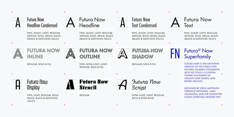
Futura Script was in good company. The various Renner Futura fonts from the thirties (Bold, Book, Light Oblique, etc.) included a few noteworthy display standouts: Futura Black (1929), Futura Inline (1931), and Futura Display (1933). They’re not the best known of the bunch, but worthy additions, to be sure.
Futura Black, re-named Stencil in Futura Now, shown here paired with Futura. Image credit: Fontshop.com.
New technology meant new duplications.
Until the 1950s, Futura’s identity drift was a matter of rampant design imitation. There had been some outright copying, too—for example, when wood type foundries would use a pantograph to create large wood letters for display type without bothering with any kind of licensing from Bauer.
But when new phototypesetting systems appeared on the scene in the fifties and especially in the sixties, all bets were off for Futura’s integrity. Phototypesetting enabled stylistic manipulation, which encouraged the distortion of typefaces.
Because Futura was so well known and loved, it was one of the first typefaces to get projected onto film for printing. In fact, Futura’s name and reputation were so strong that some of its copycats faded away. Linotype didn’t choose its own Spartan typeface for phototypesetting—they wanted the real thing, so they licensed the Futura name from Bauer.
Typesetting styles changed through the years, and with them, the spacing and shapes of the letters. Along with bell-bottoms and disco, it was the fashion in the 1970s to set display headlines extremely tight, and that trendy spacing got captured and replicated with phototypesetting.
Machine operators could also “fake” italics by using photographic lenses to distort the angle of the typeface into sloping shapes. Unfortunately, this degraded the careful crafting and balance of Futura’s meticulous dimensions. The letters got smushed here and stretched there, with results that would surely make Paul Renner scream.
Byte-sized bastardization.
Then came digitization. By the middle of the eighties, Futura had been completely digitized and circulated every which way. And every foundry imparted variances in characters, spacing, and proportions.
But it gets worse. In more recent years, anyone who fancies themselves a type designer can create an ersatz version for fun and/or profit.
A 2016 typography thread on Reddit highlights the pitfalls of such endeavors:
After an excited announcement of “A Free Futura Alternative,” a number of Redditors begin asking questions. They wonder if they should cough up the suggested $10 for the typeface or if they should simply download it without paying.
Just before they begin discussing the ethics of copying and selling an original design, someone wonders, “Is it me or [do] the capital M and W look weird?”
Chances are good that the answer was “yes.”
But now we have Futura Now.
After all of the imitating, the copying, the warping, the recopying, the digitizing, and the re-re-copying, Futura was desperate for a refresh.
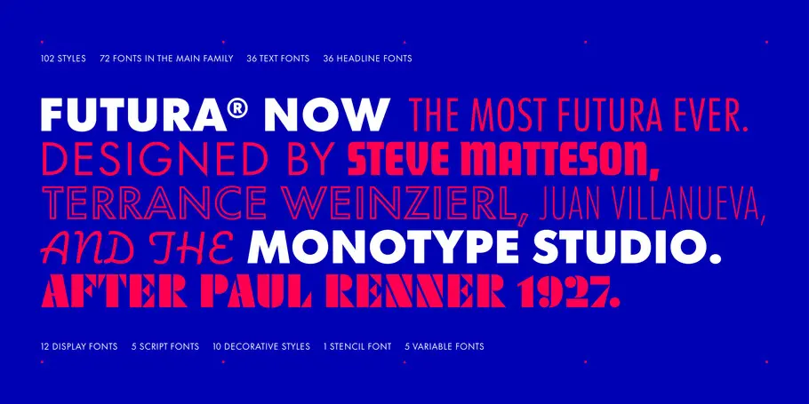
For the past several years, Monotype’s designers have dedicated themselves to studying and synthesizing Paul Renner’s creation in its myriad forms, weights, and sizes, as well as the later expansions of the Futura line. They have scrupulously and exhaustively recreated Futura for all the ways we need it today—for tiny watch faces and massive billboards, for mobile phones and static signage, for punchy headlines and easy-reading book text. Size-specific spacing makes Futura Now easy on the eyes, whatever the circumstances.
“Futura Now captures the essence of Renner’s original ideas,” says Creative Type Director Steve Matteson. “We’ve expanded to meet the demands of ‘digital first’ design campaigns, forward-thinking brands, and publishers.”
But how do you make a 93-year-old typeface and its various descendants do all that? It takes preternatural patience, deep appreciation of Futura’s original artistry, and tremendous technical skill.
Terrance Weinzierl, a senior type designer at Monotype, explains. “With a project like this, we use very specific models to create the forms and tweak them so they’ll work well for use today,” he says. “It’s very different than creating a new typeface from scratch. This is a much more delicate process. We scan a lot of paper and compare digital versions too.”
Type designer Juan Villanueva points out that digitization efforts like this have changed over time. “At the beginning, it was more of a tracing thing, an attempt to make something exactly like the original metal type version,” he says. “But now you need a whole spectrum of type that can work in any situation. As we expanded this family, we kept comparing Futura Now with ‘Futura then’ to make sure they still felt true to each other. We were careful not to lose the spirit of Futura.”
Part of the careful historical assessment and thoughtful modernization included updating certain characters that didn’t receive much attention in the past.
Weinzierl notes that some symbols were an afterthought until relatively recently. “The birth of the internet made the hashtag and octothorpe famous,” he says. “People would use generic symbols when they built fonts in the early nineties, because no one used the ‘at’ symbol. When we update a font for the 21st century, we make sure all of its symbols look good.”
There are 107 Futura Now fonts in all—a variety of weights, widths, postures, and optical sizes, as well as five variable fonts. The aforementioned Script, Inline, Display, and Black (now called Stencil) fonts are all in there, too—even expanded upon. Plus all the glyphs you need for Greek and Cyrillic.
The entire family works cohesively and flexibly. It upholds Renner’s vision and brilliant artistry. It is the real Futura, only cleaned up, set right, and fully completed. It’s ready for anything.
Like the original, Futura Now is truly a typeface for today and tomorrow—and many tomorrows beyond.
Sara Rosinsky is a type-loving freelance copywriter working under the banner of Shiny Red Copy. She frequently shares fun little lessons about spelling, grammar, etymology, and the like on LinkedIn and Instagram, which will soon be available in a book called Unflubbify Your Writing.


