


Greater digital and global reach for Orange.
Jason Panudy, Head of Creative and Brand Identity at Orange.
As it grew and expanded into new regions, Orange found that its font capabilities were not keeping up. Support for new languages was inconsistent, different teams were using different licenses and fonts, and there was concern about degrading brand recognition and license infringement.
Monotype simplified the company’s licenses by packaging them into one single enterprise agreement. This allowed Orange to deploy its fonts globally in all languages and in emerging digital environments without concern over improper use.
Origins.
In 1994, mobile phones were shiny, new (and expensive) things—a far cry from the mass market consumer products they are today. They were held up as cutting-edge technology and marketed to a rarified population of early adopters and businesspeople, not everyday consumers.
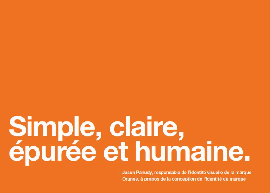
Orange sought to change all that. “Competitors were focused on talking about the technology, which was confusing and intimidating to the everyday user,” says Jason Panudy, Head of Creative & Brand Identity at Orange. “Orange launched as the brand to humanize the technology. We talked about the benefits of personal communications, not the devices themselves. The entire identity was built to support that: simple, clear, clean and human.”
A brand identity focused on simplicity and clarity needed a typeface that was equally straightforward and uncomplicated. Helvetica Neue, with its classic, clean letterforms and easy readability, “embodied that perfectly,” says Panudy. The typeface was chosen in 1994 and has become synonymous with the brand in the intervening decades.
The Challenges of a Growing Brand.
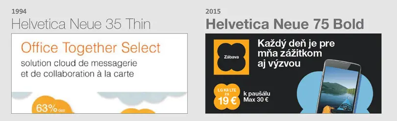
Orange did consider changing fonts as part of larger brand evolution project, which rolled out globally in 2015. “Instead, we used Helvetica Neue to give us the change we needed, without the cost and drama of a wholesale change,” says Panudy.
“Switching from 35 Thin to 75 Bold as our primary font gave us stronger typography that was more in keeping with our brand direction and more digital channels than we could have ever imagined in 1994.”
However, with an expanding geographic and digital footprint, the company couldn’t achieve consistency on all markets and channels, especially on their websites and apps, with its existing license. “Prior to working with Monotype, we licensed through a third party font house, with some countries managing their own local licenses.”
The company’s global ambitions also presented obstacles. “Languages are the challenge when going into new territories,” explains Panudy. “For example, the team in Jordan used Helvetica World for their Arabic communications, though that was at a time when we were using 35 Thin as our primary font. Helvetica World couldn’t deliver that, meaning we had inconsistencies in the style of our typography.”
Orange realized it was time to revamp its approach to font licensing. In place of piecemeal licenses, the company needed a ready-to-use license that was simpler and could scale with the brand’s growth if it wanted to avoid this potential loss of brand identity and risks of licensing infringement. It also needed a company that could advise and support it creatively, legally, and technically. That’s where Monotype came in.
Simplicity as a Solution.
Working with Monotype, Orange was able to build an enterprise license that eliminated the hassle and cost of buying individual licenses for every use case, country, or language.

“We got into discussions with Monotype about the options we could consider as part of our brand evolution project,” says Panudy. “We wanted to ensure our licenses were as futureproofed as possible and, more specifically, to upgrade them for our digital platforms. We simply talked to Monotype about what we needed and they came back with the right solution that we then tailored accordingly.”
Jason Panudy, Head of Creative & Brand Identity at Orange.
As a company that knows a thing or two about creating simple, straightforward experiences, working with Monotype has been a welcome and productive partnership.
“Our license with Monotype has simplified things for us centrally,” says Panudy. “Our teams need easy access to the right fonts and the knowledge that they are free to use them in the things they build. We’re now confident we have the appropriate licenses and can give our teams the right advice about usage.”
Most importantly, Orange can continue to grow its brand with the confidence in knowing that its visual identity is secure and ready for the future.
Related content.

How financial institutions can build trust in an era of relentless scams.
In an industry where scams are commonplace and no brand is immune, trust is fragile. So, how can financial institutions build it, and build it to last?

Creating a consistent identity for an iconic banking group.
Partnering with Interbrand and Monotype, Santander redesigned its brand to become more modern, more digital and more in tune with a new generation of consumers.

How financial institutions can deliver a seamless experience to their customers.
Fonts play an important role in delivering a smooth experience to financial customers, and also help financial institutions keep up with evolving expectations.