


Creative freedom and digital flexibility for Hearst Magazines Digital Media.
Founded in 1887, Hearst is one of the most revered media institutions in the country, with dozens of iconic titles on its roster. But companies like Hearst don’t last this long without a willingness to adapt and grow.
For Hearst Magazines, adaptation meant going digital. Over the past decade, the magazine division has evolved to meet the demands of a growing online audience. Monotype has been there every step of the way.
New digital reality
“We have more autonomy over the digital experience than we had ten years ago,” says Theresa Mershon, Creative Director for UX and Product Design at Hearst Magazines Digital Media (HMDM). This is saying a lot, considering that some of Hearst Magazines’ titles have been gazing at us from bookshelves and magazine racks for decades or more.
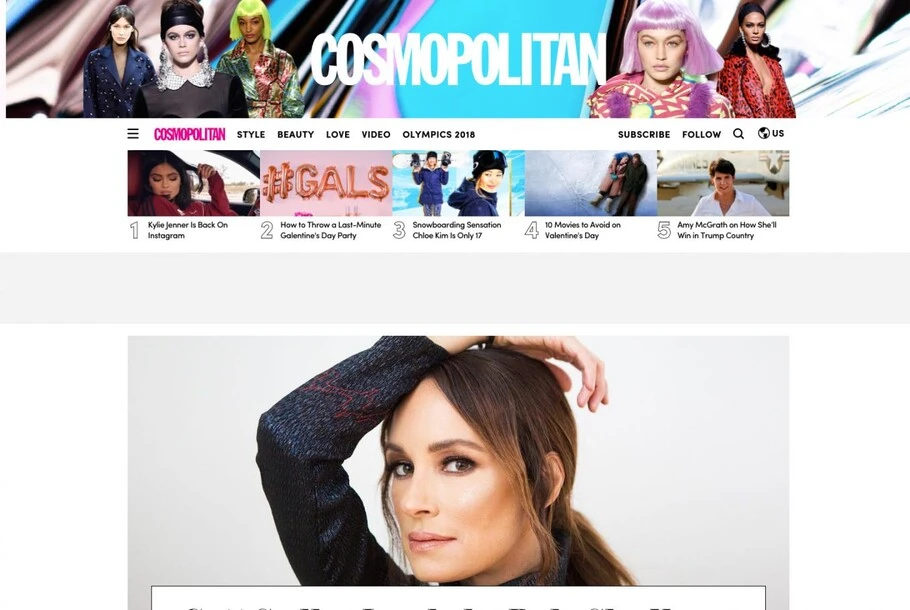
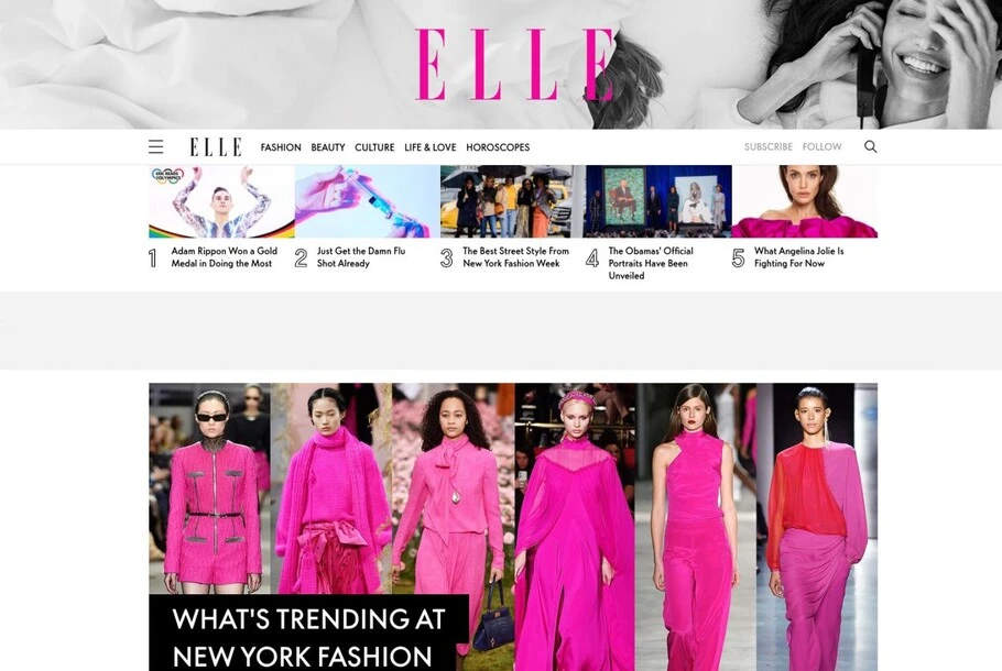
Eighteen of the brands in HMDM’s portfolio, including ELLE.com, Esquire.com, and Cosmopolitan.com, currently use Monotype fonts and technology. Around 2009, Mershon’s team began transitioning those titles to web fonts to optimize the sites for digital audiences.
Web fonts are essential to effective responsive design, in which web pages automatically scale up or down to fit different screen sizes without degrading the reader’s experience. For HMDM, using web fonts meant that content would be clean and legible, whether readers were on their phone, desktop, or tablet.
But web fonts were only the beginning.
Evolving the online experience
It isn’t enough to simply replicate the print experience online and call it a day. Digital users are demanding, new devices are constantly entering the space, and it’s up to publishers to keep pace. And while that may seem like a lot of pressure, the truth is that digital publishers have almost limitless opportunities to improve their product and business as long as they’re up to the task.
HMDM embraced that challenge and moved its digital brands to a new platform designed around speed, simplicity, and adaptability. Each site uses the same underlying structure, which allows Mershon’s team to iterate new ideas quickly.
“We need flexibility to adapt to changes in the way our audience reaches us,” Mershon says. “The system is very scalable and allows us to be truly agile.”
Fonts are essential to making this system work because without them, each site is essentially the same. “We really need to use type and color to establish each brand’s identity,” Mershon says.
HMDM uses the Monotype Fonts service, which gives Mershon’s team the freedom to experiment with new ideas. “We can create beautiful presentations for high value journalistic work,” Mershon says. Her team has developed semi-bespoke templates that leverage Monotype web fonts, granting her designers the freedom to create content their audiences will love.
Performance obsessed
A perfectly branded site is essential, but it isn’t worth much if the site takes forever to load. This isn’t lost on Mershon or her team.
“We take a generalist approach to design. Our designers work end-to-end and intimately understand what they can change, and how these changes impact page performance,” Mershon says. “On top of that, engineering is constantly iterating to improve page speed.”
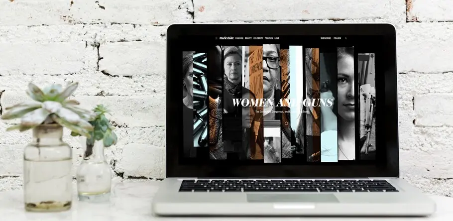
A bespoke long-form article; working with Monotype allows HMDM to be flexible with its platform, opening opportunities for creative freedom while ensuring pages load quickly and smoothly.
Working with Monotype makes it easy to constantly test and improve page performance. One key benefit unique to Monotype, Mershon says, is that Monotype web fonts look great and load quickly. This is crucial when every fraction of a second counts. And, having a flexible license means there’s virtually no limit to what can be tested.
“Our goal is to have most beautiful page experience possible without affecting performance,” Mershon says. “Monotype Fonts allows us to rapidly switch up what we’re doing.”
Looking ahead
If there’s one truth in the digital age, it’s that change is the only constant. Mershon notes that while the transition from print to digital platforms was substantial, that isn’t the end of the story.
“Visual identities expand and change focus as our brands find their audiences across many platforms,” she says. “With Cosmopolitan, for example, the Snapchat identity is cute, fun and very animated, while Cosmopolitan on Instagram tends to be more fashionable, pretty, and minimal.”
“It’s important to have a consistent visual brand across channels,” Mershon says, “but the key is to embrace both identities and present whatever side appeals to the audience on that particular channel. The breadth of choice we get with Monotype Fonts helps us do that.”
Type is essential to striking this balance, because it allows brands to change their voice without losing that essential visual connection. This means that even if the actual experience is substantially different from one channel to the other, the reader always knows it’s still Cosmopolitan talking.
Working with Monotype allows Mershon to focus on delivering the best experience possible to HMDM’s audiences. Rather than worry about what font can or can’t be used, her team can iterate, experiment, and optimize with the peace of mind of knowing the fonts will work, and work well.
Or, as Mershon put it, “Our license lets us play without worry.”


