Resources.

How do fonts influence your perception of a city and its identity? See how the right choice can convey the image of a place is and what it aspires to become.
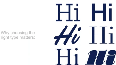
Choosing the right font for your next project is more than just an aesthetic decision. Brands have numerous factors to consider, from price to deadlines to the importance of being unique, all of which influence the selection process.
Ambiguity, from Charles Nix, offers a chance to pause for thought, question the state of affairs, and indulge in a little bit of enjoyable discomfort.

Fonts play an important role in delivering a smooth experience to financial customers, and also help financial institutions keep up with evolving expectations.

Behind the Font highlights the people and process behind the fonts you love and use. This installment features Jessica McCarty, founder of Magpie Paper Works and Rare Bird Fonts.

Ever year, Monotype and the Type Director's Club (TDC) award the Beatrice Warde Scholarship to a young woman entering the design industry. This year's winner is Blossom Liu from ArtCenter College of Design in Pasadena, California.

Behind the font highlights the people and process behind the fonts you love and use. This installment features Carl Crossgrove of the Monotype Studio.

Retail customers are scattered across a wide range of touchpoints and react with them all interchangeably. However, they're all linked through the mobile experience.

In an industry where scams are commonplace and no brand is immune, trust is fragile. So, how can financial institutions build it, and build it to last?
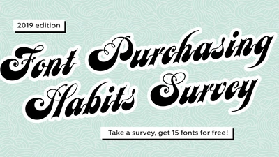
How much are designers willing to pay for high-quality fonts? Are variable fonts ready for showtime? These are among the mysteries this annual survey seeks to unravel.

Consumers are increasingly demanding connectivity in their vehicles, and are prioritizing in-car technology that enhances the driving experience.
Creatives are the primary users of the fonts, but licensing approval typically runs through other departments. Here are a few key concepts all designers should understand.
