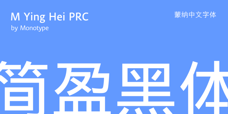
M Ying Hei™ PRC by Monotype HK

About the family
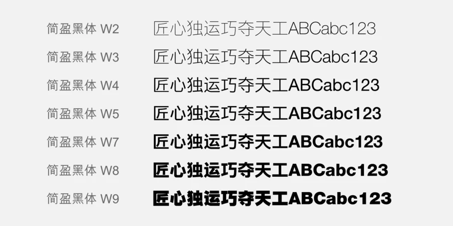
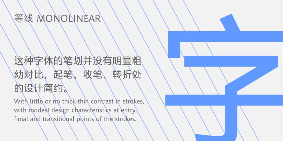
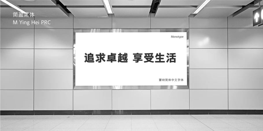
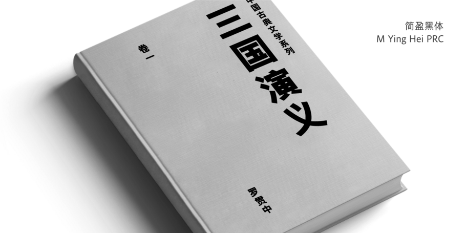
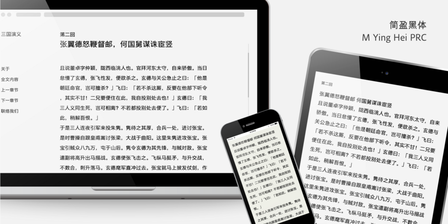
M Ying Hei™ is designed by type designer Kenneth Kwok and Robin Hui. Unnecessary details have been eliminated to pursue a minimal form. The structure of characters are well balanced, neat and dignified. Different components of a character are cooperating perfectly in an appropriate proportion. Thickness of strokes are modified according to the number of strokes, thus achieving an even texture throughout the paragraphs. Therefore a perfect choice for prints, user interface and signages. M Ying Hei™ is equipped with 7 weights, which is sufficient for various occasions like matching with different Latin typefaces and handling complex information hierarchy.
Continue reading.

Embrace Ambiguity.
Monotype introduces Ambiguity, a typeface designed to effectively express a range of attitudes and beliefs.
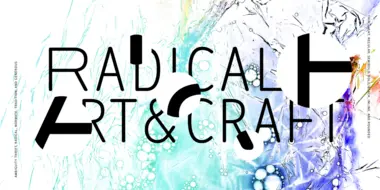
Enjoyable discomfort: The many points of view of Ambiguity.
Ambiguity, from Charles Nix, offers a chance to pause for thought, question the state of affairs, and indulge in a little bit of enjoyable discomfort.