Comfortable reading on screen.
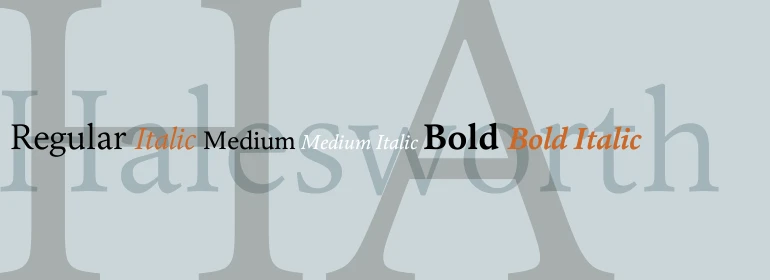
Halesworth is a Venetian Old Style book typeface designed by Carl Crossgrove. It was crafted specifically for comfortable reading on screen.
Venetian types of the past have proven to be the most beautiful, yet functional, designs for book printing. Halesworth takes this aesthetic to a new artistic level by preserving the beautiful, generous proportions of the genre and optimizing details for best performance on screen and small print sizes. The resulting typeface has reduced contrast in hairline strokes and generously open counters combined with ample curves and sturdy serifs for reading on ePaper or LCD devices.
eText typefaces are designed to meet the challenges of extended reading in digital environments such as mobile devices or desktop screens. Their forerunners are among the world’s most popular and important book typefaces for print media. These classic designs were reinterpreted to conform to technological constraints of LCD and e-Paper while retaining the properties of proportion and form which made them favorites for print.
Continue reading.

Embrace Ambiguity.
Monotype introduces Ambiguity, a typeface designed to effectively express a range of attitudes and beliefs.
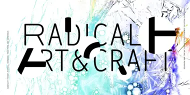
Enjoyable discomfort: The many points of view of Ambiguity.
Ambiguity, from Charles Nix, offers a chance to pause for thought, question the state of affairs, and indulge in a little bit of enjoyable discomfort.