Works hard, plays hard.
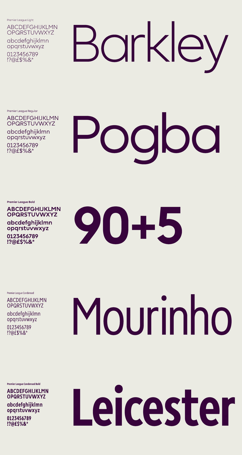
Monotype’s Toshi Omagari worked in close partnership with DesignStudio to create a hard-working geometric sans serif for Premier League that could confidently perform across a huge number of mediums – from screens and shirt numbers to TV and league tables.
Previously, Premier League had been using an all-cap typeface and needed to adopt a fresher, more conversational tone of voice, and a design that could adapt across the demands of several different mediums. With competition between European professional football leagues at an all-time high, this needed to help the brand stand out visually, but also on a commercial level.
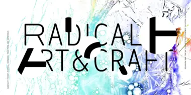
Enjoyable discomfort: The many points of view of Ambiguity.
Ambiguity, from Charles Nix, offers a chance to pause for thought, question the state of affairs, and indulge in a little bit of enjoyable discomfort.

Embrace Ambiguity.
Monotype introduces Ambiguity, a typeface designed to effectively express a range of attitudes and beliefs.