


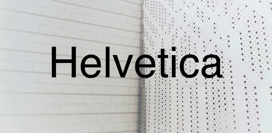
Just how neutral is Helvetica?
For many, Helvetica is the epitome of neutrality. It’s known for being the blank page or the empty vessel; the typeface that stands back and lets others do the talking. As such, Helvetica has been enormously successful in corporate branding—think companies like American Apparel, Knoll and Muji, both of which have built their visual identities around Helvetica.
“I think it was so popular with corporate identity because it looks so efficient and trustworthy,” says Terrance Weinzierl, Senior Type Designer at Monotype. “It doesn’t look wasteful or polarizing.”
Weinzierl has his own analogy for the typeface’s famed neutrality, describing it as the ‘round white plate’ of the design world. “If you’re a restaurant, and you want to choose flatware, then the round white plate is the utopia of flatware,” he explains. “It won’t go out of style, just like if you choose Helvetica it won’t go out of style. There’s a lot of gravitas around it. It’s a symbol or an icon of what a typeface is.”
Indeed, a large part of Helvetica’s strength lies in this perceived neutrality, which has kept the typeface in use for the last 60 years. Its inoffensive voice and clarity results in regular use on official documents, nutrition labels, public signage, and anywhere else a designer needs a typeface that can be ‘invisible’ but still convey key information.
Take a back seat
For Steve Matteson, Monotype’s Creative Type Director and part of the team behind Helvetica Now, Helvetica’s rise in popularity is very much a case of being in the right place at the right time.
“The rise of Helvetica happened in parallel with the printing process that made it very easy to reproduce photographs,” he explains. “Photography became the main thing you’d see when you opened a magazine. If you looked prior to the 60s, there’d be spotty black and white photos throughout a magazine, but with the ease of reproduction of photography, images became the focal point. Helvetica was secondary to this, and it was intentionally a quiet voice that didn’t conflict with the imagery.
“That contributed to people looking at it as the neutral typeface. Helvetica is adept at receding and allowing the photography, videography, or illustration to be the focal point. It lets others be champion.”
Jim Ford, Monotype Senior Type Designer, agrees: “It’s sort of a blank typeface. It doesn’t have a lot to grab onto. It’s very plain unless you manipulate or exaggerate it, so it gives power to color and image. You only notice its details if it’s really big, otherwise, it just disappears. It puts the emphasis on other things, and that’s what’s great about it.”
The myth of neutrality
However, no design is completely neutral. Typefaces, like pieces of furniture, logos, or styles of illustration, are subject to context and history as well as our changing opinions of them. As designer Nina Stössinger noted in a Tweet earlier this year, we cannot divorce design from the meaning attached to it, and even so-called neutral typefaces “brim with context and connotation and intent and tone.”
“To us, a ‘neutral typeface’ is not a typeface that is intrinsically neutral, but a typeface that a certain group of people, at a certain moment, choose to perceive as neutral,” Amsterdam design studio Experimental Jetset wrote in 2005. “In short, it’s a typeface that possesses certain expressive characteristics, but for a number of cultural reasons, we as a society choose to ‘filter out’ these when we perceive the typeface.”
And while Helvetica undoubtedly offers a restrained typographic voice, it’s worth noting that the design is more than its reputation.
“When you look at Helvetica, at large sizes especially, there’s a lot of craft in there and a lot of nuances,” points out Matteson. “If you’re setting Helvetica in a design where there’s little imagery or competition with the letterforms, it can become the hero because it has a grace to it.”


“For me, neutrality comes from homogenization. For example, if the ‘b’ and ‘d’ look like reflections of each other,” he adds. “But in Helvetica, the lowercase A stands out for having this little twist in the lower bow, and the uppercase R also has a distinctive curve at top and bottom. Those things aren’t neutral.”
Half the story
So what does it mean when we say a typeface is neutral? Are we really talking about its clarity? Its ability to effortlessly contain a message? To blend in? Or are we referring to its ubiquity and that we’ve seen it so many times that it no longer provokes a reaction? Perhaps it’s all of these.
In many ways, the narrative around Helvetica has become a self-fulfilling prophecy. We expect it to be blank, therefore it’s used as such, and so the stereotype perpetuates.
But there are examples of the typeface’s expressive side. For many, Helvetica is associated with artwork and flyers for 1970s punk bands — created when Letraset Helvetica was widely available. Neville Brody unexpectedly used the typeface in the 80s for Arena magazine, in an attempt to wring some emotion from it, and Massimo Vignelli even recommended Helvetica Extra Bold for “intensive and passionate” declarations.
All are proof that the typeface can be more than its reputation, but also a reminder that design is heavily subject to the passage of time, historical events, and our own shifting opinions. Describing Helvetica as neutral may not be wrong, but it’s only half the story.
To explore the latest iteration of Helvetica, visit the Helvetica Now specimen page.