Putting AI to work: The magic of typeface pairing.
Terrance Weinzierl, Creative Type Director

Font pairing is a subjective practice with infinite possibilities. But what if you had an AI tool that considered your expertise and emotions as your personal assistant?
Have you ever cooked a meal at home and been delighted to find the perfect ingredient to complement your recipe?
Maybe you forgot you had cilantro, crushed peanuts, or lemon juice, and it’s just the thing you needed to elevate your dish. Or perhaps, you were getting dressed for the day. You selected your favorite pair of denim but weren’t sure which shirt would match. You considered your mood and then the destination. You finally decided on a warm, seasonal sweater. In either scenario, you created a fresh and distinctive flavor, an enhanced experience. And as a result, a sensation of ease and satisfaction washed over you.
This is what finding the perfect font pairing feels like.
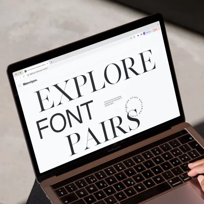
The Monotype AI pairing engine.
These are the daily decisions you make about harmony and contrast.
These pairings are thoughtful, carefully curated designs.
Like pairing anything, it’s a subjective practice with infinite possibilities. There are many good choices, some that are bad, and a few that are exceptional.
Now imagine if you had an AI tool that considered your expertise and emotions as your personal assistant. It could offer exciting, delightful ideas, and increase the speed and quality of your creative decisions. These suggestions could even act as a soundboard or a source of inspiration. We are using AI to increase the depth and breadth of our font pairing suggestions.
The power behind font pairing.
Let’s say you’re designing a magazine. It might be desirable to have a very flexible typographic palette, with both a sans and serif typeface able to handle body copy duties. One article could have the sans as the body, and the next article could use the serif for the body. An effective pairing like that could offer variety among similarity.
Pairing typefaces expands your typographic palette by offering more hierarchy choices, more texture, and weight options, as well as an opportunity to fine-tune tone of voice. For example, a workhorse of a sans family could be well suited to handle most of the type duties of a brand. But it could look more friendly if you paired it with a rounded sans style, perhaps more casual and personal if paired with a handwriting typeface, or it could even be dressed up into a more sophisticated and serious tone by pairing it with a serif typeface. By finding a unique typeface pairing, you can take your first typeface choice and nudge it into a rarer look and feel.
Some brands and projects can get away with just a single typeface family. But a second typeface can add lots of flexibility and complexity to its messaging. It can also be a way of extending or refreshing an existing brand. Maybe an established brand is growing by adding another product or service that requires a different tone but could benefit from having visual similarities from the parent brand—boom, typeface pairing to the rescue.
Font pairings are extremely valuable; they provide variety, functionality, and tone of voice, sparking a new brand or breathing life into an old one.
How fonts are paired: from harmony to contrast.
A large spectrum of typeface pairings is available, ranging from harmonious to contrasting. Harmonious means things look similar, blend well or are related by formal qualities. For example, a blue shirt with blue denim, with a small amount of color difference, would have harmony. An orange shirt with blue denim would have much more contrast. Contrast is about emphasizing the differences.
Often, pairing a sans-serif with another sans-serif might result in insufficient distinction—too much harmony, not enough contrast. Instead, for a more sophisticated typographic palette, many choose a sans with a serif. For example, a blue shirt with blue denim might appear very dull, offering up too much harmony, but an orange shirt might have too much contrast. That’s when a compromise to use an analogous color would work best, such as green or violet which are neighbors to blue on the color wheel. A little bit of contrast, but mostly in harmony. The spectrum of typeface pairing works much like a color wheel in this way.
Typeface pairs can be very harmonious, especially styles from the same family, like using Helvetica Now Regular and Bold for example. They pair well because they look very similar, with similar construction and proportions, while allowing some contrast that is needed for hierarchy in any layout. Simply put, a typeface family is designed to pair with itself; that’s why we design so many weights in a typeface. A “super family” like FF DIN or Kairos or Macklin for example, have many related styles that are easy to pair like a sans, serif, or stencil. These off-the-shelf pairings are easy to choose because the family name tells you they belong together.
Contrasting pairs can be almost anything because the focus is on how the type styles differ. Some typeface families have been designed like kits, where the family name includes both a sans and script, for instance, which creates a template for the designer to use, like Laura Worthington’s Charcuterie or Ed’s Market families. These are examples of pairs with higher amounts of contrast—they look very different from each other but create a certain mood when used together.
While contrasting pairs can be more easily selected, harmonious pairs are often harder to find and choose, often requiring some knowledge and experience with type to get good selections. While it is ultimately a subjective practice, we can follow some guidelines in choosing harmonious typeface pairs.
Monotype’s Font Pairing AI.
Monotype Studio is dedicated to helping creatives find the perfect font pairing. We understand hand-picked selections are very tailored, and not everyone has the time or money to spend on a typographic consultant. When developing our font pairing tool, accessibility and artistry were our priorities.
For the first iteration of our AI, we started by focusing on the harmony between typefaces because the rules are tighter. Harmony demands certain similarities, which reduce dramatically as we move towards contrasting pairs.
We also focused our pairings on harmonious sans and serif designs that could both be used for smaller text. The typographic attributes were considered and prioritized as we selected good pairs to feed the machine. The structure or skeleton of the strokes such as stem joins and the aperture of the terminals, the proportions like x-height and overall width, stroke contrast and weight played a big role in judging the amount of style contrast between two typefaces. Thinking back to the color wheel, it’s like we were looking for colors that sit next to each other and then told the machine they are good pairs.
As we collect feedback on this model—you’re invited—we plan to develop further versions that will expand the capability and reach of the pairing model to include more of the typeface family members like weight and width, as well as the contrasting side of the spectrum.
Our font pairing AI is an engine of typographic curation, easing the anxiety of overwhelming options and disruptive indecision. The search is catalyzed by your unique starting point, escorted by expertise, enhanced by AI, and finally, suggested to you.
The experience of the Studio designers, the scale and strength of AI, the depth and quality of our library results in a unique and powerful creation that only Monotype yields. And we believe it’s the best in the industry because of our designers, our typeface collection, and the input from our audience. Ultimately, the more data and the more connections, the more possibilities.
Terrance Weinzierl, Creative Type Director
Conclusion.
Monotype’s AI font pairing is about discovery. It unveils options you may not have contemplated before. A seemingly simple font pairing? It can create richer experiences.
And yet, there might be a time when you disagree with a pairing. Your head could tilt with confusion. Skepticism and doubt might ensue.
At that moment, consider how this pairing could direct you toward another typeface. Invite you to embrace a style you previously shrugged off. Encourage you to explore other pairings and perspectives. Or maybe, just maybe, discover more about your own creative tastebuds. Because font pairings, much like food, are powerfully subjective and equally polarizing —is pineapple pizza actually appetizing or a culinary catastrophe?
This tool provides inspiration and insight into the art of font pairing while aiding the speed and quality of your font choices. It’s not by chance. It’s work. It’s type, technology, and expertise at the push of a button.
Asmita Jalali, Product Designer, was a contributing author.


