Premier League: a brand identity that works hard, plays hard.

Monotype’s Toshi Omagari worked in close partnership with DesignStudio to create a hard-working geometric sans serif for Premier League that could confidently perform across a huge number of mediums – from screens and shirt numbers to TV and league tables.
Previously, Premier League had been using an all-cap typeface and needed to adopt a fresher, more conversational tone of voice, and a design that could adapt across the demands of several different mediums. With competition between European professional football leagues at an all-time high, this needed to help the brand stand out visually, but also on a commercial level.

Premier League logo before and after.
“We were moving away from something that had been designed ten years ago and not built for a digital age,” says the DesignStudio team. “We’d redrawn the lion and everything felt cleaner and simpler. We needed type that could work from a large scale and be impactful, but still work succinctly on digital applications.”

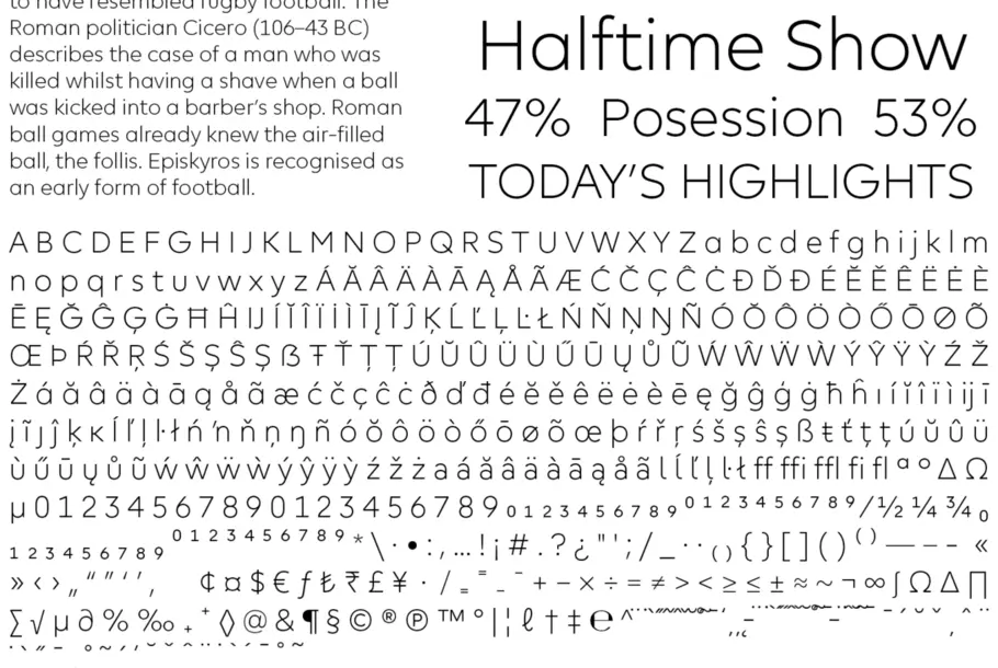
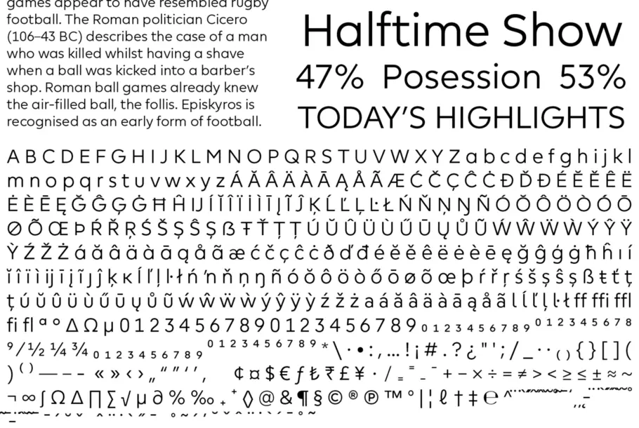
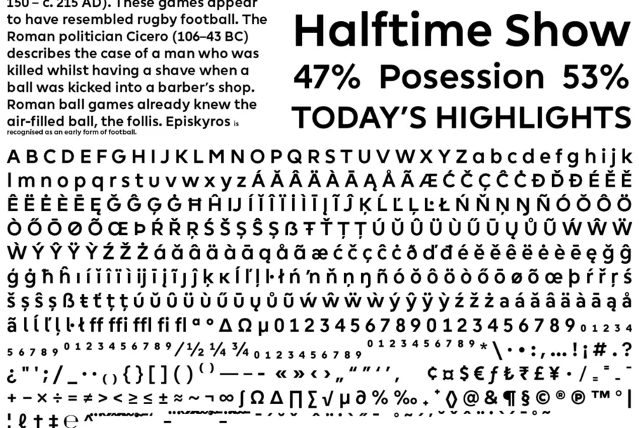
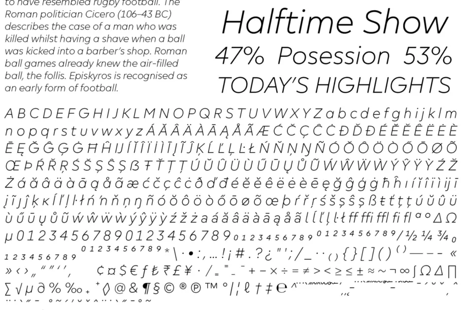
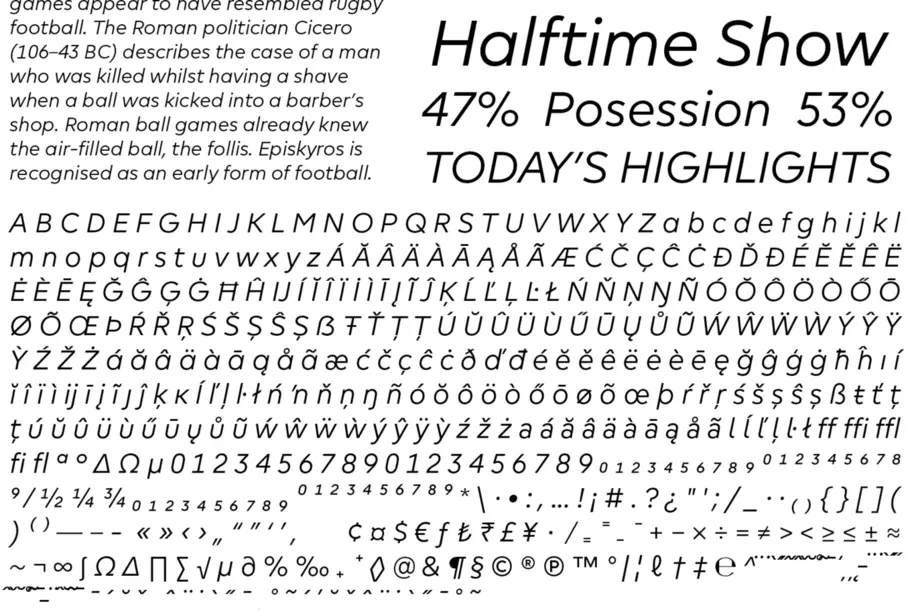
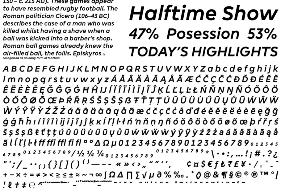
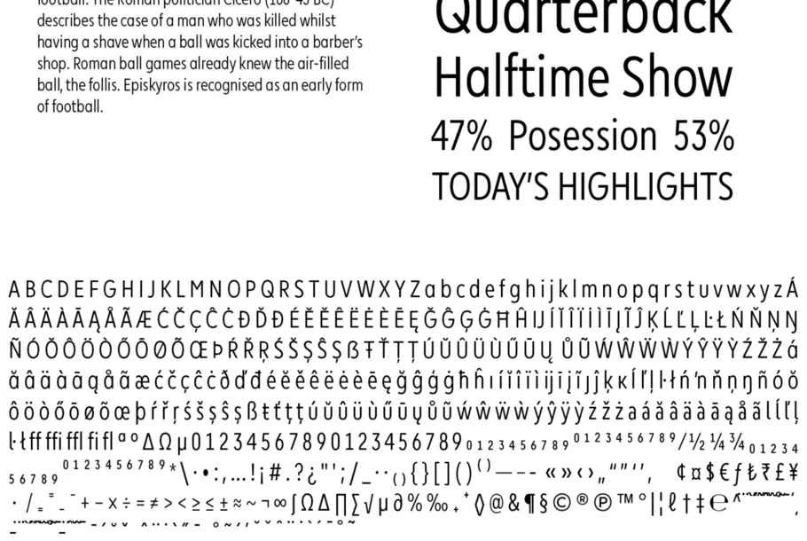
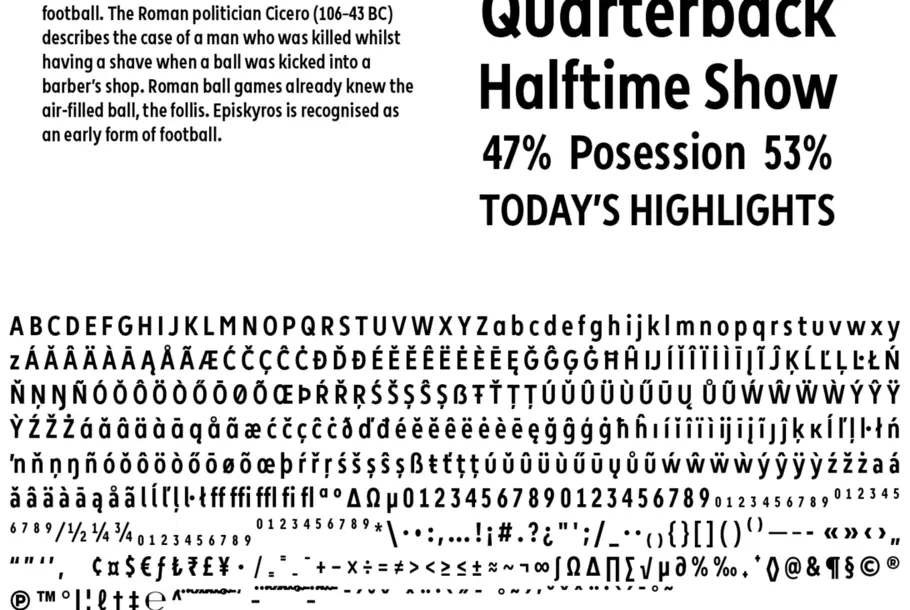
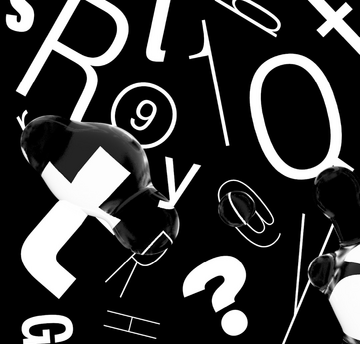
Not only did the typeface need to be able to work when at a large size, but it needed to function at a much smaller scale when used in tables, and as condensed cuts – to allow for especially long player names. This meant some unusual typographic experiments, which included using England player Alex Oxlade-Chamberlain’s name as a test case.
“It was one of those instances where you realize that having a typeface that’s all caps and chunky isn’t going to work,” says DesignStudio. “Working around that was fun.”
The roots of the typeface lie in a wordmark first drawn by DesignStudio in the early stages of the rebrand. Taking the slightly tapered stems of the lowercase r, g and m, Omagari worked closely with the studio to translate these details into the DNA for a full family. The designer spent time in the studio’s east London office, working with the team to draw over letters printed out at enormous sizes, and working on tweaks as the studio suggested them.
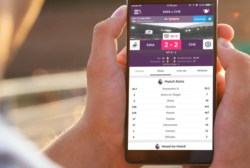
“We knew that it would be used a lot on TV and mobile, so it was essential that numbers be different and distinct,” says Omagari.
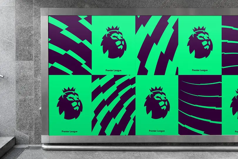
Although Premier Sans needed to be a workhorse that could cross every touchpoint – TV, broadcast, print, website, apps, and everything in the grounds – it was also essential it conveyed a new personality for the brand, and be unafraid to show some character.
“Fundamentally it’s a functional typeface, but from there you can sneak in some flare,” adds the studio.
DesignStudio.
“We worked with Toshi to look at characters that could be more interesting, and went from there into numbers and punctuation. It was about looking for things that didn’t reflect how it read as a block of text, but still added personality when it was blown up and used at headline level.”
Slight angles added into the tops of verticals helped separate the typeface from other geometric sans serifs, and numbers in particular became a point of focus, needing to be easily distinguished when used in clocks, tables, and for other on-screen uses.
“We knew that it would be used a lot on TV and mobile, so it was essential that numbers be different and distinct,” says Omagari.
It was also key the typeface helped visually align Premier League with an entirely new world of branding – not just fellow sports organizations, but the likes of Google, Apple and other companies leading the charge.
“We were looking for something that felt much more personal and open,” adds DesignStudio. “More like a contemporary in the world of these brands.”
“When people watch football now, the things that distract them are on their phone and computer, and it’s these we’re competing against as much as other sports brands.”