Finding your type: How to pick the right font for your brand.

Think of a brand from your childhood, that you associate with that time in your life. Is it still around? Perhaps it is, yet amazingly, many of our favorite brands struggle to evolve alongside the communities that they serve.
In order to remain relevant, brands must find ways to reinvent themselves every so often, through new product development, a new visual aesthetic, and new advertising campaigns. In each case, companies need to choose brand fonts that convey a cohesive identity and resonate with loyal customer audiences. For many brand stewards, this process can be quite a challenge.
So. What is a “brand font,” anyway?
Across industries, people use the term with equal parts conviction and nonchalance. Even at Monotype, we praise new releases with broad labels such as a “go-to typeface for branding” or “carefully tailored to the demands of branding design.” Of course, the true meaning of a “brand font” is far more complex and personal to each brand making a typeface decision.
Function first, form second
“The phrase ‘brand font’ is sort of a non-term,” says Monotype Type Director Steve Matteson. “All typefaces have a voice, and using that voice consistently is key to bringing more engagement to your brand.”
Put differently, the quality of a brand font is not defined by how it looks, but rather by how it is used. Remember, this is the font you will use everywhere, on virtually every piece of printed material and digital real estate your brand touches. For some companies these touchpoints can number in the thousands. So, the right brand font will provide the versatility you need to deliver consistent brand expression across every one of those touchpoints.
“When it comes to large corporations, the brand will have a lot of communications, channels, and touchpoints,” says Monotype Type Designer Malou Verlomme. “The tricky thing is to find the right balance between a strong identity that maintains brand recognition while keeping the branding functional, legible and long-lasting.”
From that perspective, we can establish broad parameters for brands to consider when choosing a brand font. “A ‘good’ brand font will have a large, well-crafted family that provides a rich palette for your brand,” says Matteson. “This allows you to express your brand impactfully across different languages and environments.”
In practical terms, this means looking for font families that encompass a wide range of weights and styles; support the languages your customers use; and equip your design teams with features they need to create engaging, distinctive visual assets.
“With more brands going global, having multiple languages covered is increasingly important,” says Verlomme. “But when brands come to us they don’t always think about that. We’re all pretty Latin-oriented by default. So it’s better to address that right from the start.”
But looks do matter
None of this is to suggest that a generic font makes for a great branding choice just because the family includes thousands of glyphs. In fact, selecting or creating a distinctive, durable design is one of the most important and challenging choices brands make.
But whereas assessing the functionality of a font is fairly straightforward, design choices can be much more complicated.
“One of the most common questions I get is, ‘what about the logo or the wordmark?’” Matteson says. “Brands worry that they’ll have to change it if they change the font. But in that situation, we can guide brands to a solution that works, either by selecting an approximate match of the logo or wordmark or finding a typeface that compliments it.”
Trendiness is another consideration. “There’s a fine line between ‘good’ familiar and ‘bad’ familiar,” says Matteson. As an example, both he and Verlomme note that geometric sans serifs are immensely popular today. These fonts have a classic, modern look that evokes a sort of nostalgic sophistication. They’re also non-specific enough in their design to be used by a wide range of companies, and flexible enough to work in a wide range of digital and print environments.
“Geometric sans are fairly reliable, low in contrast, and work well alongside various images,” says Verlomme. “The typeface is going to have to sit along lots of different contexts, icons, other typefaces, etc., so brands want something simple and clean but still recognizable, and that won’t overwhelm the branding.
“Sometimes when we see that in the brief we’ll think, ‘Ah, not another geometric sans!’ But their popularity is understandable.”
Determine your identity, then own it
However, this does pose a vexing question: Is it better to hop on the bandwagon, or strike out on your own? The design trends of the day may look great, and you may envy another brand’s use of that super-cool font, but that doesn’t mean you should necessarily follow suit.
“When everyone is going for the same typeface genre, your branding can get lost or subsumed,” says Verlomme. “Trends may not apply to your brand and you shouldn’t feel pressure to follow trends just because that’s what everyone else is doing.”
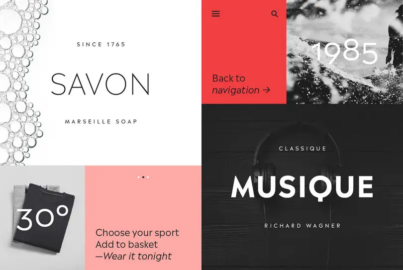
Verlomme recently designed the Madera typeface, a fresh addition to the popular geometric sans serif genre, which offers a full toolbox of weights and styles for effective branding.
When it comes to settling on the look of your brand font, the conversation begins and ends with one overarching question: Who are you? Determining your identity is integral to choosing the right typeface design for your brand.
“The ideal scenario is for a brand to trust that we can help turn their identity into a well-balanced font,” says Verlomme. “If the brand can define itself using descriptions to capture the tone, personality, and principles of the brand—to paint a thorough picture of who they are and who they want to be—we can translate that into typographic forms.”
What impression do you want to make? What values do you want to reflect? What emotions do you want to evoke? Invest time in an honest, thorough assessment of how the characteristics, values, and even the social causes you support factor into the fabric of your brand. Think about how your customers view your brand and are involving it in their lifestyle choices. Then bring your work to your type designer, agency, or creative team to find or create a typeface that reflects those qualities.
“As a brand you should know who you are,” says Verlomme. “Don’t pretend to be anything else.”


