How to choose a font that works everywhere.

Whether you are looking for a new brand font or want to establish a consistent, optimized visual identity across the web, you’ll need a font that works everywhere. In addition to choosing the right kind of font, it’s important to consider the design of the typeface itself.
Designers are the experts on this, of course, but anyone involved in branding and marketing should understand the relationship between type design and their brand. After all, type is a brand’s primary point of connection with its customers through the content and user experience it delivers.
Here are five principles to remember when choosing a typeface for your brand:
Make sure it renders well in different sizes
A font needs to be legible when it’s tiny and maintain its integrity as its size increases. Display sizes are appropriate for very large type, such as headlines, but generally, you should test your fonts to make sure they scale well.
Print offers a superior level of control because you always know how your audience will be experiencing your design. The variables inherent in digital work, however, mean you need strong, versatile type. Look for a font family that offers a robust selection of weights, and read up on x-height, kerning, and hinting—doing so will help you choose a font that enables compelling designs and a pleasant, memorable user experience.

Consider shades of gray
There is a debate within the design community over what color your body text should be. To most eyes, standard text appears to be black, but it is in fact often rendered in a dark gray, with the exact shade varying by brand or publication. True black can be hard on the eyes, though some argue that a lower-contrast gray is difficult to read as well.
The point is, make sure a font will work with whatever shade you use. Light grays don’t always look great on the web or on mobile, so don’t be afraid to experiment with different shades, and make sure the level of contrast enhances legibility.

Give it space
Reading on a back-lit, digital device poses unique challenges to basic readability. You want the reader’s eye to move smoothly over the copy, and text that is too compressed or overly stretched can cause the reader to strain. Fonts with good spacing between characters, open shapes, varying proportions, and distinct letterforms work well for digital. Tight tracking might work in printed newspaper articles, but it doesn’t always fly online.
In general, type that is very large can be spaced closely together. If it is very small, the opposite is true. It comes down to screen size and viewing distance: The difference between user experiences on a phone screen and on a desktop screen is considerable, and the acid test for type is whether it’s comfortable to read.
Correct spacing, paired with appropriate text color, helps to create an efficient, hassle-free customer experience. You want your customers to easily read product descriptions, calls to action, and other touchpoints along the buyer’s journey, so it’s essential to make the act of reading enticing.
Another concern is screen real estate. Some online use cases, such as digital ads, place severe restrictions on the amount of text that can be used. A nice, narrow sans serif font can save on valuable space in a world where assets need to be designed for the same level on legibility on the largest desktop monitor and the smallest phone.
Form matters
Serifs are often used for printed body copy to visually connect the lines of text, guiding the eye across each line like train tracks. However, serifs—especially thin serifs—don’t necessarily translate well to pixels at small sizes, and those delicate, curved font feet can feel like visual noise on the web.
This directly affects the way customers interact with your brand, so consider a complementary sans serif typeface (or a serif that was built for eText, such as Garamond eText or Dante eText) where usability is paramount. Remember that serif fonts do work well in larger digital text, such as headlines, and can give a piece a scholarly look.
With sans serif fonts, steer away from options with similar letterforms, such as fonts where upper-case Is are indistinguishable from lower-case Ls. This issue is exacerbated on small and low-resolution screens and forces the reader to linger over perplexing text.
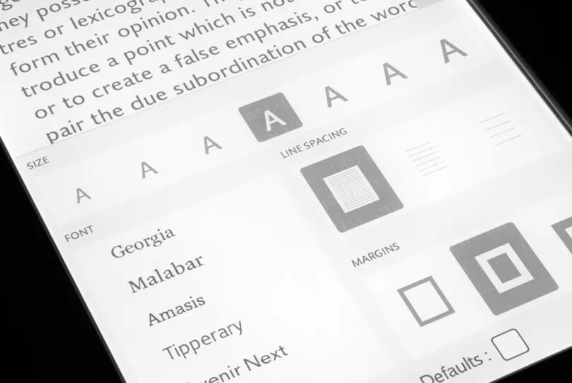
If you do want to use a serif typeface (this article is set in Malabar®, a sturdy slab serif), make sure you use a web font. Web fonts are optimized for pixel rendering, which reduces the pixelation that often muddies fonts at low resolutions. This results in cleaner, sharper text that does a better job of maintaining the font’s visual integrity. It also ensures your type will be on-brand for every user.

Remember: Type is functional
Brands want to be remembered. They want to be distinctive. They want to catch the customer’s attention and hold it. To do so, it’s important to choose fonts that reflect your brand identity across all customer touchpoints.
It’s also important to remember that type serves a purpose. It presents content. It guides buyers through the purchasing journey. It connects people with customer service. Type does actual work, representing the brand and forging a simple, straightforward connection with the customer. If type is too plain, branding will suffer. Too many frills, and the customer may tune out. It’s about balancing form and function, and each brand will find that balance on its own.


