Behind the font: Carl Crossgrove of the Monotype Studio.
Behind the font is a series of designer interviews aimed at highlighting the people and process behind the fonts you love and use.
This installment features Carl Crossgrove, senior type designer at the Monotype Studio. From Carl’s early interest in calligraphy and drawing, through his youth and college years studying fine arts and book arts, the constant thread in Carl’s life has been his fascination with letterforms. In addition to creating new typefaces for the Monotype Library, Carl also designs custom fonts and has worked on several type projects for corporate branding initiatives.
Starting from scratch
Most new fonts have their root in something that is missing—gaps in the world of type that need to be filled. This could take shape in any number of ways: Building fonts for specific use cases, new mediums or environments, or to capture a particular feeling or mood. It can even mean updating old design ideas or reviving beloved fonts to meet the demands of modern technology.
At the heart of this process is a constant dialogue with designers and brands to understand what they need or want, before solving those needs through type. Within the Monotype Studio there are people that live and breathe letterforms on a daily basis. Carl is one of them.
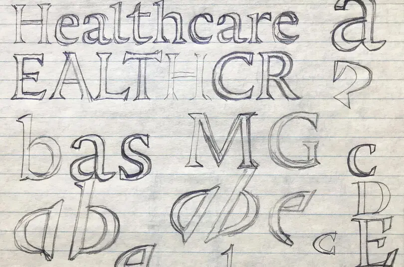
Like many type designers, Crossgrove starts drawing by hand before transferring the process to the screen. “I’ve always drawn everything, including letters, so sketching and drawing is where I start a new original design. Sometimes the idea is worked out over a long period of sketching and re-sketching a few letters at a time, other times the idea is more fully formed and I can draw upper and lower case, italic, and bold all in a sitting.
“Some designs are intended to convey a specific mood,” explains Crossgrove. “I designed Amarone to fill a gap in the very crowded script field for something calligraphic, rough, and legible. Cavolini was developed specifically as a handwriting face for small screens, originally to appear as a replacement for hand-written characters on a PDA note-pad interface. There is always a wide range of purposes and possible ranges for typefaces.”
He continued, “But this hand-and-pencil stage is all outline shapes, and only gets to a certain level of completeness; it’s still all very rough and messy. Without inking those outlines or filling them in, there’s a lot that is unknown about how a design will look in crisp black-and-white.”
Along with Charles Nix and Juan Villanueva, Crossgrove was part of the Monotype Studio team that restored Walbaum, a somewhat under-the-radar, 200-year-old modern serif released in 2018. While revivals like Walbaum begin from existing source material rather than a blank page, they nevertheless have the same purpose as fonts designed from scratch—to fill a gap or bring something fresh to the conversation.
In the case of Walbaum, the goal was to update this gorgeous workhorse of a family for the digital age, so that its warmth, character, and vast array of ornaments and flourishes could be enjoyed today.
“We didn’t like that the beauty and usefulness of the originals had essentially been lost in decades of format conversions and drift away from the originals,” says Crossgrove. “Monotype Type Director Charles Nix did the traveling and hunting to get the material, but we both scrutinized the originals so the final product would be fully informed and clearly representative of the original look and strength.”
Designing with brands
Type designers are often asked to fill gaps for major companies, too. Custom work is a substantial component of the Monotype Studio’s portfolio, including recent projects with Santander, Alibaba, Tencent, and Toyota.
Often, brands are hoping to distinguish themselves from the competition and improve recognition, or might be looking to improve legibility across a wide range of devices and environments (or both). Brands might be expanding to new regions, rebranding, or adding new products. Whatever the case, the Monotype Studio develops a close partnership to understand their opportunities, challenges, and personality.
“For custom type that is commissioned by a brand, we start with the customer’s ideas about tone and voice, as well as a clear picture of where the type will be seen and used,” Crossgrove says. “Sometimes the feel is a more subtle thing and functionality is more important. Sometimes for fashion or cosmetic brands, the overt style of the letters is most important.”
From there, Crossgrove says he guides brands through a process that focuses on real-world examples of their font in use. “The customer should see our proposals and development work in the most likely contexts, so they can judge whether the design feels right and has the right voice,” he explains. “It doesn’t help as much to show everything at the same size, as alphabets in black and white. Sometimes presenting mock-ups in their own interface and colors is more constructive, so we try to get proposals into mock-ups and typical settings where all the elements are present and the voice and feel of the type is clear.”
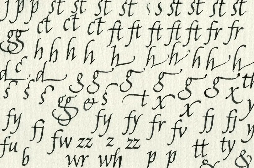
A sketch for Crossgrove’s Amarone family, which was drawn exclusively with a broad pen.
The process doesn’t end there, however. Once a design is finalized and, if it’s a custom font, the brand is happy, the font is handed off to the engineering team. Font engineers are the unseen heroes of type design, but their job is as important as any. Fonts are software, after all, and they need to work in a vast range of environments and use cases. For brands in particular, fonts need to be reliable and technically sound, so the engineering team within the Monotype Studio plays an essential role in delivering the final font files.
“There is a lot of invisible technical work that goes into a finished font product,” Crossgrove says. “Fonts consist of the outlines the designers draw and the spacing and kerning they build into those outlines, but there are also tables of data—for example, machine standards for how to render the font in different operating systems. Missing the tiniest of technical details can mean all the descenders get clipped, or the Bold doesn’t show up, or white gaps appear in letters, or the font just doesn’t appear in font menus!
These are, obviously, important considerations any brand should examine before investing a dollar in design. The design and technology need to work hand in hand so that beautiful font functions consistently everywhere it should.
“Type is part design, part technology, and has always been this combination,” adds Crossgrove. “Without the technology, it would just be hand-lettering or calligraphy.”
A (big) group effort
“Downtime” is not really in Crossgrove’s vocabulary. Like many designers, he is constantly working on a range of projects in various stages of development. “To get strong, fully-developed typefaces, it’s useful for a designer to have several projects simmering at the same time,” he explains. “Typefaces benefit from being left alone for long stretches, because flaws jump out when a designer’s eye has been refreshed by looking at other projects.
Individual designs themselves can represent months or even years of a designer’s life as this process of designing and revision plays out. “A simple display typeface could go from concept sketches to final in 3 months,” Crossgrove says, “but a big complicated family could take years, depending on priority and how much a designer can focus on active development.”
Developing a new typeface family is a team effort as well. While the design represents the vision of a single type designer or sometimes a small group, the Studio team leans on each other for edits and feedback.
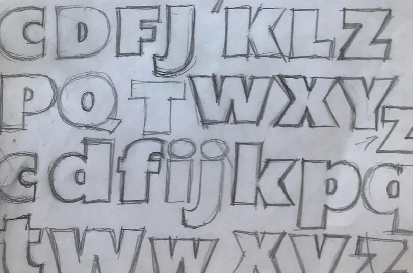
One of Crossgrove’s sketches for Mundo Sans.
“For an original design that’s more personal, the designer shows other studio members the project a few times in the development process to get feedback on weak points, unresolved issues, and to clarify the design intent,” Crossgrove says. “Closer to the end of the design process, the extra eyes help us catch little mistakes or loose details. No matter how expert the designer is, sometimes the idea needs to be made visible before it can be resolved.” For custom work, this process shifts more heavily toward the client, but Studio team members are often sought out for input and suggestions.
This collaborative environment is one of the benefits of being part of the Monotype Studio team. While some type designers prefer to be independent or part of a small foundry, working with the 60-person strong team of type designers and font engineers—and, of course, the broader Monotype organization—means an expert opinion is always available.
“In my time, I’ve met a lot of people who did start their own foundries, and it’s clear that they enjoy some benefits of entrepreneurship, but I’m content,” says Crossgrove. “Over the years I’ve gotten to work on some projects I wouldn’t have ever gotten as an independent: Devising a new connecting and joining system for our Noori Nastaliq (which unfortunately was never released), Noto Sans and Noto Serif, eText adaptations of classic library faces, Walbaum, and a lot of custom work.”


