Meet Walbaum, a restored modern serif font that exudes elegance.
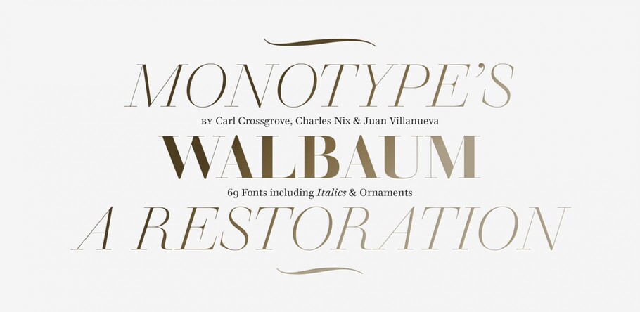
It may date back 200 years, but the Walbaum typeface is the modern serif to beat all modern serifs. Freshly restored by Monotype, this updated family oozes charm and sophistication, while remaining warm and approachable. Its range of workhorse text weights and chiseled display forms allow it to morph from elegantly matter of fact, to unashamedly attention-grabbing – and that’s before we’ve even mentioned its collection of ornaments.
Typeface restoration is a careful balancing act. Designers walk a fine line between preservation and modernization – staying true to the spirit of the letterforms, while reimagining them for contemporary use. So when Carl Crossgrove, Charles Nix and Juan Villanueva started working on a restoration of Walbaum, they set themselves a simple mantra: “What would Justus do?”
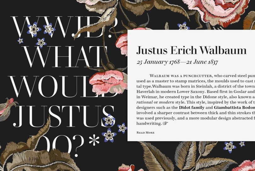
Justus Walbaum’s original display sizes were relatively limited. But given the time, the tools, and the array of type uses of today, what would Justus have created?
“We weren’t asking how we could make an exact replica of Walbaum,” explains Nix. “Instead, given the tools and the design desires that we have, we asked what would Justus do in our age? And how can we make a family that answers that in a respectful way?”
Justus Erich Walbaum designed his typeface in Germany in the early 1800s – creating an elegant yet readable modern serif that still “pushed a boundary in a very artful way”, as Nix describes it. However the typeface was a victim of history and circumstance, with the Napoleonic Wars and the death of the designer’s son preventing Walbaum from fulfilling its potential. Although comparable typefaces such as Bodoni or Didot thrived, Walbaum flew largely under the radar – except for a period in the mid 20th century when it became a favorite choice for book typography.
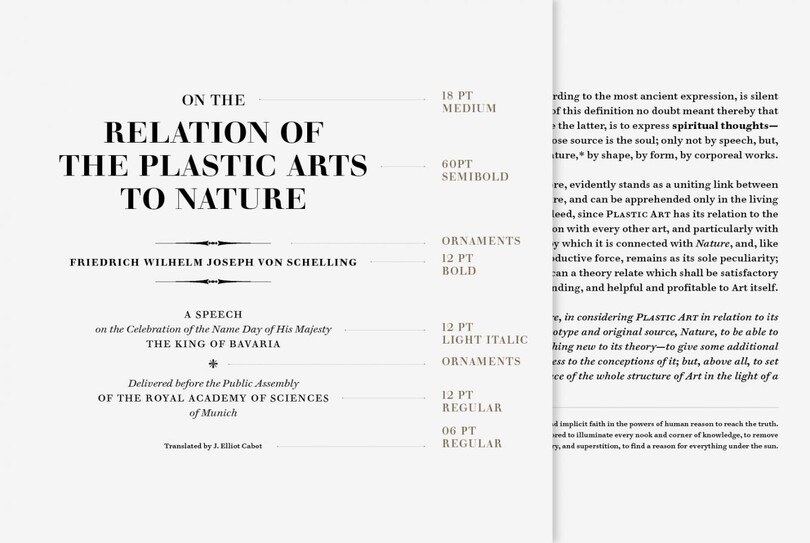
A range of weights, a much more robust character set and the ability to move seamlessly across the full range of text sizes are just a few of the updates Carl introduced for contemporary digital use.
“It has a warmth that’s devoid in most moderns,” says Carl Crossgrove. “Looking back at the original source material, you can see something of the duality of a transitional typeface or even an old style typeface in some of the details. That kind of hybrid is, to a typographer’s eye, a real winner – something like a gem that’s been overlooked. Or maybe a quality that’s been bred out of a lot of modern typefaces.”
Crossgrove, Nix and Villanueva divided the hefty task of restoring Walbaum between the three of them, taking responsibility for text weights, display and ornaments respectively.
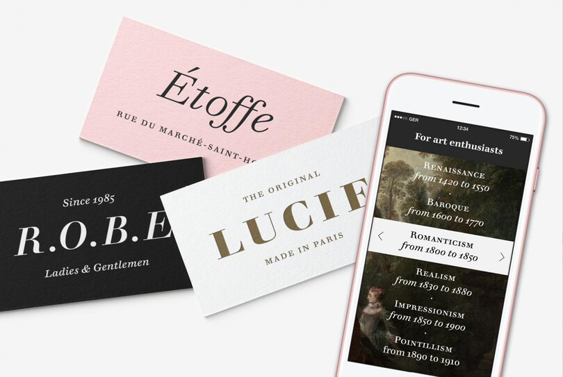
With 32 weights including italics, ornaments and two decorative cuts, the Walbaum typeface has a huge range that works across many touchpoints and mediums. From massive billboard advertising, to micro-type on e-readers, this typeface has it covered.
For Nix, tackling the display weights meant pushing the possibilities of Walbaum’s original design and taking the typeface to its most extreme form of expression.
“I was carving from the fattest, blackest possible weight backwards,” says the designer. “And then filling in the blanks in between. Thinking of it like a Noguchi sculpture, I started with a big rounded block of basalt and carved backwards from there.”
Crossgrove’s text weights add to the typeface’s palette, preserving the warmth and charm of Walbaum’s original work, but expanding it for a huge range of contemporary demands. “The small sizes that he cut were not only lucid and comfortable in text, they were downright warm,” says Crossgrove. “Something that you would never expect from a modern text, and it’s what we tried to capture in the text weights.”
“There’s a substrate that Walbaum could never have imagined – our computer screens and TVs and so on,” adds the designer. “It has to live in these modern settings, and what we’ve found is it really does.”
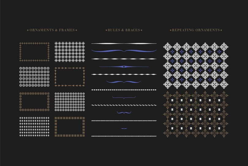
Juan found inspiration in the idea that ornaments are a rare commodity in today’s typographic market. He felt that these are not only an important part of the Walbaum legacy, but that they give designers another tool to augment their designs either with the typeface’s letterforms, or as ornaments that can act as borders, patterns or icons.
Walbaum is finished off with Villanueva’s suite of ornaments – a feature not commonly seen in contemporary designs – which are based on original specimens found in New York, Leipzig and Berlin.
In total, the family offers 32 weights, giving designers a rich palette to work with. For those looking to experiment, Walbaum’s decorative display cuts and ornaments also offer plenty of potential.
Get the Walbaum fonts
Walbaum by Charles Nix, Carl Crossgrove, and Juan Villanueva is included in the Monotype Fonts service.


