News
18 articles
How a Dog Talks: The Surprising Redemption of Comic Sans, with Terrance Weinzirl on Very Special Episodes
Terrance Weinzierl, Executive Creative Director at Monotype, recently joined hosts Dana Schwartz, Zaron Burnett, and Jason English on the podcast Very Special Episodes to talk about the history and legacy of one of the most misunderstood fonts: Comic Sans®. Terrance has a great appreciation for the typeface — when Comic Sans received an expansion and a refresh in 2011 with Comic Sans Pro, the two new italic and bold italic fonts in the family were drawn by Terrance. Hear from Terrance and others to get a new perspective on the renowned typeface Comic Sans on Very Special Episodes.

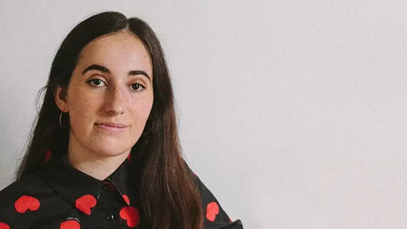
Wedding Whimsy — Marie Boulanger Explores Popularity of Brush Calligraphy Typefaces with The Independent
Why do certain font styles become ubiquitous? In the wedding industry, an approachable brush calligraphy style has quickly become the norm. Marie Boulanger, design team lead at Monotype, spoke with The Independent on this trend.

Monotype Partners with Wix to Extend Font Library for Wix Creators
Monotype Imaging Inc., a global leader in type design and technology, and Wix.com Ltd, the leading SaaS website builder platform, have partnered to extend Wix’s font library, demonstrating the value of premium typography to both platforms and their users.

Monotype Unveils Human Types and AI Project
Monotype Imaging Inc. announces the launch of its Human Types and AI exploration project as part of type trends Re:Vision 2025. Led by Monotype’s Executive Creative Directors, Charles Nix and Phil Garnham, this activation provides a deep dive into the evolving relationship between Artificial Intelligence (AI) and typography.

Grave Markers and Kerning – Charles Nix Shares Expertise with NYTimes on Pope Francis’ Tombstone
Recently, Charles Nix, senior executive creative director at Monotype, was asked to share his expertise on Pope Francis’ tombstone and the attention its design has drawn. Read on at The New York Times for insights from Charles Nix on mathematical vs. harmonious kerning and why the spaces between letters have such a large impact.

Monotype Expands Collaboration with Adobe to Bring Hundreds of World's Most Renowned Fonts to Creative Cloud
Monotype Imaging Inc. announced today an exciting extension of its longstanding partnership with Adobe. Hundreds of the most popular, high-quality fonts from the Monotype library and select foundry partners are now integrated into Adobe Creative Cloud and available to subscribers around the world.

Taking a New Direction with Re:Vision — Phil Garnham & Marie Boulanger Speak to DESIGNBOTE
Phil Garnham, Executive Creative Director, and Marie Boulanger, Design Lead, sat down with DESIGNBOTE to discuss Monotype's 2025 trends report, Re:Vision, Future Typographies.

Celebrating 30 Years of Comic Sans: Terrance Weinzierl Shares Insights on BBC Tech Life
Tune in to hear Terrance Weinzierl, Creative Type Director at Monotype, on BBC Tech Life podcast as he dives into the fascinating history and design of the iconic Comic Sans font, celebrating its 30th anniversary.

2024 Has Seen the Rise of the Retro in Advertising Campaigns
As celebrated in our most recent Type Trends Report, 2024 has seen the rise of the retro, from ’90s nostalgia and grunge to the return of the comforting, traditional serif.

Monotype Joins The Readability Consortium to Advance Global Readability Research
Monotype Imaging Inc. has partnered with The Readability Consortium (TRC), a group of engineering, psychophysics, and design researchers dedicated to researching how to make text faster, easier, and more comfortable to read. With this exciting collaboration, Monotype will help amplify efforts in format readability work to investigate how fonts can have an impact on readability by increasing engagement and reducing reader fatigue.

Four Women That Rock The Type World: Personal Triumphs and Visionary Perspectives
Recognizing the impact women have had on the type design industry, Typeroom delves into the journeys of four exceptional women at Monotype, exploring their challenges, triumphs, and visions for the future of type design.

The Era Of Spatial Typography Is Here
"Spatial typography designed for augmented or virtual reality opens up a third dimension for type design", says Phil Garnham, executive creative director at the type design company Monotype.

An Interview with Creative Type Director, Akira Kobayashi
Akira Kobayashi, Creative Type Director at Monotype discusses the new era of global type design in an interview with Kim Tidwell at PRINT. Akira shares his thoughts on this new era after renown Japanese type foundry Fontworks joined the Monotype family earlier this month.

Two NYC Pride Fonts Invoke One Powerful History and Infinite Hopes for the Future
Can something embody both a legacy and the future? NYC Pride’s new brand identity does just that. Heritage of Pride’s brand identity, created in partnership between Lippincott and Monotype, features the Gotham® and Knockout® typefaces from NYC-based Hoefler&Co®., now part of the Monotype Library.

The Counterspaces – Typography in the Age of Black Swans
Zetafonts presents the new issue of the Type Trends lookbook series, titled The Counterspaces (Typography in the Age of Black Swans).
"A presentation of work and the thoughts of some of the most interesting and innovative creators and thinkers in the typographic field and guides the reader in a hidden world of undefined and antagonistic areas in typographic design."
How we connect emotionally with typography - exploring Neuroscience and fonts
Marie Boulanger, brand designer at Monotype, talks about her research project looking at how we connect emotionally with typography.

AI inspo and the future of font pairing
Terrance Weinzierl, creative director at Monotype, discusses how AI can transform the daily workflow of designers by providing fresh, informed inspiration in font pairings, and how it aids the speed and quality of font combinations while inspiring designers to be more creative.

The Future of Communication Technology: James Fooks-Bale On How Monotype’s Technological Innovation Will Shake Up How We Connect and Communicate With Each Other
"Perfection isn’t always the main goal. Teams should not shy away from imperfection and instead value the process of constant improvement. Doing so will enable companies to foster a culture of innovation and creativity."