Grave Markers and Kerning – Charles Nix Shares Expertise with NYTimes on Pope Francis’ Tombstone
News

News
Grave Markers and Kerning – Charles Nix Shares Expertise with NYTimes on Pope Francis’ Tombstone
Recently, Charles Nix, senior executive creative director at Monotype, was asked to share his expertise on Pope Francis’ tombstone and the attention its design has drawn.
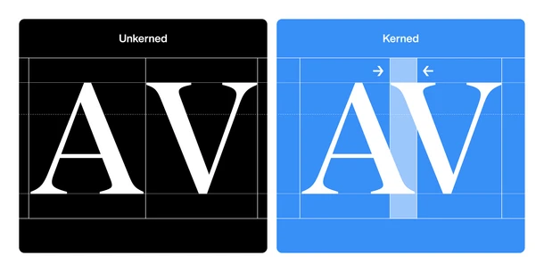
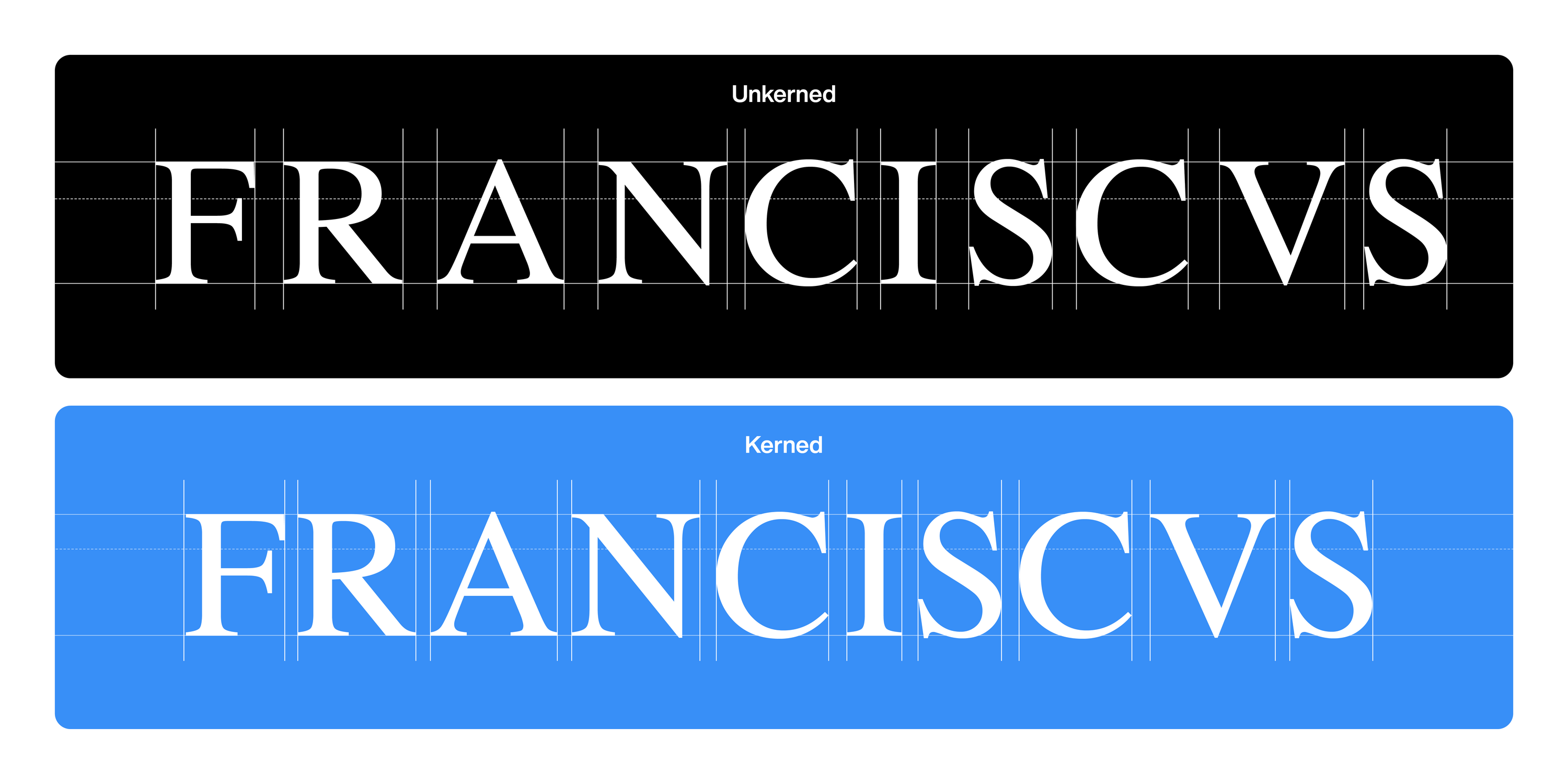
The marble slab, reflecting Pope Francis’ request for a simple, unadorned final resting place, displays his Latin name Franciscus in all-capital Times Roman letters, “FRANCISCVS.” However, due to spacing that appears irregular to the eye, the ten letters instead read as “F R A NCISC VS.”
Why would the tombstone have been carved this way, and why does it look discordant, even to the eyes of non-designers?

Senior Executive Creative Director
Charles Nix.
Charles Nix is a Senior Executive Creative Director, designer, typographer and educator. He was lead designer for Helvetica Now and has designed a number of popular typefaces in the Monotype Library, including Walbaum and Hope Sans, which received a Certificate of Typographic Excellence in the 22nd Annual Type Directors Club Typeface Design Competition.


