


注目の記事
Shorai Sansは、幾何学的な形状が特徴のMonotypeの日本語書体です。Monotypeクリエイティブタイプディレクター小林章とタイプデザイナー土井遼太、そして書体デザインの第一人者、中村征宏氏を制作メンバーに迎え開発されました。

Find design inspiration in an age of information overload.

In this article, get a peek at recent and upcoming book releases in a variety of genres to get a sense of what typography styles are trending in publishing right now. This post is a guest piece from our friends at Reedsy, a website that connects authors with publishing professionals.

Today’s brands must keep up with a fast-paced digital world and navigate a “new normal” that’s still emerging from the worst of the pandemic. The last few years shifted everyone’s digital expectations, how brands operate, and in some cases, impacted their business models. Moreover, issues like biodiversity, sustainability, diversity and equity, and brand activism are all booming. So how does this all impact brand building? These macro shifts are greatly influencing how companies position themselves, the services they offer, and how they communicate with their customers.
Monotype Fontsはデザイナーのことを考えて設計されている、と私たちはよくお伝えしています。さらに現代の組織のニーズに応えるように構築したのもまた事実です。つまり、IT部門を含めたさまざまな部門のために構築されているとも言えます。
フォント管理ルールが明確でない、あるいは長期的な計画そのものがない場合、クリエイターは程度の差こそあれ、その悪影響を受けることになります。Monotype Fontsは、クリエイターのワークフローを妨げるフォント関連の問題をなくすように設計されています。クリエイターの方々から、Monotype Fontsのサブスクリプションをご契約いただく前によく寄せられる疑問を以下にご紹介します。
漫画に出てくるスーパーヒーローには相棒が必要ですし、プロスポーツのチームにはコーチが必要です。そして世界中のクリエイターチームには、一流のエージェンシーであれ、どん欲にトップを目指す新鋭であれ、頼りにできるサポートチームが必要です。特に特別な書体やフォントライセンスにかかわるニーズに対応するに当たっては、そうしたサポートが大事になります。
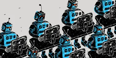
クリエイターは、目的にぴったりのフォントを求めて、幅広く検索することがよくあります。高品質なフォントを安く(あるいは無料で)見つけなければというプレッシャーも重なると、知らないうちに組織のネットワークに脆弱性を持ち込むことになりかねません。結局のところ、フォントはソフトウェアです。あらゆるソフトウェアがそうであるように、フォントも悪意のある目的で利用される可能性があります。
昨今のリブランディングの試みは、単にブランドの見た目やイメージを新しくするだけでは終わりません。現代の企業は、目まぐるしく変わるテクノロジーや、顧客の期待に適応することを迫られています。そのためには、顧客とのコミュニケーションの仕方を根本的に変えることが求められます。
2018年にAdobeのフォントサービスTypekitの名称がAdobe Fontsに変わりました。事実上、Adobeは独立したサービスとしてのフォント事業から手を引くことになり、これらのフォントはCreative Cloudのサブスクリプションアプリに組み込まれました。
フォント、音楽、映像、色――これらはすべて、デジタル資産やマーケティングキャンペーンの制作に不可欠な要素です。しかし、特定のプロジェクトやキャンペーンにぴったりはまる魔法のようなフォントは、シンデレラのガラスの靴のように、たった1つしかありません。マーケティングチームや制作チームにとっては、プロジェクトの裏にあるメッセージを表現できそうな完璧なフォントが見つかりさえすれば、何もかもうまく収まるように思えます――ただし、合法的なフォントライセンス契約は別として。
企業のブランド刷新は、とても大きな決断です。ブランドの抜本的な再生につながる可能性があるとはいえ、膨大な時間と投資が必要な一大事業です。
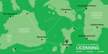
カンパニーデスクトップライセンスと従来のデスクトップライセンスとでは、何が違うのでしょうか?フォントライセンス契約に関して、時流に乗ってクラウドに移行するのが合理的なのはどのような場合でしょうか?現実的に考えれば、ライセンス契約に関する意思決定をするとなると、不安に感じるのも仕方ありません。ボードゲームをモチーフにして、手続きを一つ一つ教えてくれる図解ガイドでもあれば話は別なのですが……。


