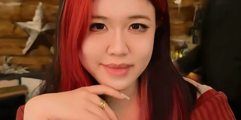
Meet the 2025 Beatrice Warde Scholarship recipient: Siyun Li.
Siyun Li.
Every year, Monotype and the Type Director’s Club (TDC) award the Beatrice Warde Scholarship to a young female or non-binary student entering the design industry. This prestigious scholarship pays tribute to the “first lady of typography,” Beatrice Warde, a champion of type education throughout her career with Monotype and the first female member of the TDC.
This merit-based scholarship helps pay the tuition for one undergraduate student, a rising senior, whose design work demonstrates exceptional talent, sophistication, and skill in the use of modern typography.
Previous winners include Gabriela Parra Sánchez (2024), Doah Kwon (2022), Ximena Amaya (2021), Tatiana López (2020), Blossom Liu (2019), Anna Skoczeń (2018), Tasnima Tanzim (2017), Ania Wieluńska (2016), and Rebecca Bartola (2015).
For Siyun Li, design is like a diary — capturing emotions, stories, and moments from everyday life. As the 2025 recipient, she uses type to make undervalued creative labor visible and bring personal narratives to life. Dive into her thoughtful approach to design and typography in our recent interview.
What made you decide to study design — were you always interested in creative pursuits?
I initially wanted to become an illustrator, largely because I didn’t fully understand what designers actually did at the time. As I learned more, I realized that design is a discipline broad enough to hold many of the skills and technologies I wanted to explore.
I’ve been creating content online for nearly ten years, and from a young age I’ve always enjoyed turning ideas into something shareable. In high school, I founded a campus design club called AGE_Studio to advocate for the value of design and fair compensation. Seeing more students become interested in design through that experience, along with the unconditional support from my parents, gave me the confidence to commit to this path long-term.
How would you describe your design style?
My work is often inspired by things that happen in everyday life — moments that make me happy, hurt, stay in my memory, or spark curiosity to explore further. Friends have told me that my design feels like a diary, and I agree. Through design, I document my experiences and allow emotions to settle over time.
What role do you see typography playing in shaping social conversations or cultural movements over the next decade?
From a functional perspective, typography has already reached a high level of maturity. Most practical needs are already well covered. Because of that, I think the next important role of type is less about usability and more about what it communicates.
Typography is increasingly becoming a carrier of emotion and stance. It shapes how people approach a text, whether they choose to engage with it, and how they interpret its context. Rather than pursuing perfect uniformity, I’m more interested in type that reflects personal and honest expression.
Can you share some of the real-world problems you’re particularly interested in tackling with design?
Since high school, I’ve been thinking a lot about how creative labor is treated. Design is often consumed quickly and seen as a surface-level addition, while the time, judgment, and emotion behind it remain largely invisible.
I’m especially sensitive to this kind of invisibility, which has led me to be interested in real-world systems that appear to function smoothly but quietly undervalue human effort. I often think about whether unfair structures quietly marginalize people who are genuinely invested in their work, gradually wearing down their passion. It happens across all fields.
While design may not immediately change systems, it can make these issues visible rather than allowing them to remain hidden beneath the appearance of normal functioning.
What role do you think type can play in these kinds of projects?
As I see it, typography is part of the content itself. Choices like weight, spacing, and rhythm shape how a text is approached and felt before it is fully read. When text and visual form truly merge, meaning is carried not only by words, but by their presence on the page or screen.
In this sense, type guides attention, sets emotional tone, and subtly frames how a message is understood. It becomes part of the storytelling, influencing not only what is communicated, but how and from what position it is perceived.
What kinds of projects are you working on lately?
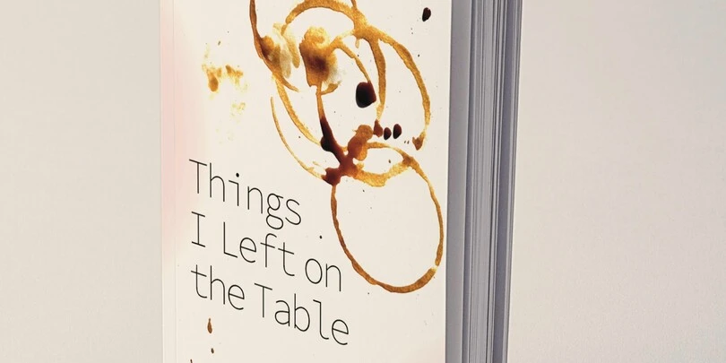
Recently, I’ve been redesigning and reformatting my late grandfather’s autobiography. I want to see his memories and the unforgettable history of my hometown. When the book was first written over a decade ago, I didn’t have the skills I have now. This project feels like a belated gift, and I hope he would have liked it.
I’m also working on a series called Matryoshka, which includes a typeface and experimental videos. Inspired by the nesting dolls my dad gave me on my birthdays as a child, the project explores themes of growth and the process of continuously unfolding.
How did you hear about the Beatrice Warde scholarship?
I learned about the scholarship through a recommendation from Professor Zipeng Zhu.
What do you think made you stand out as a winner for the scholarship?
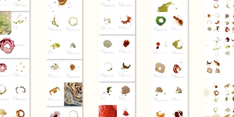
I believe what set me apart was my attention to the beauty in everyday life. We’ve always believed that we overlook too many meaningful things, and some that seem too insignificant, messy, or imperfect, deserve to be noted. This way of observing the world strongly informs how I approach design.
What does the award mean to you personally?
This award makes me feel that what I’ve consistently cared about is being seen. It offers a sense of affirmation and gives me confidence to continue pursuing design. At the same time, this recognition is valuable for my resume and future career, opening up more opportunities as I move forward professionally.


