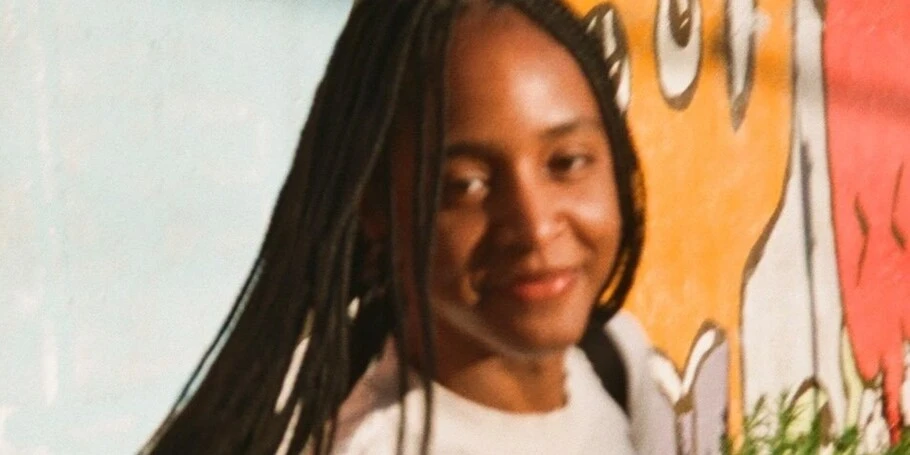
Meet the 2025 Adé Hogue Scholarship recipient: Charitssa Stone.
Charitssa Stone.
Every year, Monotype and the Type Director’s Club (TDC) award the Adé Hogue Scholarship to an outstanding US-based BIPOC student entering the design industry. This prestigious scholarship, formerly called the “Superscript Scholarship” pays tribute to Broderick “Adé” Hogue, a Chicago-based art director and letterer who was tragically killed in 2021 at the age of 32 while cycling in Chicago’s Near North Side.
This merit-based scholarship helps pay the tuition for one BIPOC student, a rising senior, whose design work demonstrates exceptional talent, sophistication, and skill in the use of modern typography.
2025 scholarship winner, Charitssa Stone’s passion for design was first sparked during an internship, blending storytelling with visual language. Inspired by jazz, she challenges norms and focuses on cultural misrepresentation. Explore Charitssa’s creative journey as a designer merging typography, sound, and culture to tackle representation and identity. Learn about her recent work, including local collaborations, and her belief in typography as a tool for shaping narratives and dialogue.
Learn more about Charitssa in our recent interview below.
What made you decide to study design — were you always interested in creative pursuits?
In undergrad at NYU, I interned at a small branding/identity design agency as a social media intern. After about a week, the creative director noticed my strong interest in design and started teaching me everything she knew. Design quickly became a mode of self-expression and storytelling for me. Shortly after, I changed my major from Computer Engineering to Integrated Design & Media, with a minor in Digital Art and Design — it was the closest I could get to studying graphic design since NYU didn’t offer a graphic design major.
I’ve always been creative, especially in high school, but I didn’t grow up knowing much about graphic design or that it could be a career. Looking back, though, I was always finding ways to incorporate design and art into my projects; I just didn’t have the language for it yet.
How would you describe your design style?
Honestly, my design style is still something I’m figuring out. Overall, it’s shaped by my everyday interests. During my time at Yale, I’ve consistently been taking classes at the School of Music, around different histories and topics in jazz. And while I’m not a musician, those sonic qualities and structures that show up in jazz have made their way into my design approach — things like improvisation, call-and-response, and layering. Because of that, my compositions aren’t always fixed; they feel responsive, sometimes slightly off-grid, sometimes tightly controlled. I’m really interested in that tension between structure and looseness.
Visually, I tend to build systems that feel rigid in the rules they set, but within that create moments of dissonance: type that feels choreographic, layouts that invite partial reading rather than immediate clarity. There’s often an emphasis on accumulation and fragmentation, where meaning comes together over time rather than through instant legibility.
What role do you see typography playing in shaping social conversations or cultural movements over the next decade?
I think typography will continue to function as more than just a tool for communication — it will act as a carrier of cultural memory, identity, and political expression. Especially over the next decade, as conversations around race, diaspora, and authorship become more urgent, typography has the potential to shape not just what is being said, but how it’s felt and experienced. I see typography as a way to both document and produce culture. It can archive voices, reference histories, and also actively participate in shaping new visual languages that emerge from social movements.
Can you share some of the real-world problems you’re particularly interested in tackling with design?
I’m particularly interested in how design can address issues of representation, specifically how Black American cultures are often misrepresented, flattened, or decontextualized. A lot of visual language that originates within these communities gets circulated widely, but stripped of its history and meaning. I’m interested in using design to re-anchor those forms, to highlight where things come from, and to make space for more nuanced narratives. At the same time, I’m interested in the ethics of that process. Thinking about who is doing the framing, who the work is for, and how it circulates. So, it’s not just about visibility, but about responsibility and care in how stories are told.
What role do you think type can play in these kinds of projects?
Typography can hold voice, tone, and context, especially when thinking about language as something lived and spoken rather than neutral or standardized. In projects around representation, type can be a way to push back against flattening. It can reference specific histories, gestures, and cultural rhythms, whether that’s through structure, spacing, repetition, or even distortion. I’m interested in how typography can reflect the ways people in my community communicate — how language moves, how it shifts, how it carries multiple meanings at once.


What kinds of projects are you working on lately?
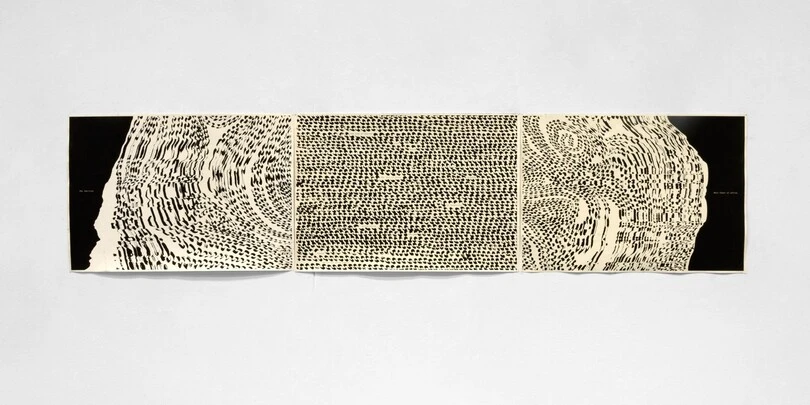
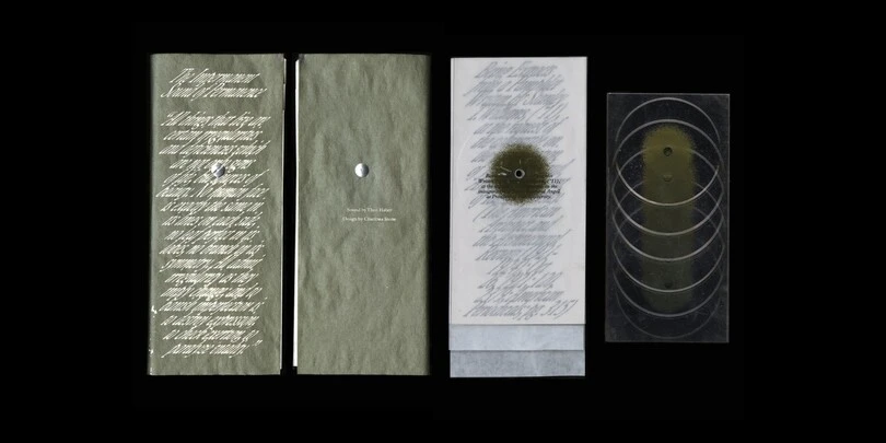
Lately, I’ve been working across a mix of typographic, research-driven, and time-based projects that all circle around language, sound, and Black lived experiences. A lot of my current work explores typography as something choreographic — thinking about how text can move, unfold, and be experienced over time rather than read all at once. I’ve been making editioned publications where meaning builds through pacing, repetition, and fragmentation, often pulling from archival texts and reworking them through different tonal frameworks.
I’ve also been working more with sound, experimenting with how spoken language, DJ practices, and sampling intersect with design. Outside of school, I’ve been collaborating with a local Black-owned record store, Grails, where I’ve been designing a range of materials: programs, signage, posters, and other in-store graphics. That work has been a really meaningful way to engage design within a specific community context, thinking about how visual identity can reflect the culture and energy of the space while also supporting its day-to-day operations.
How did you hear about the Adé Hogue scholarship?
I’ve always followed TDC, but I heard about the scholarship through a friend who encouraged me to apply, so I did.
What do you think made you stand out as a winner for the scholarship?
I think my work stood out for its focus on typography as a way to explore culture, while staying grounded in both research and experimentation.


What does the award mean to you personally?
This award means a lot to me! My practice is still evolving and moves across typography, sound, and research, so having that work seen and valued feels really affirming. It also reminds me that the questions I’m asking around representation, cultural context, and how design can carry voice and history are worth continuing. I didn’t grow up knowing graphic design was a possible path, so having my work recognized now feels especially meaningful.


