注目の記事
Shorai Sansは、幾何学的な形状が特徴のMonotypeの日本語書体です。Monotypeクリエイティブタイプディレクター小林章とタイプデザイナー土井遼太、そして書体デザインの第一人者、中村征宏氏を制作メンバーに迎え開発されました。

7年ぶりにウェブサイトのデザインを変更したTED(Technology Entertainment Design)は、TED TALKで語られる情熱的なスピーチとその素晴らしいアイデアを伝えるのにふさわしい書体としてNeue Helveticaを採用しました。


本記事では、さまざまなジャンルの最近出版された書籍や近々発売される予定の本を通じて、現在出版業界でトレンドとなっているタイポグラフィスタイルを垣間見ます。この投稿は、著者と出版専門家をつなぐウェブサイト「Reedsy」の仲間たちによるゲスト投稿です。

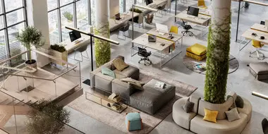
今日のブランドは、急速に進化するデジタル世界に対応しながら、パンデミックの最悪の影響からまだ脱しつつある「新しい日常」を乗り越える必要があります。この数年間で、すべての人のデジタルに対する期待やブランドの運営方法が変化し、一部ではビジネスモデルにも影響を与えました。さらに、生物多様性、持続可能性、多様性と公平性、そしてブランドアクティビズムといった課題がますます注目を集めています。これらの要素は、ブランド構築にどのように影響するのでしょうか。これらの大きな変化は、企業が自らをどのように位置づけるか、どのようなサービスを提供するか、そして顧客とどのようにコミュニケーションを取るかに大きな影響を与えています。
エグゼクティブ・クリエイティブ・タイプディレクターのTom Foleyが、Antalis Creative Powerと共に2021年の書体のトレンドレポート、サンセリフ体の現状、そしてフォントをタイムレスなものにする要素について議論しました。
今日、企業や機関が持続可能で環境に配慮した原則と実践を優先することは、道徳的な義務となっています。より多くの消費者が、環境問題に対してブランドに責任ある行動を求めています。しかし、視覚的コミュニケーションはこのテーマにおいてどのような役割を果たし、またタイポグラフィやデザインは優れた持続可能性の実践にどのように貢献できるでしょうか。

Monotype Fontsが日々のワークフローにスムーズに統合されることで、創造性と生産性が大幅に向上します。直感的な操作性と幅広いフォントコレクションが、あなたのアイデアを形にする最適なパートナーに。今すぐ試して、デザインの可能性を広げましょう!
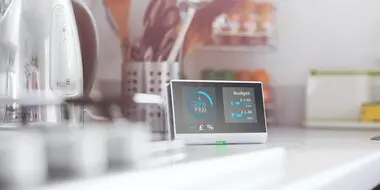
スマートウォッチ、ウェアラブル端末、医療機器、自動車のダッシュボードなど、リソースに制約のあるデバイスのメーカーは、もはや表示用に低品質のビットマップフォントを使用する必要はありません。Monotype Spark ソリューションは、スケーラブルな書体と高品質の多言語フォント表示の利点を組み込み環境にもたらします。
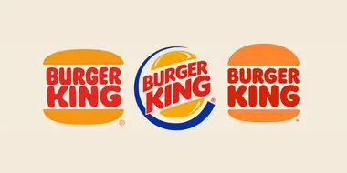
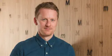
Monotype Studioのシニア・クリエイティブ・タイプディレクター、Phil Garnhamが、デジタルにおける書体の進化を探り、Burger Kingのリブランディングの中心にある伝統を称賛します。

人々、そしてブランドがデジタル主導の体験へと急速に移行し続ける中、人間味あふれるパーソナルなオンラインプレゼンスは大きな違いを生み出すでしょう。デザインがどのようにそれを可能にするのか、その方法をご紹介します。
家で料理をしていて、レシピにぴったり合う完璧な材料を見つけて嬉しくなったことはありませんか?たとえば、コリアンダーや砕いたピーナッツ、レモン果汁などが思いがけず手元にあって、それが料理をワンランク引き上げてくれる、まさに必要だったものだった、というようなことです。
すべての顧客接点でブランドの一貫性を保つ最善の方法とは?それは、すフォントを統一して使うことです。しかし、フォントの不一致は意外とよくある問題です。このガイドを使って、そうした不一致を見つけ、すばやく解決する方法を学びましょう。詳細はこちらから。