注目の記事
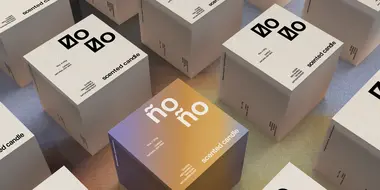
Shorai Sansは、幾何学的な形状が特徴のMonotypeの日本語書体です。Monotypeクリエイティブタイプディレクター小林章とタイプデザイナー土井遼太、そして書体デザインの第一人者、中村征宏氏を制作メンバーに迎え開発されました。

7年ぶりにウェブサイトのデザインを変更したTED(Technology Entertainment Design)は、TED TALKで語られる情熱的なスピーチとその素晴らしいアイデアを伝えるのにふさわしい書体としてNeue Helveticaを採用しました。


本記事では、さまざまなジャンルの最近出版された書籍や近々発売される予定の本を通じて、現在出版業界でトレンドとなっているタイポグラフィスタイルを垣間見ます。この投稿は、著者と出版専門家をつなぐウェブサイト「Reedsy」の仲間たちによるゲスト投稿です。

今日のブランドは、急速に進化するデジタル世界に対応しながら、パンデミックの最悪の影響からまだ脱しつつある「新しい日常」を乗り越える必要があります。この数年間で、すべての人のデジタルに対する期待やブランドの運営方法が変化し、一部ではビジネスモデルにも影響を与えました。さらに、生物多様性、持続可能性、多様性と公平性、そしてブランドアクティビズムといった課題がますます注目を集めています。これらの要素は、ブランド構築にどのように影響するのでしょうか。これらの大きな変化は、企業が自らをどのように位置づけるか、どのようなサービスを提供するか、そして顧客とどのようにコミュニケーションを取るかに大きな影響を与えています。
多くの企業は、まずフリーフォントを使ってスタートします。何といっても無料なのですから。さらに、フリーフォントは一般的にオープンエンドのライセンス形態で提供されており、ほとんどあらゆる場面で使用できます。しかし、企業が成長するにつれて、フリーフォントの欠点——たとえば文字セットの不完全さや、使い古されていてありきたりな見た目・印象など——が次第に目立つようになります。
Monotype Fontsに関するよくある質問にお答えします。サブスクリプションの特徴から用語の定義まで、導入前に知っておくべき情報をこのFAQでご確認ください。
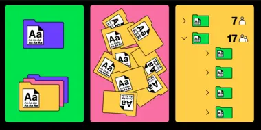
Monotype Fonts は、すべてを一つのプラットフォームに集約し、不透明になりがちな業務の一部に透明性とコントロールをもたらします。
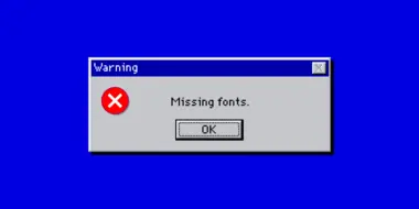
誰もが「虹色の回転ホイール(いわゆる死のビーチボール)」を知っていますが、「フォントが見つからないエラー」はどうでしょうか? これもまた、作業を進めようとするデザイナーにとっては同じくらいフラストレーションのたまる問題です。さらに、それはエージェンシー全体の業務に悪影響を及ぼし、クライアントからの信頼を損なうリスクもあります。
多くの人はフォントを固定されたデザイン要素と考えていますが、実際にはフォントも定期的に更新されるソフトウェアの一種です。修正や機能追加、改良などが行われており、長期的に見てもユーザーにメリットをもたらすものです。
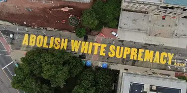
本質的に、書体は物語を語る存在です。文字の形はメッセージを伝えます。そして、そのようなメッセージは、抗議のためにコミュニティ主導でデザインされた形において、最も純粋な形で表現されることがあります。
あなたのメッセージに、人間味と誠実さを持たせることが、これまで以上に重要になっています。そして、書体があなたのブランドの声であるなら、それが正しいことを語っているかを確認することは、さらに重要です。
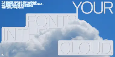
VPNは会社のネットワークを保護するために優れたツールかもしれませんが、フォント管理には時代遅れの方法です。VPNを使用すると、クリエイティブの生産性が低下し、ワークフローが妨げられることで、結果的に貴重な時間とコストのロスを招いてしまいます。より効率的でスムーズなフォント管理の方法を検討してみませんか?