Wolpe Tempest™
Part of The Wolpe Collection
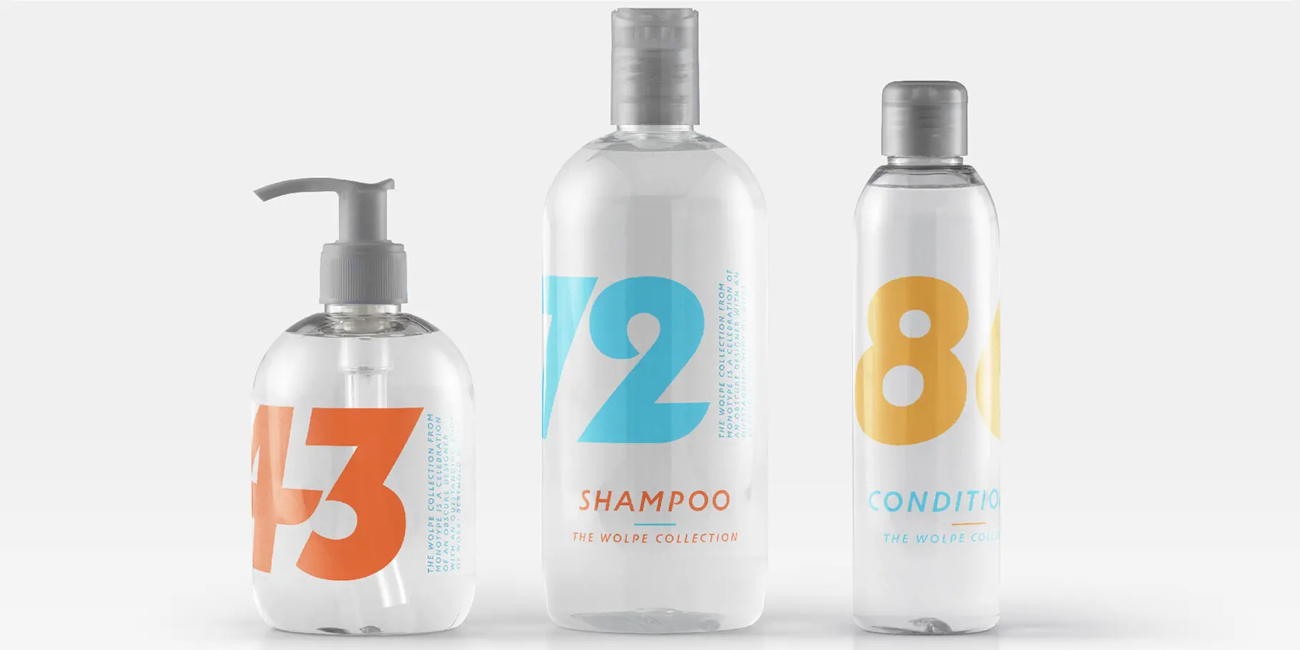
Part of The Wolpe Collection
Wolpe Tempest is part of The Wolpe Collection of typefaces, and like it’s original design, sets itself apart from formal and static sans-serif italic type designs. The Wolpe Collection celebrates Berthold Wolpe’s outstanding body of work, and includes five iconic typefaces, digitized and updated by Toshi Omagari of the Monotype Studio.
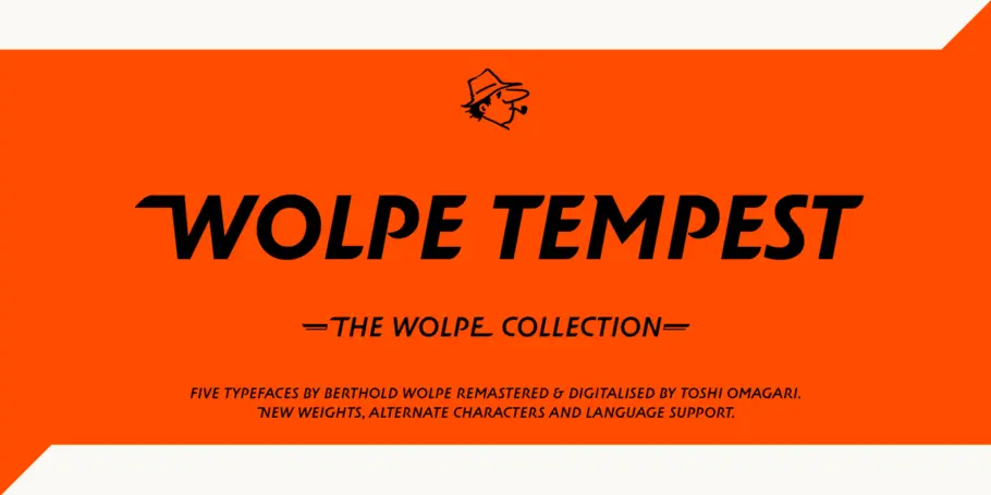

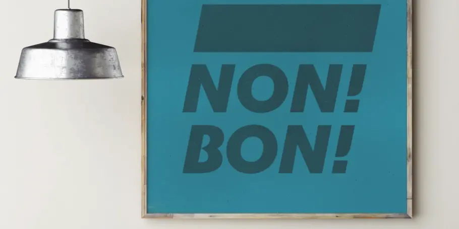
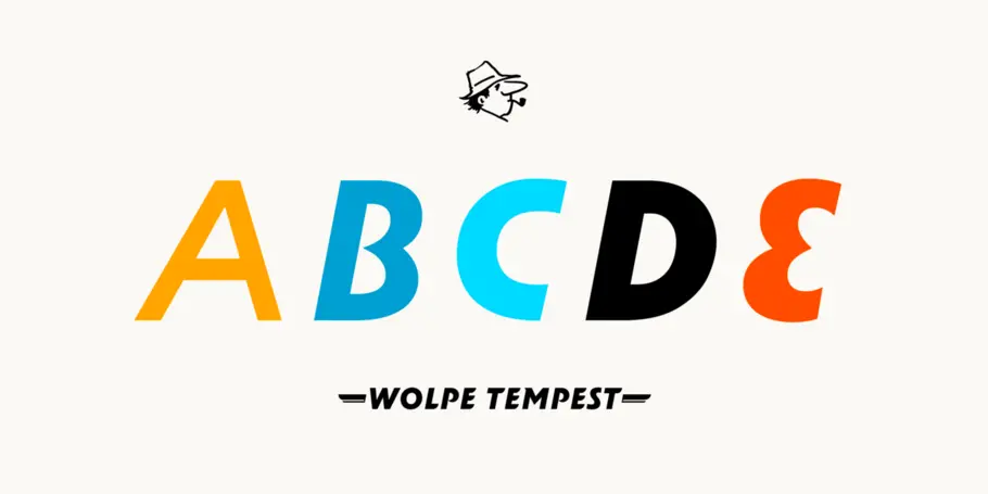
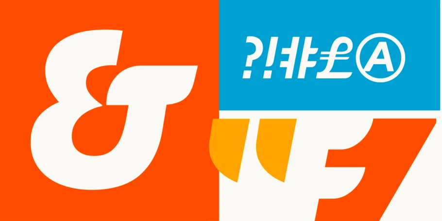
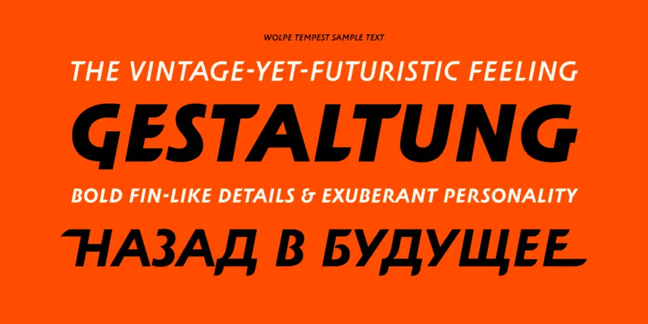
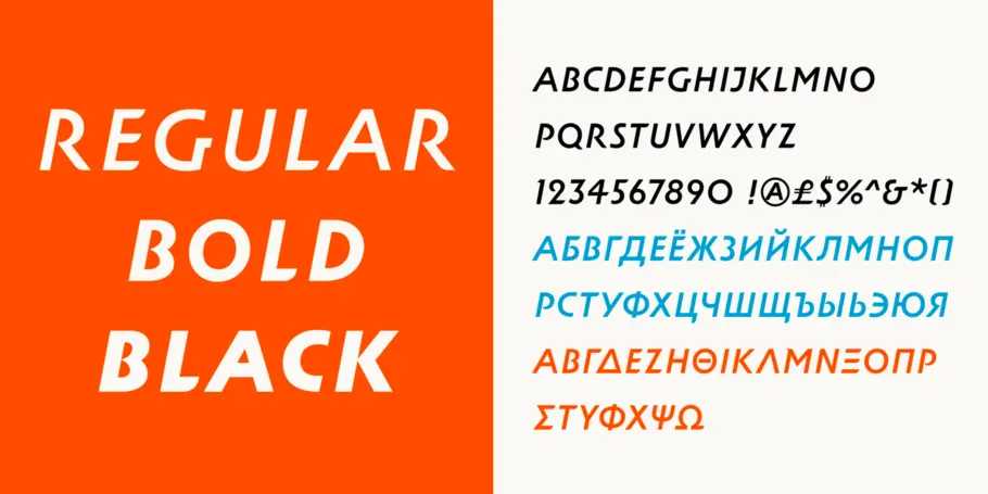
Wolpe Tempest is part of The Wolpe Collection of typefaces, and like it’s original design, sets itself apart from formal and static sans-serif italic type designs. The Wolpe Collection celebrates Berthold Wolpe’s outstanding body of work, and includes five iconic typefaces, digitized and updated by Toshi Omagari of the Monotype Studio.
Berthold Wolpe saw book jackets as small posters, whose job was to make an immediate impact in a busy and competitive visual field. Tempest Titling, as it was known, was one of the typefaces that grew out of Wolpe’s hand-lettering for a Fanfare Press book cover. It shares some similar DNA with Wolpe’s best known typeface, Albertus, but it has a personality and energy all its own.
Digitizing Tempest for the first time, Toshi made no changes to Wolpe’s basic alphabet, but created a small group of alternate letters with extravagant swashes – flourishes on entry and exit strokes – for adding extra dash to book titles, logotypes and headlines. He also developed regular, bold and black weights, taking care to preserve the original Tempest’s unmistakable profile and skeleton. “You can’t go too thin because the round endings disappear, and they are what give Tempest its character. The energy of the strokes diminishes with weight.”

Berthold Wolpe helped shape graphic design in post-war Europe. His book jackets, with their intense colour and vivacious typography, were way ahead of their time, and his Albertus® typeface continues to be widely admired and used by designers today.

With a focus on multilingual typography, Senior Type Designer Toshi Omagari has created fonts for several major brands and worked on some of Monotype’s most recent major type releases. He is a regular speaker at events like ATypI, sharing his experience and insights on multilingual type design.
We offer a number of ways for you to start working with our typefaces.
The H&M custom font family speaks stylishly across all brand communications— from large in-store graphics to smaller type for their website.
Monotype worked with noted illustrator Sir Quentin Blake and his team to recreate his handwriting as a bespoke typeface.
