A typeface that defined a movement.
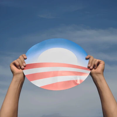
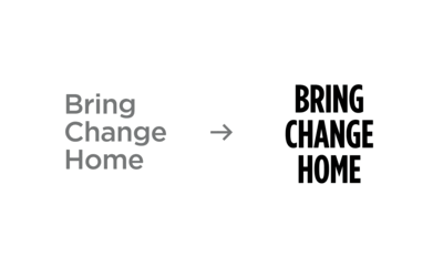
Few typefaces are as deeply connected to a cultural moment as Gotham. Once chosen as the keystone typeface for the Obama for America campaign in 2007, Gotham Bold became synonymous with the campaign’s message of hope and change. Its bold, open, and disciplined forms reflected the candidate’s personality and resonated with millions. Today, as the Obama Foundation continues to evolve, so does its brand identity—adding a new chapter to Gotham’s rich history.
Gotham Bold became the visual representation of a campaign that reshaped political branding. Its geometric simplicity masked a sophisticated optical structure, creating a balance between clarity and approachability. That same balance made it the natural choice for the Obama Foundation, which carried Gotham forward into President Obama’s post-White House initiatives.
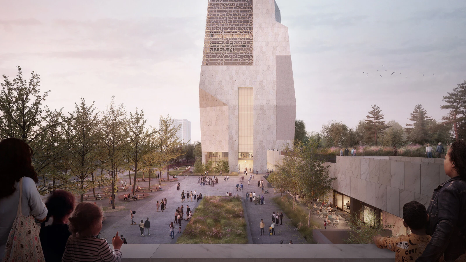
As the Foundation expanded its programs and prepared for the launch of the Obama Presidential Center, it became clear that its typography needed to evolve to match its growing mission. The challenge: refreshing Gotham in a way that retained its essence while introducing new energy and flexibility.
Creating a vision for a modern identity.
To bring a refreshed brand identity to life, the Foundation’s agency partner, Manual Creative, developed a strategy that would include customized versions of Gotham for use in different settings and programs. The goal was to extend Gotham’s voice and create distinct yet connected personalities for each of the different facets of the Foundation’s work.
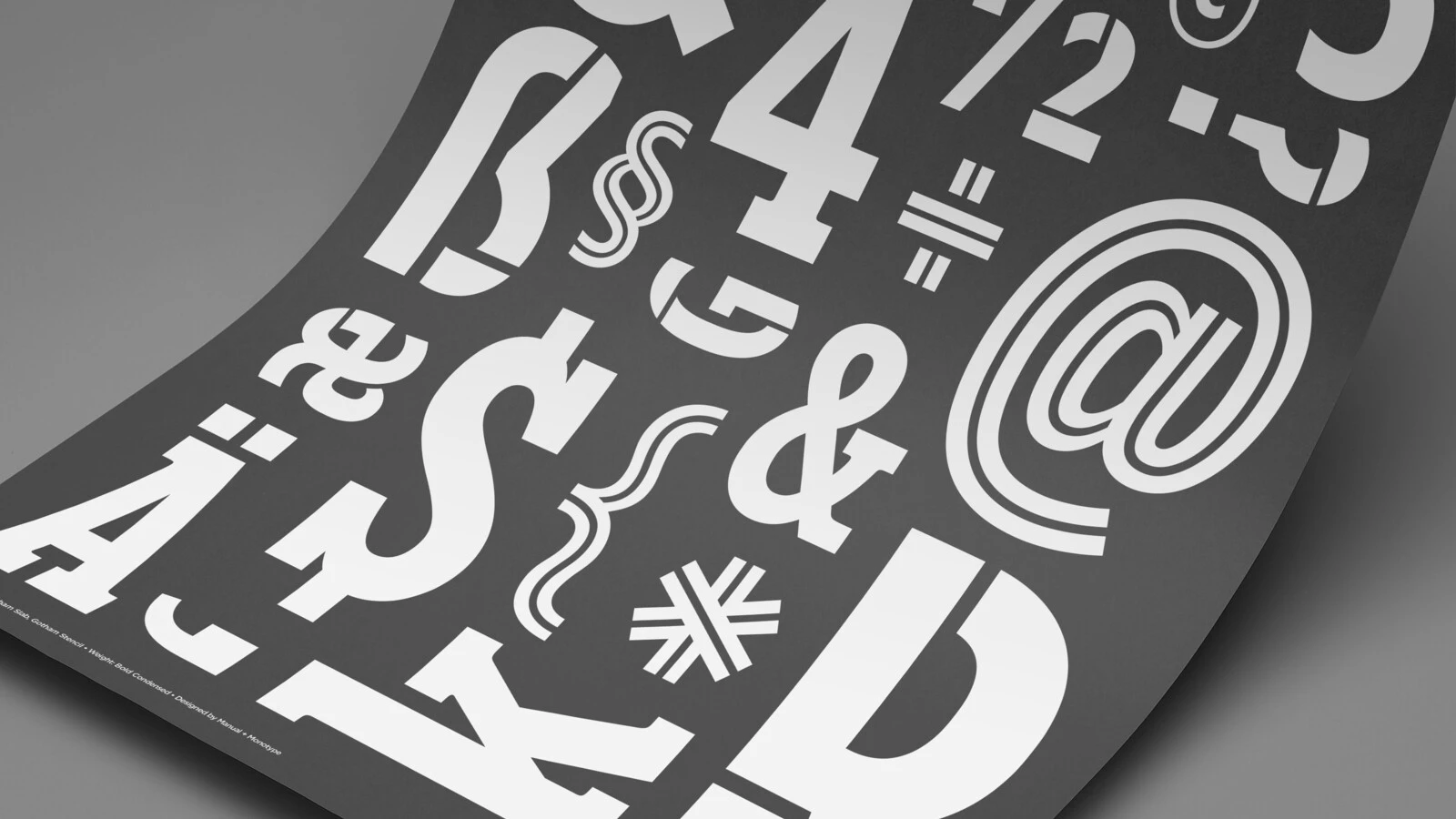
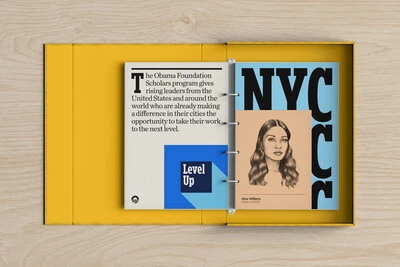
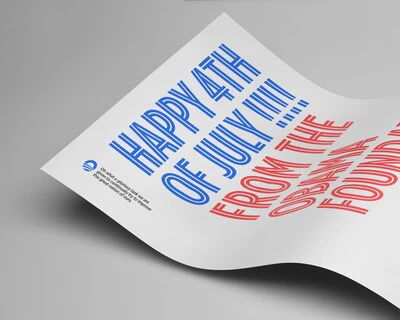
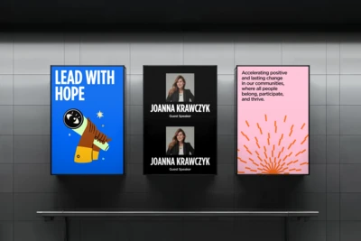
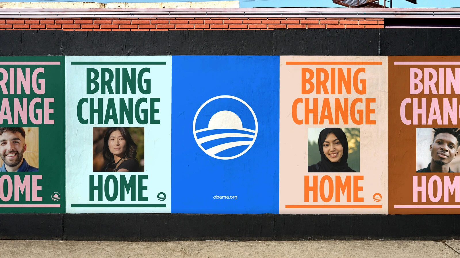
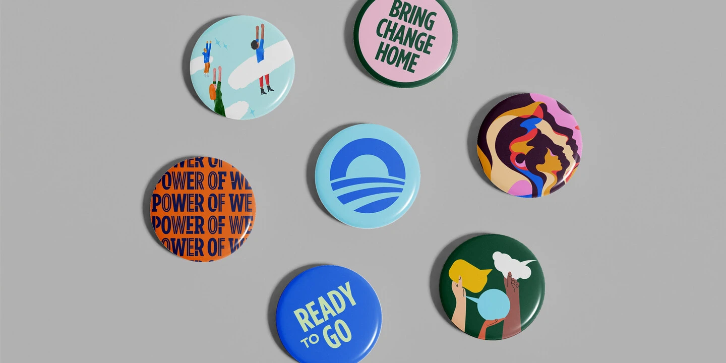
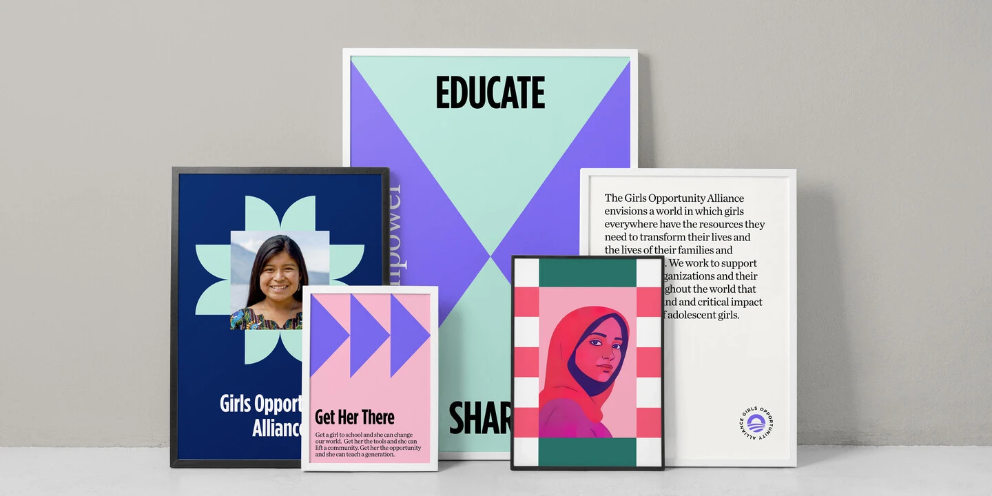
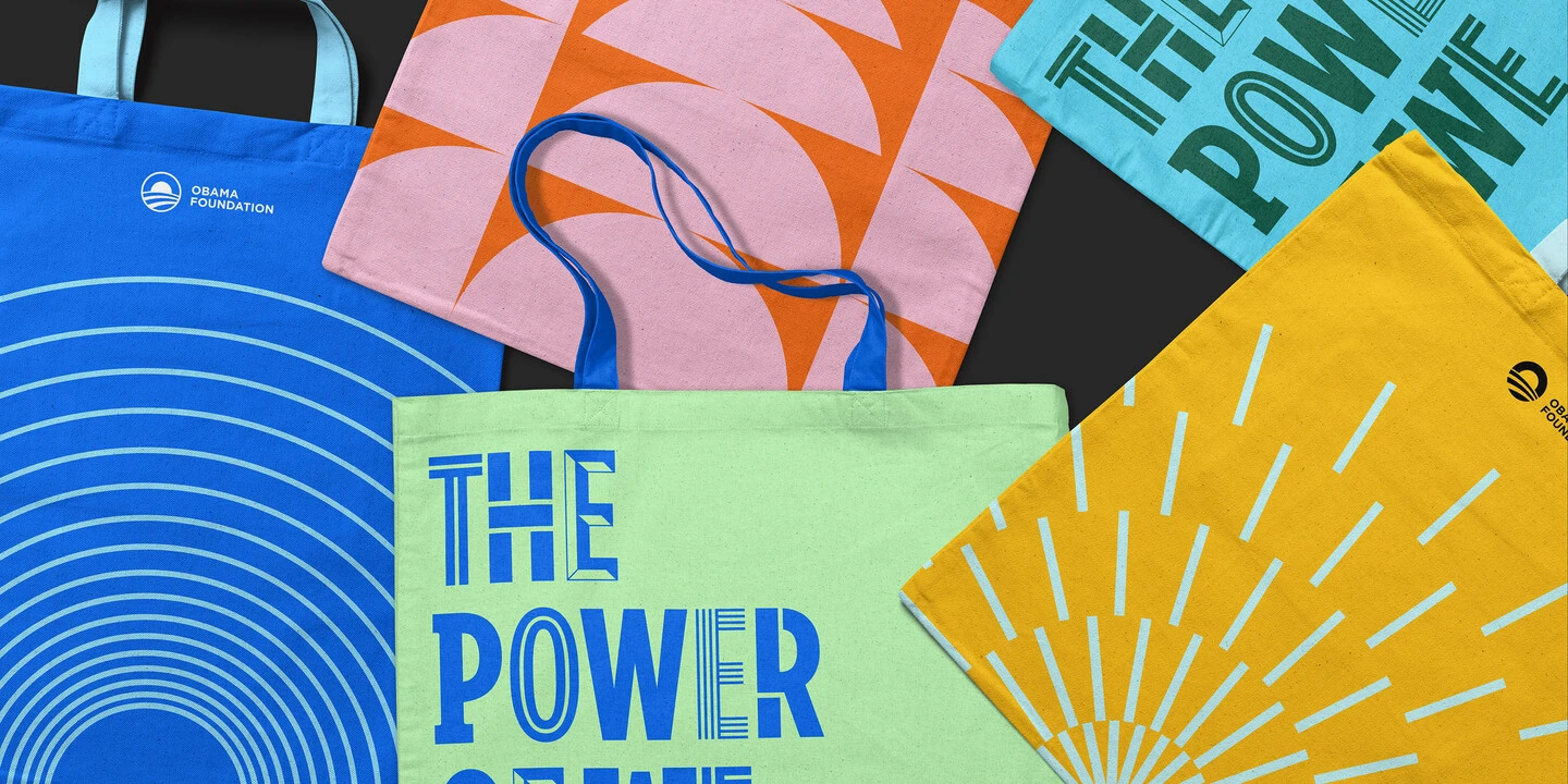
The result was a shift toward Gotham Condensed Bold as the primary type style, complemented by three custom variations designed for specific messaging:
- Gotham Inline – A vibrant, high-energy style used in athletic and sports-related communications.
- Gotham Slab – A nod to historical Americana, reinforcing themes of democracy, education, and civic engagement.
- Gotham Stencil – A contemporary take on the stencil aesthetic, symbolizing community engagement and sustainability.
Each of these new styles allows the Obama Foundation to communicate with clarity and impact while maintaining a cohesive brand identity.
Obama Slider 1
The craft behind the customization.
Monotype’s involvement went beyond execution—Manual Creative and Monotype worked in true partnership, blending the agency’s design vision with Monotype’s typographic expertise. Monotype Creative Type Director, Sara Soskolne, who has been involved with every Gotham expansion since 2005, brought her deep understanding of the typeface’s DNA to the project.
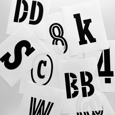
Each variation presented unique design challenges as the bold, condensed structure required careful optical refinements to maintain balance and legibility in all three styles. Adding slab serifs disrupted its dense, vertical texture and inevitably required many shapes to be substantially redrawn; inline styling had to be reconsidered mid-process to avoid awkward intersections, and the stencil variation demanded an unconventional, organic approach rather than a rigid pattern.
Despite these challenges, the process was seamless. “Smoother than imagined,” as Tom Crabtree, Creative Director at Manual described it. “The collaboration between our design team and Sara specifically was great … just a lot of trust on both sides. Sara got our vision, what we were trying to do and we just said, well, we trust you to craft it with us.” Monotype’s experience with layered, collaborative projects ensured that every adaptation stayed true to Gotham’s integrity while meeting the Foundation’s specific needs.
A typeface—and a brand—built for the future.
The Obama Presidential Center is a forward-looking institution designed to inspire future leaders. Its typography reflects that vision—dynamic, impactful, and deeply tied to the Foundation’s mission.
By expanding Gotham’s range, the Foundation now has a typographic system that supports its evolving programs while staying true to the identity that first captured the public’s imagination. The collaboration between Manual Creative and Monotype ensured that every new variation of Gotham was crafted with care, balancing history with innovation.
As the Obama Foundation continues its important work, its typography will remain a vital part of how it communicates—just as it has from the beginning.
Imagery courtesy of Manual Creative.