注目の記事
Shorai Sansは、幾何学的な形状が特徴のMonotypeの日本語書体です。Monotypeクリエイティブタイプディレクター小林章とタイプデザイナー土井遼太、そして書体デザインの第一人者、中村征宏氏を制作メンバーに迎え開発されました。

7年ぶりにウェブサイトのデザインを変更したTED(Technology Entertainment Design)は、TED TALKで語られる情熱的なスピーチとその素晴らしいアイデアを伝えるのにふさわしい書体としてNeue Helveticaを採用しました。


本記事では、さまざまなジャンルの最近出版された書籍や近々発売される予定の本を通じて、現在出版業界でトレンドとなっているタイポグラフィスタイルを垣間見ます。この投稿は、著者と出版専門家をつなぐウェブサイト「Reedsy」の仲間たちによるゲスト投稿です。

今日のブランドは、急速に進化するデジタル世界に対応しながら、パンデミックの最悪の影響からまだ脱しつつある「新しい日常」を乗り越える必要があります。この数年間で、すべての人のデジタルに対する期待やブランドの運営方法が変化し、一部ではビジネスモデルにも影響を与えました。さらに、生物多様性、持続可能性、多様性と公平性、そしてブランドアクティビズムといった課題がますます注目を集めています。これらの要素は、ブランド構築にどのように影響するのでしょうか。これらの大きな変化は、企業が自らをどのように位置づけるか、どのようなサービスを提供するか、そして顧客とどのようにコミュニケーションを取るかに大きな影響を与えています。
近年の書体技術の進歩を背景、ブランドや代理店にとってバリアブルフォントの現実を探求する時が訪れています。
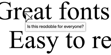
デザインに最適な書体は、あなたの存在を際立たせる力を持っています。しかし、何十万ものフォントがあり、それぞれが独自に設計されています。では、どうすれば、これだと思えるものを見つけることができるのでしょうか?
フォントは多くの場合、顧客が最初に目にするブランディング要素です。メッセージに形を与え、24時間365日、顧客にブランドの声を届ける存在とも言えます。では、あなたのブランドのフォントはどのような印象を与えているでしょうか? この動画で、注目すべきポイントを確認してください。

契約書に署名する前に、一字一句すべてに目を通すのがベストプラクティスであることに疑いの余地はありません。とはいえ、人生は短いので、法務部門に法律的な文書の精読を任せてしまいたくなる気持ちも理解できます。ですが、エンドユーザー使用許諾契約(EULA)は、特定の条項に注意を払って読めば、実は非常にシンプルで理解のしやすいものなのです。
Monotypeのニューヨークオフィスで行われたHelvetica® Nowの発表会で、Monotypeのシニア・エグゼクティブ・クリエイティブ・ディレクター Charles Nixが、この象徴的な書体におけるリデザインのプロセスを紹介しました。
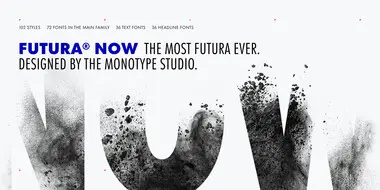
書体のアイコンに新しい生命を吹き込むという趣旨のもと、Monotype Studioでは、デザイナーが新鮮な目でクラシックな書体を見る機会を提供する、愛用されているフォントファミリーの決定版についてご紹介します。
この多用途な書体ファミリーの現代版は、90年にわたる歴史を持つ、最も人気のある書体のひとつを整理し、統一感のあるものとして再構成しています。これまで扱ってきたどのデジタル版よりもオリジナルに忠実であり、バリアブルバージョンを含む37の新しいスタイルに命を吹き込んでいます。
Monotype Fontsは 、クリエイターが書体を扱い際に直面しがちな多くの複雑さを解消するように設計されています。では、Monotype Fontsはクリエイティブチームのワークフローをどのように簡素化できるのでしょうか? Monotype Fontsのサブスクリプションには、いくつのフォントが含まれているのでしょうか? どのようなフォントにアクセスでき、どのようなプロジェクトで使用できまるのでしょうか?
私たちの世界の物語は、文字でつづられています。フォントの検索や共有、ライセンスの取得、トレンドへの対応、優れたブランドの構築まで、Monotype Fontsでデザイナーの作業がいかに楽になるかをご覧ください。この動画を見て、あなたの人生が変わるかもしれません。