注目の記事
Shorai Sansは、幾何学的な形状が特徴のMonotypeの日本語書体です。Monotypeクリエイティブタイプディレクター小林章とタイプデザイナー土井遼太、そして書体デザインの第一人者、中村征宏氏を制作メンバーに迎え開発されました。

Find design inspiration in an age of information overload.

In this article, get a peek at recent and upcoming book releases in a variety of genres to get a sense of what typography styles are trending in publishing right now. This post is a guest piece from our friends at Reedsy, a website that connects authors with publishing professionals.

Today’s brands must keep up with a fast-paced digital world and navigate a “new normal” that’s still emerging from the worst of the pandemic. The last few years shifted everyone’s digital expectations, how brands operate, and in some cases, impacted their business models. Moreover, issues like biodiversity, sustainability, diversity and equity, and brand activism are all booming. So how does this all impact brand building? These macro shifts are greatly influencing how companies position themselves, the services they offer, and how they communicate with their customers.

Type& 2022 Day 1、Session 1の前半、株式会社ブリヂストン 酒本氏のプレゼンテーションのレポート。ケーススタディよりさらに詳しくコーポレートフォント制作について解説。
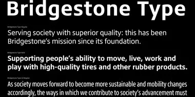
Monotypeは、タイヤ・ゴム業界におけるグローバルリーディングカンパニー、株式会社ブリヂストンの欧文コーポレートフォントを制作しました。
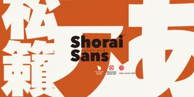
Shorai Sansは、幾何学的な形状が特徴のMonotypeの日本語書体です。Monotypeクリエイティブタイプディレクター小林章とタイプデザイナー土井遼太、そして書体デザインの第一人者、中村征宏氏を制作メンバーに迎え開発されました。

2019年から、Monotypeは斬新でクリエイティブな書体づかいで印象に残るブランドアイデンティティを構築した企業に「Type Champions Award」を贈っています。このたび、第2回となる2020年度の受賞者が決定いたしました。
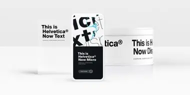
リリースから60年、Helvetica®はその明快さと中庸さで常に人気を誇ってきました。しかし多くの書体にたがわず、時代や技術の変化とともに、この書体に求められるものも増えてきました。スイスデザインのシンプルさを体現したHelveticaは、これまで以上にさまざまな場面、さまざまなサイズでの活躍が期待されています。
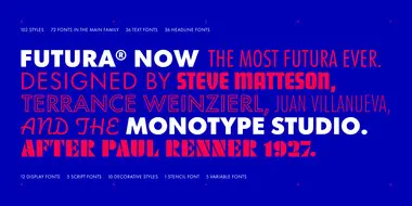
Futura Nowは、Paul Rennerによる幾何学的サンセリフ書体の名作、Futuraをオリジナルに忠実に改刻し、現代のデザインニーズに合わせてファミリーを大幅に拡張した、まさにFuturaの決定版といえるものです。
Fonts in games have a subjective role, helping to convey the theme and atmosphere of a game while shaping expectations about its content. And there’s the more practical job of conveying information quickly, legibly, on any kind of screen and in multiple languages, so that no one gets left behind or in the lurch.