Choosing game fonts is an assault course of vital design decisions

When the race is on or the bullets are flying, there are more important things on a gamer’s mind than the fonts of text and titles. But get them wrong and gamers will be sure to let you know. Subliminally, the design of the scores and instructions in an interface can have a huge impact on the gaming experience.
Fonts in games have a subjective role, helping to convey the theme and atmosphere of a game while shaping expectations about its content. And there’s the more practical job of conveying information quickly, legibly, on any kind of screen and in multiple languages, so that no one gets left behind or in the lurch.
Monotype works with game developers to create fonts that fit right into their worlds, establishing atmosphere, conveying instructions and delivering scores.
Atmosphere
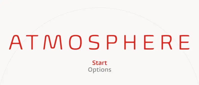
You can create the greatest game the planet has ever seen, but if the branding, box art and promotion don’t cut it, no one’s going to know. Getting your game’s theme, atmosphere and novelty across on a shop shelf or poster is a tough task. Branding matters, whether it’s for a title, a franchise or a studio. Some type styles have become clichés in entertainment media — the geometric san serif for sci-fi titles is one. Putting a twist on them can make all the difference in crowded genres. And developing branding that’s a good partner to the in-game type will make for a satisfying overall experience.
Instruction
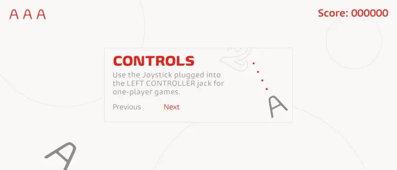
What makes a great brand or blurb for a game isn’t the same as what makes good in-game text. Expressive type will do the job of attracting attention, recognition and interest, but it’s not what gamers are looking for in the thick of the action. For on-screen text at small sizes, a complementary but more functional, legible font will score highly. Legibility is far from an exact science. There are competing variables to weigh up, such as x-height, caption weight and screen quality. And two that require the closest management: scale and expected viewing distance. TVs need larger type and heads-up displays suit outline or shadow text.
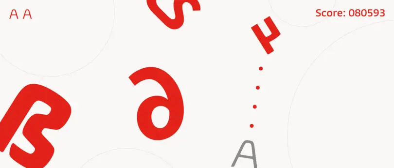
Designing for Screens
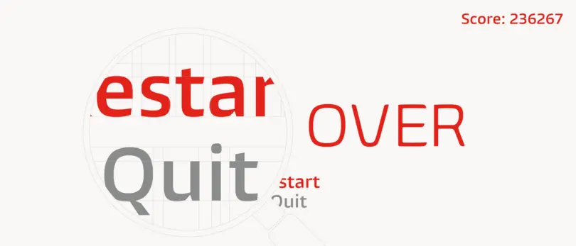
As long as they’re made of pixels, screens will never be as good at displaying text as the printed page. But with the right rendering and optimization software to enhance performance and legibility, they can get close. And they can give a game the edge by providing a consistent experience across all devices. To do that, letterforms need to stay sharp in different digital environments. A taller x-height gives letters more pixels to work with. Looser spacing can correct pixel overlap, and low stroke contrast keeps all letter parts at least as wide as a pixel, so they don’t disappear.
Localisation
Localization is about more than just good translation for different markets. There’s the important matter of making sure the font you choose is equipped with a full character set for every language. Open source fonts often don’t have what it takes. For example, they can’t offer the coding support to make character-based languages like Chinese and Arabic usable and legible. Quality control can be a headache if two or more fonts are needed on the screen at once, or when more than one language lives in a single font file. Monotype’s design support can make sure you have all languages covered, and, if needed, extend your chosen font to cover all the required characters.
We’re champions at gaming fonts
- Dedicated team of designers and engineers to collaborate with your game developers
- An extensive catalog of gaming fonts to choose from
- Type designers to create or customize fonts specifically for your game
- Comprehensive language/localization support for internationally marketed games