Neue Haas Unica
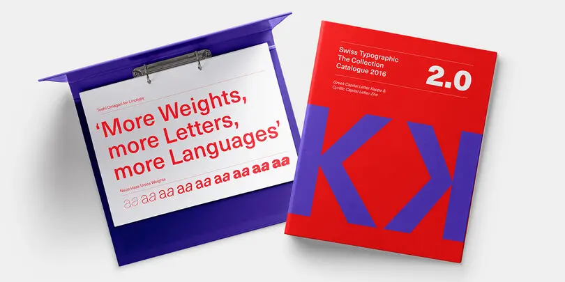
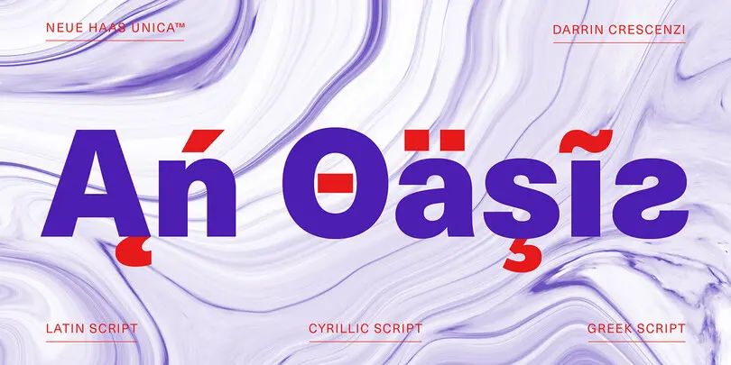
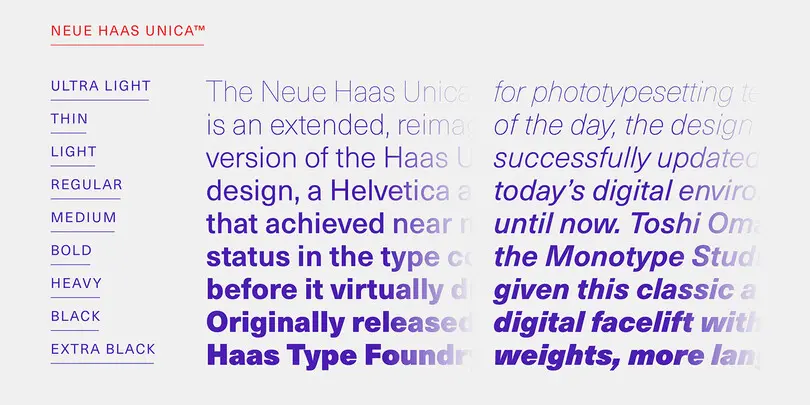
The Neue Haas Unica™ family is an extended, reimagined version of the Haas Unica® design, a Helvetica® alternative that achieved near mythical status in the type community before it virtually disappeared. Originally released in 1980 by the Haas Type Foundry, the design was never successfully updated for today’s digital environments – until now.
Metro Nova
Rescued from obscurity by Doug Wilson, and restored by designer Toshi Omagari, Metro Nova distills the idiosyncrasies of Dwiggins’ Metro No. 1 into a new family that retains Metro’s inimitable sense of character, while still appealing to current design sensibilities. With seven regular weights, from thin to extra black, and six condensed weights, Metro Nova offers a contemporary take on a classic piece of design, updating the hand of Dwiggins’ for a new generation of designers.
Mundo Sans
Mundo Sans, by Carl Crossgrove for the Monotype Studio, is distinctive, approachable – and ready to tackle jobs both big and small. Its open counters and large x-height, which give the design a straight-forward no-nonsense mien, are softened by inviting calligraphic undertones. With 10 weights and a complementary suite of cursive italics, there is little outside the range of the Mundo Sans family.
DIN Next Slab
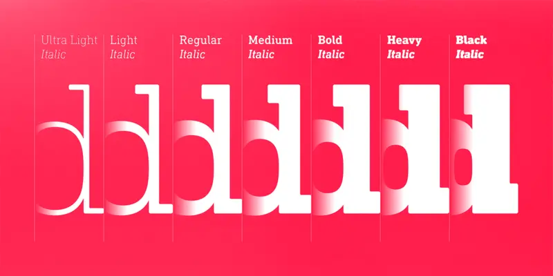
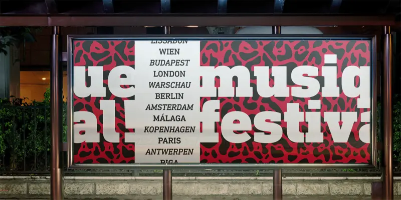
DIN Next Slab, also produced under the direction of Akira Kobayashi, the typeface is a variant based on the optimized shapes of DIN Next. The expansion will make the popular font all the more flexible and versatile. Apart from that, the geometric slab serifs underline the technical and formal nature of the font and emphasize a central design element of DIN Next.
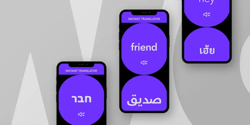
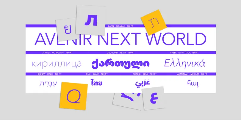
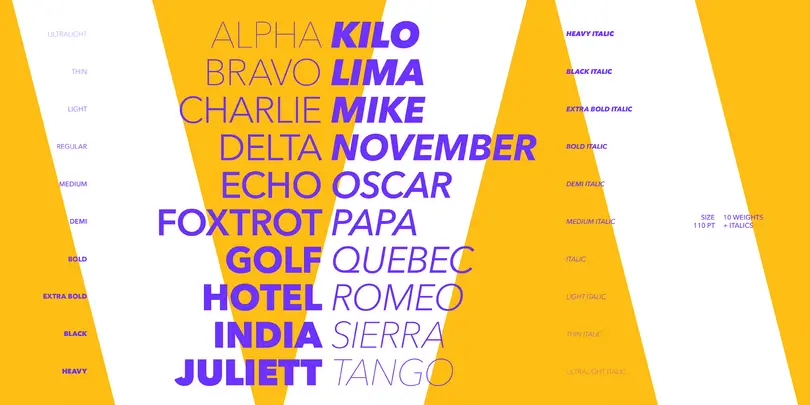
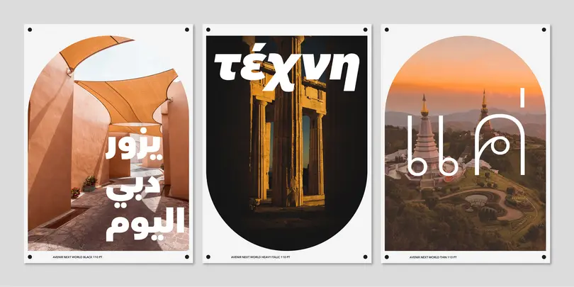
Avenir Next World
Neue Frutiger World
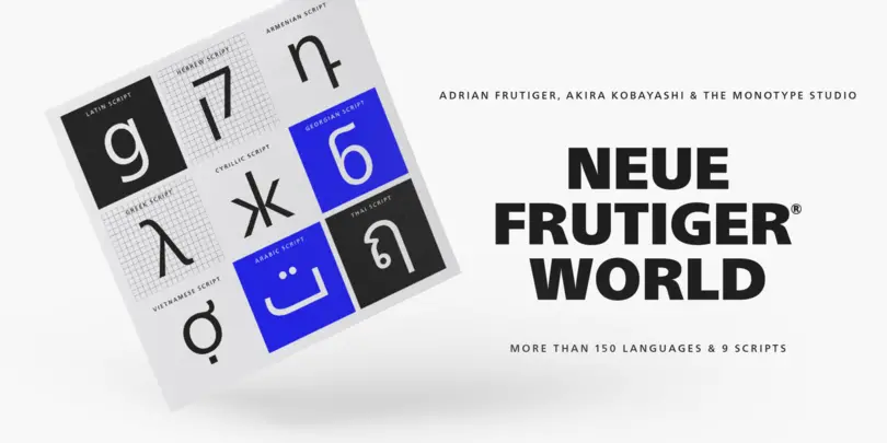
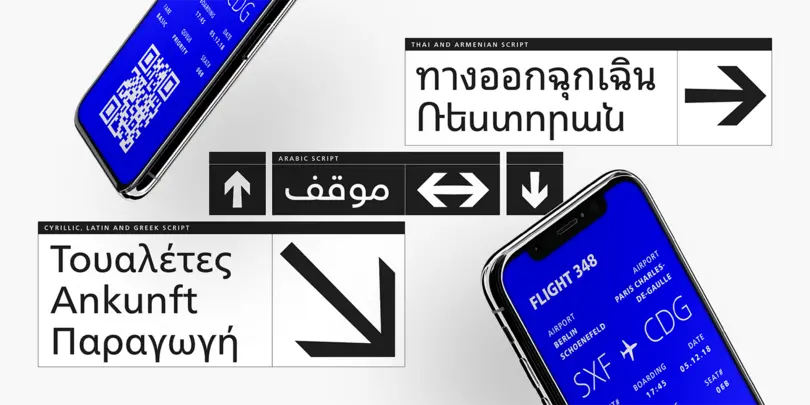
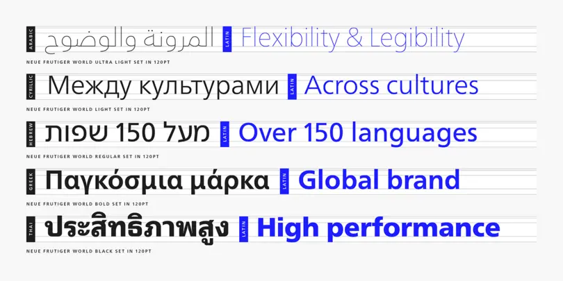
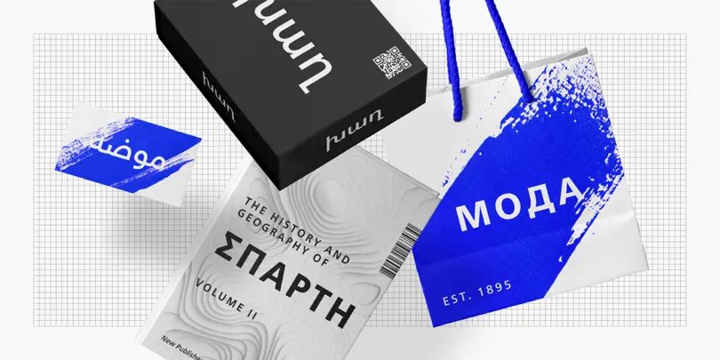
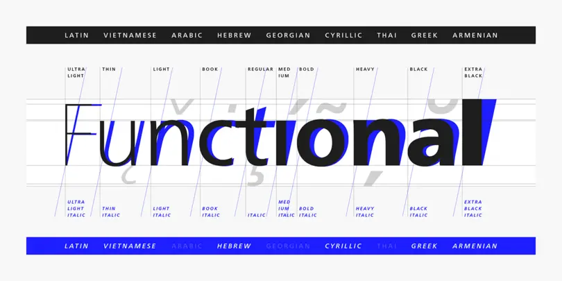
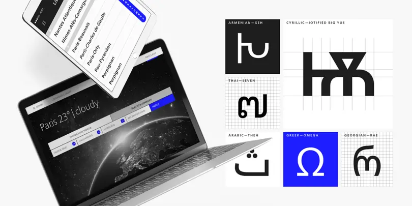
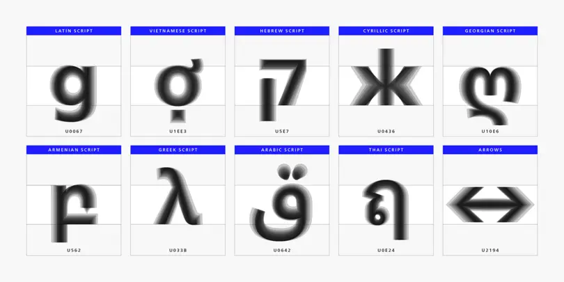
Neue Frutiger World is designed for global use with an impressive range of 10 weights, from Ultra Light to Extra Black, with matching italics. It embodies the same warmth and clarity as Adrian Frutiger’s original design, but allows brands to maintain their visual identity, and communicate with a consistent tone of voice, regardless of the language. Neue Frutiger World supports more than 150 languages and scripts including Latin, Greek, Cyrillic, Georgian, Armenian, Hebrew, Arabic, Thai and Vietnamese.
H&M
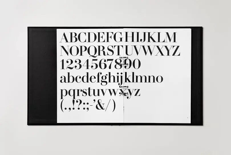
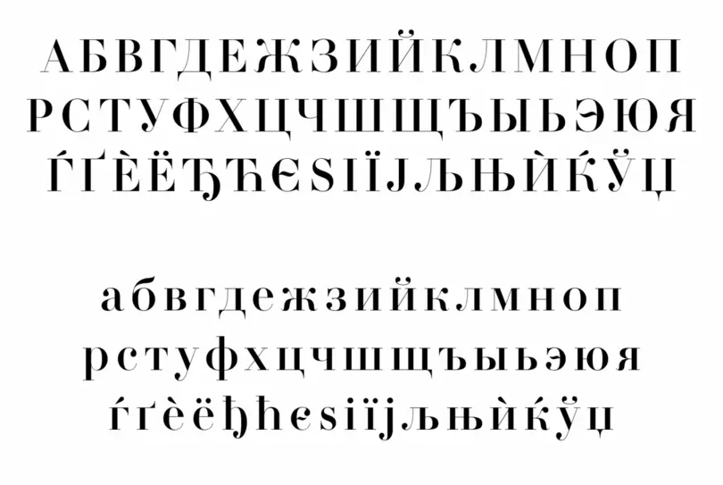
Swedish clothing brand H&M’s branding materials cover everything from advertising and catalogs, to packaging, films and signage. Although H&M was already working with a bespoke sans-serif typeface design called HM Ampersand – which was also designed by Monotype – it wanted to develop a fuller typographic language that it could use in a range of contexts around the world.
