


Typography terms and definitions.
Jump to: A, B, C, D, E, F, G, H, I, J, K, L, M, N, O, P, R, S, T, U, V, W, X.
A
Accents.
Alternates.
Different shapes (or glyphs for the same character in a typeface, for example small caps, swash characters, contextual alternates, case-sensitive forms, etc.
Anti-aliasing.
Blurring the edges of a font on screen to soften the look of bitmapped type. Anti-aliasing is usually desirable at large point sizes (16 points or above).
Antiqua.
The common German and Scandinavian names for serif faces, as opposed to “Grotesk” which means sans serif face. The Scandinavian name is “Antikva”.
Aperture.
The partially enclosed, somewhat rounded negative space in some characters such as ‘n’, ‘C’, ‘S’, the lower part of ‘e’, or the upper part of a double-storey ‘a’. Specifically the opening to the counter space.
Apex.
The point at the top of a letter where two strokes meet, for example in the capital ‘A’.
Arc.
Any curved contour of a letter.
Arm.
The horizontal stroke in a character that does not connect to a stem at one or both sides.
Ascender.
Any part in a lowercase letter that extends above the x-height, found for example in ‘b’, ‘d’, ‘f’, ‘h’, ‘k’, etc. Some types of ascenders have specific names.
Axis.
An imaginary line drawn from top to bottom of a glyph bisecting the upper and lower strokes is the axis. The slant of the axis (or lack thereof) often helps determine the type classification.
B
Backslant.
Characters that lean to the left, as opposed to italic or slanted characters that lean to the right.
Ball Terminal.
A terminal that resolves into circular shape.
Bar.
The horizontal stroke in characters such as A, H, R, e, and f.
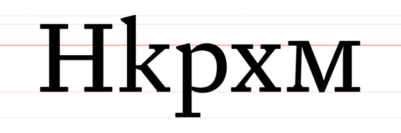
Baseline.
The imaginary line upon which the letters in a font appear to rest.
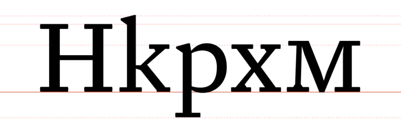
Letters appear to sit on the baseline, shown in red, with the exception of letters with a descender, such as the lower-case “p.” Photo credit: Fontshop.com.
Beak.
A triangular, serif-like protrusion at the end of a stroke in certain serif type designs.
Body.
Originally the physical block on which each metal character sat, in digital type it is the imaginary area that encompasses each character in a font. The height of the body equals the point size; its width is the letterform plus its sidebearings.
Bowl.
The curved part of the character that encloses the circular or curved parts (counter) of some letters such as ‘d’, ‘b’, ‘o’, ‘D’, and ‘B’.
Bracket.
The bracket is a curved or wedge-like connection between the stem and serif of some fonts. Not all serifs are bracketed.
C
Cap height.
The height from the baseline to the top of the uppercase letters (not including diacritics).
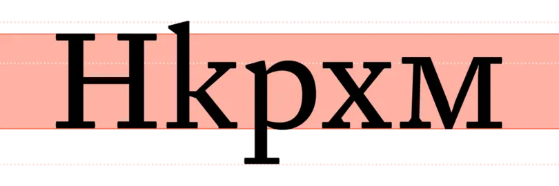
Cap height is the height from the baseline to the top of the uppercase letters. Photo credit: Fontshop.com.
Case sensitive.
The position of a number of punctuation marks like hyphens, brackets, slashes etc. is centered on the x-height of the lowercase letters. Fonts with case-sensitive punctuation also have slightly raised alternates of these characters that are centered on the cap height (the height of the capital).
Character.
Any letter, numeral, punctuation mark, and other sign included in a font. Some characters can be represented by more than one glyph.
Contextual.
Feature-rich OpenType fonts can detect certain characters or character combinations before and/or after specific characters and substitute them with alternate glyphs or ligatures according to the context.
Counter.
The enclosed or partially enclosed circular or curved negative space (white space) of some letters such as d, o, and s is the counter.
Crossbar.
The (usually) horizontal stroke across the middle of the uppercase ‘A’ and ‘H’.
Cross stroke.
The (usually) horizontal stroke that intersects the stem of the lowercase ‘f’ and ‘t’.
Crotch.
The inside of a narrow angle where two strokes in a character meet, as in V, W, Y.
D
Delta hinting.
Instructions added to a TrueType font, allowing it to display nicely at any point size on screen. Delta hinting does not affect printing, nor is it available for PostScript fonts. Due to the extensive time required to create delta hints, most fonts do not include them. Delta hinting is a time-consuming and expensive process, but makes for quality TrueType fonts.
Descender.
Any part in a lowercase letter that extends below the baseline, found for example in g, j, p, q, y, etc. In italics, f often has a descender. The old-style numerals 3, 4, 5, 7, and 9 also have descenders. Some types of descenders have specific names.
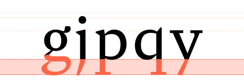
The lower-case g, j, p, q, and y are the most common characters with descenders, but some numbers and italicized letters can have them as well. Photo credit: Fontshop.com.
Diacritics
A diacritic is an ancillary mark or sign added to a letter. Accents are one type of diacritics. In the Latin alphabet their function is to change the sound value of the letters to which they are added; in other alphabetical systems like Arabic or Hebrew they may indicate sounds (vowels and tones) which are not conveyed by the basic alphabet.
Dingbats.
Decorative symbols and characters that are generally not included in a font or character set, including boxes, bullets, arrows, pointers, and other characters. Often made up into their own font.
Display.
A category of typefaces designed for decorative or headline use. As opposed to text typefaces, display typefaces are usually meant for larger settings.
Double-storey.
A double-story ‘a’ or ‘g’ has two counters, as opposed to their single-storey variants which only have one counter.
E
Ear.
Typically found on the lower case ‘g’, an ear is a finishing stroke usually on the upper right side of the bowl.
Embedding.
When the viewer of a digital document is missing the font used to create this document, the text will display incorrectly. Embedding includes font information in a digital document, to ensure that the text is rendered with the font specified by the author. Some EULAs restrict embedding.
EOT (Embeddable OpenType).
File format developed by Microsoft to enable TrueType and OpenType fonts to be linked to web pages for download, to ensure that the text is rendered with the font specified by the author.
EULA (End User License Agreement).
As with most software, fonts are licensed to individuals and organizations. The EULA defines the terms and provisions for use of the font software. The EULA also indicates the number of CPUs the fonts may be installed on. The number of CPUs for which a font is initially licensed can vary depending on the manufacturer. Free fonts also come with a EULA.
Expert set.
A font that contains special characters, such as small caps, fractions, ligatures, extra accents, and alternate glyphs. Because TrueType and PostScript fonts only support a limited number of glyphs, some characters that are not used as frequently come in an expert font. OpenType fonts on the other hand have the capacity for thousands of glyphs, so one font can include all these extras plus other scripts etc.
Eye.
Much like a counter, the eye refers specifically to the enclosed space in a lowercase ‘e’.
F
Family.
A collection of related typefaces which share common design traits and a common name. A type style means any given variant of this coordinated design and is the equivalent of a font or typeface. Super families are very extensive with a very large number of weights and widths. Type systems are collections of related type families that cross type classifications.
Feature-rich.
The OpenType font format offers numerous advanced typographic features. However it is up to the type designer or foundry to decide how many and which ones to implement. Feature-rich or fully-featured OpenType fonts have a large number of those advanced functionalities built in.
Fett.
The common German name for the black weight in a type family; the bold weight is called “halbfett”.
Figures.
The set of arabic numerals used in typography with the Latin alphabet to represent numbers. They exist in two forms: lining figures and old-style figures. Also, any combination of the individual numerals. In book design, illustrations printed with the text are known as figures.
Finial.
The curved or tapered end of a stroke that has no serif.
Fixed-width.
Flag.
The horizontal stroke at the top of the numeral ‘5’.
Flourish.
An ornamental stroke or combination of strokes, usually based on calligraphic writing. May be attached to a letter or other character (as in a swash letter) or serve as a separate, decorative character.
Font.
A collection of letters, numbers, punctuation, and other symbols used to set text (or related) matter. Although font and typeface are often used interchangeably, font refers to the physical embodiment (whether it’s a case of metal pieces or a computer file) while typeface refers to the design (the way it looks). A font is what you use, and a typeface is what you see.
Foot.
The part of a stem that rests on the baseline.
Foundry.
A company that designs and/or distributes typefaces; a type manufacturer. The name originated in the days of metal type when type was made from molten lead. Many foundries sell fonts through font stores.
G
Gadzook.
An embellishment that connects the letters in a ligature but is not originally part of either letter.
Glyph.
Every character in a typeface, (e.g: G, $, ?, and 7), is represented by a glyph. One single type design may contain more than one glyph for each character. These are usually referred to as alternates.
Grotesk.
The common German name for sans serif faces, as opposed to “Antiqua” which means serif face.
H
Hairline.
The thinnest stroke in a typeface design with strokes of different width.
Halbfett.
The common German name for the bold weight in a type family; the black weight is called “fett”.
Hanging figures.
Hinting.
Guidelines added to a font to help it print and display more consistently at small sizes. Most fonts contain some form of hinting, ranging from very cursory to very thorough. Hinting is a very time-consuming process. Man-made hints usually are of better quality than automatically generated hints.
Hook.
The curved, protruding stroke in the terminal of the lowercase ‘f’, ‘J’ and ‘j’.
Hybrid figures.
An intermediary style between oldstyle figures and lining figures, hybrid figures are somewhat smaller than the capital letters and have a consistent body size, yet some parts extend slightly upwards and downwards. Hybrid figures usually are tabular.
I
Ink Trap.
To avoid clogging by ink build-up, (usually sharp) interior corners are opened up so they can literally trap excess ink. Although originally ink traps were strictly functional, designers occasionally use them as a formal design trait.
Inline.
Describes a typeface with white lines appearing inside the character strokes, sometimes intended to imitate carving or chiseling, as if the characters were carved in stone or wood, or to imitate engraving in metal. Inline typefaces are generally reserved for display work.
Italic.
A (mostly) slanted type style which takes its basic shapes from a stylized form of handwriting, and is usually narrower than its roman counterpart. Italics are commonly used for emphasis in text. They are primarily found in serif designs, while obliques originally were associated with sans serifs.
J
Joint.
The spot where a stroke joins a stem.
K
Kerning.
The built-in spacing of a typeface is intended to produce an even texture in any letter combination. Certain combinations, like LT, VA or To tend to look gappy and loose with the default built-in spacing. Kerning is an additional adjustment to those problem pairs that corrects the excess or inadequate space. Well-spaced fonts need comparatively fewer kerning pairs. Fonts that are properly kerned appear evenly spaced without large open gaps of white space between any two characters.
L
Leading.
Its original meaning is increasing the vertical space between lines of metal type by literally inserting lead strips. In the digital age it now means the vertical space between lines of text, from baseline to baseline. Also known as linespacing.
Leg.
The down-sloping stroke on the letter ‘K’, ‘k’ and ‘R’.
Ligature.
Special characters that are actually two letters combined into one. In cases where two adjacent characters would normally bump into each other, a ligature allows the letters to flow together more gracefully. This usually makes word shapes more aesthetically pleasing. Some common ligatures are ‘fi’, ‘fl’, ‘ff’, ‘ffl’, etc.
Linespacing.
The vertical space between lines of text, measured from baseline to baseline.
Lining figures (LF).
Numbers that rest on the baseline, and are usually the same height as capital letters. Lining figures can be tabular or proportional.
Link.
The small, usually curved connecting stroke between the upper bowl and lower loop in the double-storey ‘g’.
Loop/Lobe.
In a double-storey ‘g’, the loop is the enclosed or partially enclosed counter below the baseline that is connected to the bowl by a link. The enclosed or partially enclosed extenders on cursive ‘p’, ‘b’, ‘l’, and similar letters are also called loops.
Lowercase.
The small letters in a typeface. The name refers to the days of metal type, as the small letters were kept in the lower part of the type case.
M
Master size.
Traditionally, the size of a typeface from which other sizes are generated. With most digital type, one master is used by the composing system and software to generate all type sizes. For improved legibility and aesthetics, however, a few manufacturers of digital and phototype create a number of different masters, each recommended for the generation of a different range of sizes. In metal type for hand setting (foundry type), where each character design was first cut on a metal punch, each size had a separate master; with machine-cut punches, several point sizes often shared one master.
Midline.
The imaginary line that rests on top of the body of the lowercase letters, disregarding ascenders. The distance between the baseline and the midline is the x-height.
The midline rests on top of the body of the lowercase letters. Photo credit: Fontshop.com.
Monospaced.
Characters designed to all have the same width, ignoring their normal proportions. Wide characters have an unusually narrow design, while narrow characters have lots of white space on both sides. This allows for neatly setting columns of text and tables, for example in programming code, accounting, etc.
N
Neck.
Non-proportional.
Numeral.
A character that represents a number. The Arabic numerals are the figures 0, 1, 2, 3, 4, 5, 6, 7, 8, and 9. They are named Arabic because of their historical origin in Middle Eastern cultures, although they are different from the set of numerals now used in the Middle East that are designed to harmonize with Arabic typefaces. In computer coding systems, they are often known as digits.
Roman numerals are alphabetical symbols used by the classical Romans to represent numbers: I = 1, II = 2, III = 3, IV = 4, V = 5, X = 10, and so on. Roman numerals are still in use today, generally for ceremonial applications, on timepieces, in certain proper names (such as Richard III), and for applications in book design such as preliminary pagination.
O
Oblique.
A typeface that is slanted. Oblique typefaces are different from italic typefaces, in that they are mechanically sloped, then optically adjusted. Italics, on the other hand, are designed differently from upright or roman versions. They are usually narrower than their roman counterparts, and usually based on fluid calligraphic writing.
Oldstyle figures
Numbers that have different heights, some aligning to the baseline, some below. Oldstyle figures harmonize well with lowercase letters. Using oldstyle figures helps keep the numbers from standing out too much and disturbing the overall flow of the typography on the page.
Oldstyle figures can be proportional or tabular.
OpenType.
The most recent font format emerged at the beginning of the new millennium. OpenType was initially developed by Microsoft, which were later joined by Adobe. In a few years time it has become the new standard format for digital fonts. The biggest advantages shared by all OpenType fonts are their single file structure, cross-platform compatibility, and advanced typographic functionality. This means any single OpenType font file will work on both Mac and Windows systems, and some OpenType fonts include expanded character sets and special features like automatic ligatures and alternate glyphs. OpenType is the best format for most purposes. It comes in PostScript flavor (OTF) and TrueType flavor (TTF).
While OpenType fonts will work on a basic level in most any application, the advanced features might not be accessible in certain software and older operating systems.
OpenType features.
Optical size.
Some type designs come in different versions optimized for use in specific point sizes. Subtle variations in weight, contrast, and proportion make them as legible in small text as they are beautiful in big headlines.
OT/OTF/TTF (OpenType font).
Overshoot.
The amount to which a round or pointed letter extends beyond comparable letters with flat tops or bottoms. This optical correction prevents those letters from appearing smaller.
P
Petite caps.
Slightly smaller than small caps, petite caps are capital letters that are exactly as high as the x-height of the lowercase letters. They also allow for unicase setting.
Pica.
A typographic unit of measure corresponding to 1/72nd of its respective foot, and therefore to 1/6th of an inch. The pica contains 12 points. The standard in contemporary printing (home computers and printers) is the computer pica (1/72nd of the Anglo-Saxon compromise foot of 1959, i.e. 4.233mm or 0.166in). At 100% zoom one computer pica corresponds to 12 image pixels on a computer monitor display, thus one computer point corresponds with one image pixel.
Pixel.
Originally, this word was short for the term “picture element”. A pixel is a single rectangular point in a larger graphic image composed of many rectangular points. Computer monitors can display pictures because the screen is divided into millions of pixels arranged in rows and columns. Pixels are so close together that from a distance they appear to be connected.
Pixel fonts are modular type designs that take advantage of the pixel grid to render often very small type on screen. They are very popular in web design, but also became an aesthetic on their own.
Point.
Type sizes are generally expressed in points. The point is a typographic unit of measure corresponding to 1/12th of a pica. At 100% zoom one computer point corresponds with one image pixel on a computer monitor display.
Point size.
The point size of a typeface refers to the size of the body, the imaginary area that encompasses each character in a font. This is why a typeface with a large x-height appears bigger than typeface with a small x-height at the same point size.
Pro.
OpenType Pro fonts share the same technical specifications as OpenType Standard (Std, or simply OT) fonts, but support a broader range of languages. Standard OT fonts contain support for Western languages, while Pro fonts include Central European, and often Cyrillic and/or Greek.
Proportional.
Characters designed to respect their normal proportions. Wide characters will occupy more horizontal space than narrow characters.
Proportional figures.
Proportional figures are different from tabular figures in their total character width. They are spaced to fit together more like letters. For instance, as the figure 1 is very narrow it takes up less width than the number 6. Because their spacing appears more even, these figures are best in texts and headings where columnar alignment is not necessary. They cannot be used to set tabular matter. Proportional figures can be lining or oldstyle.
R
Rasterization.
The process by which vector information is converted into pixel information, which can then be displayed by a monitor or printed by a non-PostScript printer.
Roman.
The (standard) upright type style. The term Roman is also sometimes used to denote the Regular weight.
S
Serif.
A short line or finishing stroke that crosses or projects from stems or strokes in a character. Serifs have many shapes, including hairline, bracketed, wedge, and slab. Fonts without serifs are called “sans serifs.”
Shoulder.
The curved part projecting downward from a stem in the lowercase ‘h’, ‘m’, ‘n’.
Single-storey.
A single-storey ‘a’ or ‘g’ only has one counter, as opposed to their double-storey variants which have two counters.
Slanted.
Small Caps (SC).
Small caps are capital letters that are approximately as high as the x-height of the lowercase letters. When properly designed small caps are absent in the selected font, many applications can create small caps by scaling down the capitals. However this makes these fake small caps too light and narrow, and they don’t harmonize properly with the lowercase. Originally small caps were only available for the roman text weight(s), but nowadays many type families also have them for the italic styles and the bolder weights.
Spacing.
Spacing refers to the distribution of horizontal space on both sides of each character in a font to achieve a balanced and even texture. Spacing problems in difficult letter combinations (exceptions) are solved with kerning. Well-spaced fonts need comparatively less kerning pairs.
Spine.
The main curved stroke in the letter ‘S’ and ‘s’.
Spur.
The small protruding part off a main stroke, often where a curve meets a straight stem.
Spurless.
Specific type designs that have no spurs, with curves seamlessly transitioning into straight stems.
Std/OT (OpenType Standard).
(appended to a font or volume name) OpenType Standard fonts support the basic range of languages. Some foundries use the abbreviation Std, while others simply use OT. In the latter case OT identifies both the font format and the language support. Some foundries do include Central European (CE) and Turkish in their Opentype Standard fonts.
Stem.
Any vertical stroke in a character.
Stress.
In a curved letter, the thickening of curved strokes and the position or angle of this thickening in relationship to the vertical axis. An important design feature of most typeface and lettering styles, stress is derived from a related feature in writing created with a broad-edged writing instrument.
Stroke.
Any single linear element in a character.
Style.
Any given variant in a type family; the equivalent of a single font or typeface.
Style-linking.
Style-linked families are fonts that are grouped together under a single item in the font menu. To access other styles in a style-linked family, use the style buttons in the application that you are using. Some applications like for example the Adobe Creative Suite don’t support style-linking, yet still conveniently list the fonts by family.
Stylistic set.
In OpenType fonts with alternate glyph shapes for certain characters, different character sets can be grouped in stylistic sets. Instead of having to manually switch individual characters, the user can select the appropriate stylistic set which has all the desired alternates.
Super family.
Swash.
An elegant extension on a letter form, either a modification of an existing part or an added-on part.
T
Tabular Figures (TF).
Numbers that share identical character widths (that is, they are monospaced). Using tabular figures enables you to set columns of numbers, and have them neatly line up vertically. This is especially useful for tables, thus “tabular”. Tabular figures are usually lining, but can also be oldstyle.
Tail.
The descender of a Q or short diagonal stroke of an R.
Taper.
The thinning ending of a stroke.
Teardrop terminal.
A terminal that resolves into teardrop shape.
Terminal.
The end (straight or curved) of any stroke that doesn’t include a serif.
Three-quarter caps.
Slightly taller than small caps, three-quarter caps are capital letters that extend to about halfway between the x-height and the cap height. Their primary purpose is to prevent acronyms and other successions of capitals from standing out too much in text.
Three-quarter figures.
Slightly less tall than lining figures, three-quarter figures are figures that extend to about halfway between the x-height and the cap height. Their primary purpose is to prevent dates and other numbers from standing out too much in text. Three-quarter figures can be proportional or tabular.
Tittle.
The dot on the ‘i’ and ‘j’.
Tracking.
Adding space between sequences of characters, as opposed to kerning, which only adds space between a pair of characters.
TrueType (TT/TTF).
A font format developed by Apple Systems, Inc. and licensed to Microsoft Corp. TrueType fonts are natively supported by the Windows and Mac operating Systems. On the Mac, both the printer and screen fonts are combined in a single TrueType font suitcase file.
Type size.
Type system.
Also called super families, type systems are collections of coordinated type families that cross type classifications, and are designed to work together in perfect harmony. They can be sans and serif companions, text and display cuts, or any other combination. The different families in a type system or super family share common character architecture, proportions, x-height, weights, and pedigree, to name a few.
Typeface.
An artistic interpretation, or design, of a collection of alphanumeric symbols. A typeface may include letters, numerals, punctuation, various symbols, and more — often for multiple languages. A typeface is usually grouped together in a family containing individual fonts for italic, bold, condensed, and other variations of the primary design. Even though its original meaning is one single style of a type design, the term is now also commonly used to describe a type family (usually only with the basic styles regular, italic, bold, bold italic).
U
Unicase.
Type design with uppercase and lowercase letter forms that share the same height (with a few exceptions), allowing them to be mixed.
Uppercase.
The capitals in a typeface. The name refers to the days of metal type, as the capitals were kept in the upper part of the type case.
V
Vector.
A mathematical equation that defines a curve or straight line. These lines define the shapes of the character outlines in a font. Vector fonts are scalable without any loss of quality. The vector information is used to rasterize the characters for displaying on monitors or printing on non-PostScript printers.
Vertex.
The point at the bottom (or top) of a character where two strokes meet, for example the ‘v’, ‘V’, ‘w’, ‘W’ etc.
Volume.
Fonts can be purchased individually, but packages or volumes always offer the best value and performance. A font volume is a collection of fonts that are sold as a unit. This can either be a type family, part of a type family, or a collection of fonts that are stylistically or thematically related.
W
Weight.
A single style or iteration of a typeface. Strictly speaking the term “weight” refers specifically to the heaviness of the strokes in a typeface. However, it is often used as a general term for any style: Italic, Small Caps, Bold, Light Condensed, etc.
Width.
The space occupied by a character plus its left and right side spaces. The measurement of this space may be expressed in different ways: in some computer-aided design software and with hand-done artwork, it is typically expressed in millimeters; in other software and in many typesetting devices, it is expressed in relative units.
WOFF (Web Open Font Format).
Font format developed by Mozilla in concert with Type Supply, LettError, and other organizations for use on the web, to ensure that the text is rendered with the font specified by the author. Similar to TrueType, OpenType, and Open Font Format, but adds metadata and private-use data structures, and allows foundries and vendors to provide license information if desired.
X
X-height.
The height of the lowercase letters, disregarding ascenders or descenders, typically exemplified by the letter x. The relationship of the x-height to the body defines the perceived type size. A typeface with a large x-height looks much bigger than a typeface with a small x-height at the same size.
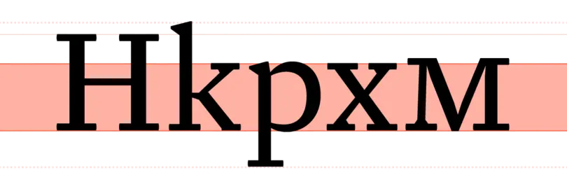
The relationship of the x-height to the body defines the perceived type size. Photo credit: Fontshop.com.


