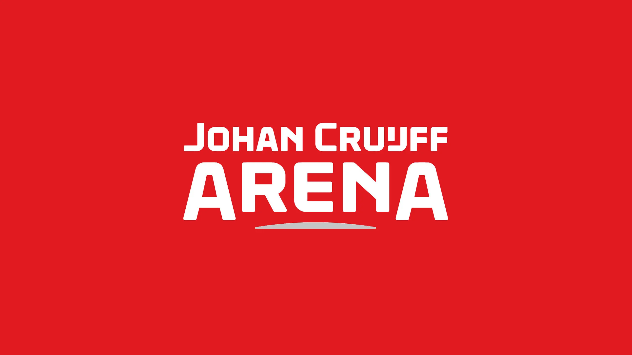
Johan Cruijff ArenA.
A custom typeface for the Johan Cruijff Arena in Amsterdam and a logotype to symbolise ‘The Home of Legends';

A custom typeface for the Johan Cruijff Arena in Amsterdam and a logotype to symbolise ‘The Home of Legends';
Brief.
In Summer 2017 Dutch branding agency VBAT contacted us about a top secret project. They were pitching on a new visual identity for the Amsterdam ArenA and asked us to collaborate with them on their creative concept, embracing their design thinking from a typographic angle. As part of the concept delivery custom letterforms were needed for the logotype, alongside a supporting display typeface and a special set of numbers for wayfinding that would bring continuity and a new dimension to the venues visitor experience.
The purpose of the new identity pitch was to rename the arena after Dutch sporting and football icon Johan Cruijff. The logotype symbolises Johan Cruijff ArenA as ‘The Home of Legends. A stadium where epic events of the past, present and future have and will forge long lasting memories for those who visit it’ explain VBAT. The typography needed to be both sporting and architectural in tone and be suggestive of forms to be found in the new stadium’s forthcoming redesign.
Approach.
We initially worked closely with VBAT on typographic ideas for the logo, exploring several different routes. A key part of the design was the ‘ij’ ligature which is part of the Dutch spelling of Cruijff’s surname and a reference to the stadiums location in Amsterdam.
The custom display font was created as an extension of our collaboration with VBAT on the logotype. Conceptually the design of the typeface is inspired by the structure of the new stadium design, the outer rounded shell surrounding the inner rectangular playing field. It’s this thinking that gave rise to the DNA of the typeface design. As part of the wayfinding design process VBAT identified a need for large scale numerals. An additional numerals font was created for the identity system, with an outer keyline stroke for emphasis.
Result.
Jason Smith, Founder and Creative Director at Fontsmith said: ‘In keeping with the spirit of Johan Cruijff himself the logotype is bold and progressive. The angles, the strength of curves and the subtleties of contrast in shapes with some sharp and soft edges. Perfecting the balance and overall structure and solidity of the logo.’
Graham Sturt, Creative Director at VBAT said: ‘Fontsmith collaborated with us from the very start of the pitch process to great effect. Knowing each other very well from previous projects meant we were able to achieve a lot in an incredibly short time frame. With our ‘Home of Legends’ concept established very early in the process it was easy to allow Fontsmith the necessary freedom to develop a modern custom typeface for this very special project. We are really pleased with the end result and look forward to working with it in application to many of the Johan Cruiff ArenA brand carriers. This is where you will see it really come to life.’
See more from the Monotype Studio.

Phil is a Creative Type Director and type designer with many years of experience in the design and engineering of fonts for global brands. Working in collaboration with design studios and global clients, Phil understands the creative and business needs of brands looking to build continuity with type.

Born in São Paulo, Brazil, Senior Type Designer Fernando Mello went to the UK to study in the MA Type Design program at the University of Reading in 2006, from which he was approved with distinction. He soon joined Fontsmith, where for over a decade he has been involved in the creation of several innovative, functional and well-constructed typefaces. Fernando joined the Monotype Studio in January 2020.