Duolingo
See how we helped Duolingo find its voice (and its wings) with a custom brand font.
See how we helped Duolingo find its voice (and its wings) with a custom brand font.
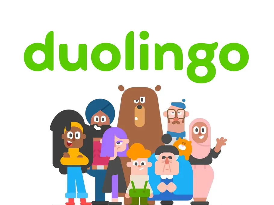
Taking inspiration from Duolingo’s iconic owl mascot ‘Duo’, agency Johnson Banks had begun to explore how the shapes inherent in the mascot’s design could influence the typography. Together we began to look at how to incorporate the shape and spirit of an owl’s wing into a unique custom font.

Designers
Brief
Duolingo, the hugely popular language learning web app, were refreshing their brand identity and Johnson Banks came to us to help finesse the favoured concept. Our brief was to fine-tune it into a master logo and then extrapolate it into the design of a new custom display typeface, one that aims to become synonymous with the brand and create a distinct continuity of voice across all of Duolingo’s communications.
Taking inspiration from Duolingo’s iconic owl mascot ‘Duo’, Johnson Banks had begun to explore how the shapes inherent in the mascot’s design could influence the typography. Together we needed to look at how to incorporate the shape and spirit of an owl’s wing into every conceivable letterform.
Execution
Johnson Banks shared their entire creative process for the new logo and their initial versions so that we had a firm grasp on the creative direction.
The shape of the ‘g’ was both integral to the logo design and a key component of the overall feel of the typeface, so many creative directions were proposed for this important character.
The logotype lead the way for the headline font as we started expanding the design out to key words and phrases. Once the master logotype was refined and approved, we expanded our development process for the typeface, exploring alternative forms for almost every letter shape, and testing each time with the tone of voice and sample messaging that Johnson Banks had proposed. The process of collaborative feedback sessions left no stone unturned.
Result
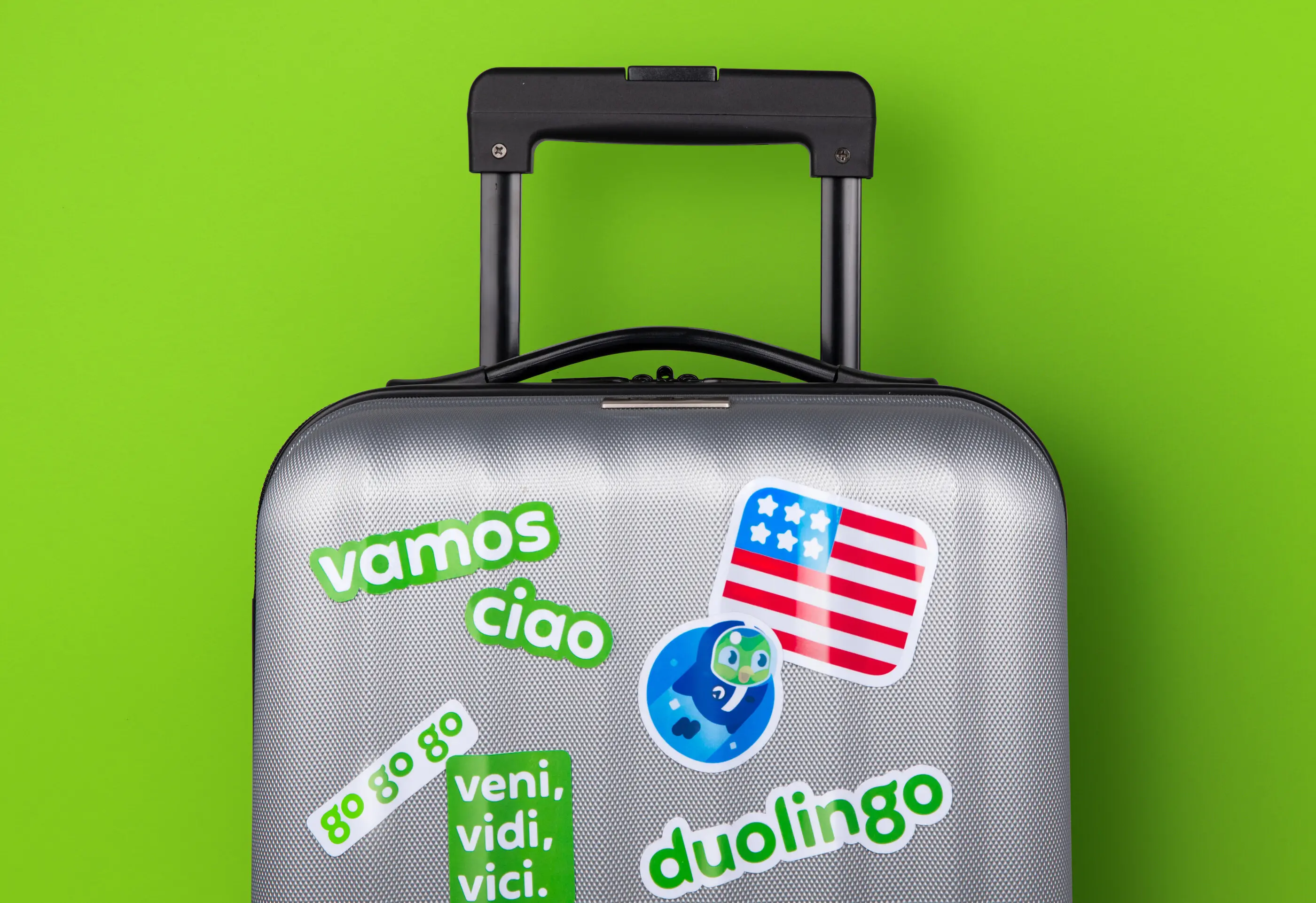
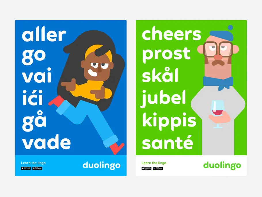
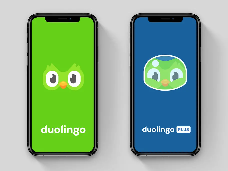
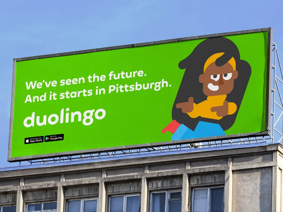
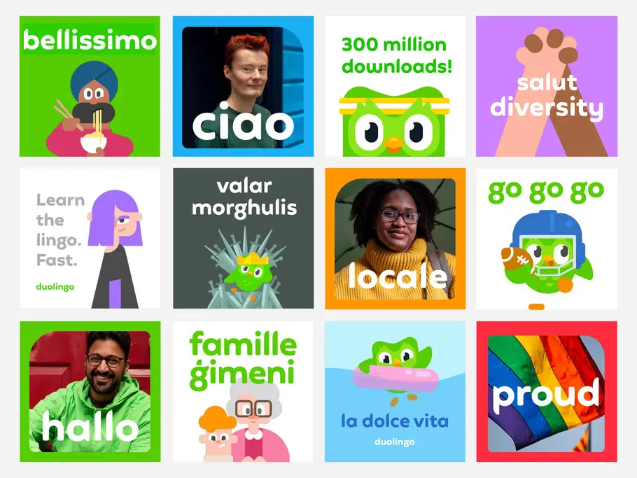
The Duolingo visual identity system is a great example of how brands can create a unified visual language around a central theme. Every aspect of Duolingo’s identity is informed by and conveys Duo’s personality and rounded feather form.
‘Feather Bold’ is a key part of the brand that was rolled out into all aspects of Duolingo’s branded communications, alongside an entire brand refresh that Johnson Banks carried out in tandem with Duolingo’s design and marketing team.
“The team really grasped what we were trying to achieve with this project. What began as a ‘what if’ – about extrapolating a brand mascot out into an entire typeface – slowly took shape. They were able to take our favoured route and really turn it into something both workable, and unique”
— Johnson Banks Founder and Creative Director Michael Johnson

Phil is a Creative Type Director and type designer with many years of experience in the design and engineering of fonts for global brands. Working in collaboration with design studios and global clients, Phil understands the creative and business needs of brands looking to build continuity with type.