Search
Font pages

Helvetica Now
The Helvetica Now Font Family was designed by and published by Monotype. Helvetica Now contains 96 styles and family package options.

Avenir Next World
The Avenir Next World Font Family was designed by and published by Linotype. Avenir Next World contains 20 styles and family package options.

Futura Now
The Futura Now Font Family was designed by and published by Monotype. Futura Now contains 102 styles and family package options.

Helvetica Now Variable
The Helvetica Now Variable Font Family was designed by and published by Monotype. Helvetica Now Variable contains 2 styles and family package options.
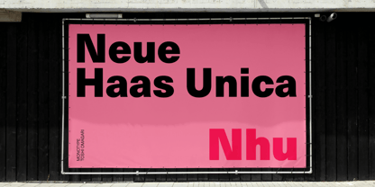
Neue Haas Unica
The Neue Haas Unica Font Family was designed by and published by Linotype. Neue Haas Unica contains 18 styles and family package options.
Other articles
1227 results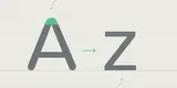
The A-Z of typographic terms.
As type designers we can get immersed in an insular typographical bubble at times. It’s easy to forget that our language, the lingo, words and terms that we use to discuss, critique and refine our designs is under the constant pressure of discourse and scrutiny within, often redefining itself.

A guide to type styles.
When it comes to commonly known type categories, you might be able to think of sans, serif, script and maybe slab. Four categories would be simple and easy, but it would also make design boring. Thankfully there are many more categories and subcategories to explore.
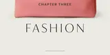
Fonts and luxury brands: Chapter three fashion.
Following on from our research into how fonts are used in the beauty and automotive industries, in part three we take a look at ten luxury fashion brands. What is the most fashionable font style? How do these brands use typefaces to stand out from competitors and are there opportunities which are being missed?
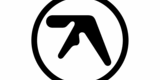
Special Aphex – the Aphex Twin logo.
For as long as I can remember, I’ve been drawn to strange abstract symbols, marks simplified down from more complex expressions, shapes that look like they might be alphabetical. As a type designer, my day to day is a bubble of black-and-white shapes, lines, stems, curves and bowls, white space and the all-round balance of form.

DNS1
DIN Next Slab
DIN Next Slab, also produced under the direction of Akira Kobayashi, the typeface is a variant based on the optimized shapes of DIN Next. The expansion will make the popular font all the more flexible and versatile.

Between1
Between
Akira Kobayashi’s Between™ typeface comes in three main states. While different from each other, they all offer human-centered design to ensure that copy set in them is affable and approachable.

Unitext1
Unitext
Created with the needs of branding design in mind, Jan Hendrik Weber's Unitext is a crisp, clean typeface that functions well across print and online use. It blends humanist and grotesque qualities, adopting a style that the designer describes as “neo grotesque”.

Sachsenwald
When he discovered the Sachsenwald typeface, Toshi Omagari saw the opportunity to revive and preserve a beautiful blackletter design. Toshi adding an alternate X character, and created light and regular weights to accommodate a whole new set of uses.

Wolpe Pegasus
The Pegasus typeface, originally designed by Berthold Wolpe, is full of surprises. The E and F both have oversized serifs. The A and H have cross bars of very different thicknesses. The K and g look a little unhinged, and the g boasts a distinctive, spiky loop.