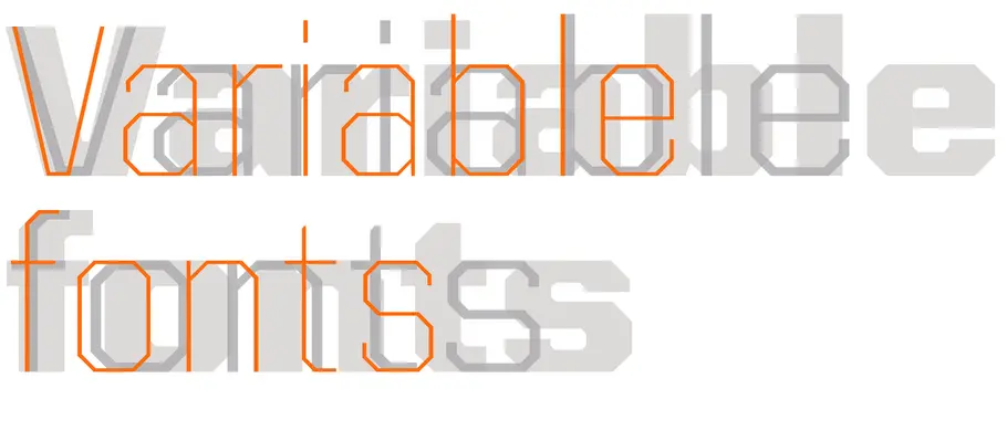
Part 2: from TrueType GX to Variable Fonts
In Part 1, veteran type design Tom Rickner discusses the 25 year history behind the events which led to the OpenType 1.8 variations announcement. In this posting, he looks forward. Tom shares his research surrounding potential use cases for designers and developers and introduces Monotype’s first variable font prototype.
At present OpenType 1.8 is a statement of where we want to go, rather than where we are today. Getting there will require a lot of work from a large number of people and organizations like Google, Adobe, Microsoft and Apple.
What exactly needs to happen?
- Operating systems need to add support for a number of newly defined data structures
- Application developers need to enable support for selecting variable font styles
- CSS standards need to expand to enable the specifying of variable font styles
- Font tool developers need to update their tools to output variable fonts
- Type designers and font producers have to actually make the fonts
- Font markets need to make variable fonts available
So there is still plenty of time to prepare for changes to workflows in the future.
The future with variable fonts
The future with variable fonts offers tremendous powers of control to both designers and users of type alike. While we have not defined all the different use cases for variable fonts, a number of them have been at the forefront of our thoughts as we and other industry participants define this format extension.
Easier distribution of large typeface families
Fewer files can mean fewer headaches, particularly if you are an IT system administrator tasked with rolling out fonts across your organization. A single variable font can be a substitute for anything from a small family of just 2 weights, to large families with numerous axes of variation such as weight, width, optical size, and more. Whether it is 5, 10 or even 50 styles, if the different styles can be described with similar point structures, they can likely be built as a variable font, and greatly reduce the number of files required to deliver and install.
Compression
Packaging multiple styles in a single file also can provide for substantial compression in families of fonts. I will share more detail in future blog postings, but the core message here is the more styles you add to a variable font, the smaller the per-style size becomes. As an example, here is a chart showing the size in bytes required for a small test font family we created, both as individual TTFs, and as a variable TTF created from those same individual TTFs.
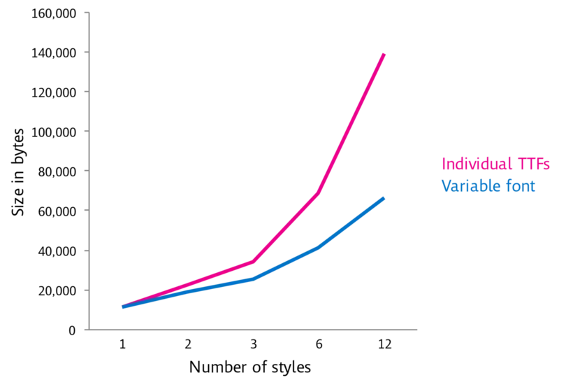
The more styles we add, the greater the savings as a percentage of the total static font sizes. However the savings is actually even greater than this chart illustrates, as these numbers only represent the stored styles. In most cases, large families have many styles that are created completely by interpolating from these master styles. In the case of the example font here, these 12 input fonts are used to generate 8 weights, across 3 widths, across 2 postures (Roman vs. Italic), which corresponds to 48 individual typeface styles stored in a single variable TTF.
What took approximately 555k to store these 48 input TTFs can now be served up and rendered with a single variable TTF of only 66k. That is a saving of approximately 88% in file size. While the degree of saving is heavily dependent on the size of the character set, the degree of complexity or subtlety in the design, the number of axes, and the number of instances, these numbers are a reasonable approximation of the kinds of saving one might expect from many families built as a variable font.
More subtle control over styles
In the early days of digital type, you might have 4 styles to choose from for a given typeface: Regular, Italic, Bold and Bold Italic. As type designers began building larger families, users were given access to additional weights, and sometimes additional widths. As type designers started using the interpolation capabilities within their tools, the ability to create larger families with large arrays of styles was easier than ever. But even with the expanded choices presented to users of type today, there are times when one wishes they could choose a version of a typeface that was slightly bolder, or just a touch narrower.

Variable fonts can enable that choice, provided your application presents you with a user interface for selecting arbitrary instances in the design space. The most common interface that we’ve seen to date is the “slider”, which is something like the fader one finds on a sound mixing board. This lets a user drag the knob to select a coordinate along the design axis. With this mechanism, a user can start by selecting a named instance such as Condensed SemiBold, and then they can “tweak” the sliders as desired to get something that is just a bit wider and just a touch heavier.
Responsive typography
For over 500 years we designed documents with print in mind. With the advent of desktop publishing and scalable outline font formats like TrueType, PostScript, and OpenType we began designing for screen as well as print. But today, our definition of the “screen” varies tremendously depending upon the particular device you happen to be viewing. Gone are the days for designing for either 72 or 96 dpi. Gone are the common screen sizes of 640 x 480, or 800 x 600. The plethora of devices with an ever expanding variety of properties and pixel configurations means that design for “the screen” requires a degree of flexibility in your layout that wasn’t a consideration in the first five centuries of typography.
Responsive typography is the term we use to describe the dynamic and responsive arrangement of text, graphics and other media within current physical limitations of the device on which your typography is presented. Attributes like apparent point size, leading, or line lengths may change from screen to screen. Providing the best reading experience could entail adjusting various properties in subtle but highly effective ways. A slight condensing of the overall width could reduce awkward hyphenation and justification. A widening of a headline could allow one to maintain a fully justified column without increasing the overall point size, which could have resulted in taking up too much vertical screen real estate.
It is important to point out that having the flexibility of variable fonts is necessary but insufficient for achieving the dream of responsive typography. Additional support in both authoring and display environments will be needed as well to deliver the kinds of enhanced user experiences many desire.
Optical sizing
Prior to the advent of phototypesetting, a single typeface was typically designed at a number of different master point sizes. Certain basic characteristics such as spacing, contrast and the degree of detail would change as you increased or decreased the point size. For example at smaller text sizes we generally want more open counters and spacing, and perhaps a larger x-height. In addition, fine details like serifs benefit from thickening up and reducing contrast. As the typeface size increases we can allow greater contrast, finer detailing, and more refined spacing.
When the shift to phototypesetting occurred, many systems started using a single photographic master for each letter, and they relied on the use of lenses to scale fonts in a linear fashion. When these photo masters (or the drawings for a hot metal font) were digitized to create the first digital outlines, type foundries typically used a text size master, such as 12 point. This digital outline was then used to represent all point sizes, with the possible exception of offering a size variant such as a “Display”. We lost something when this happened, namely size specific typefaces which optimized different design characteristics to provide the highest quality typography possible.
OpenType 1.8 includes the ‘opsz’ tag for optical size as one of the predefined axis tags that is recognized. However I should point out that just as with the responsive typography, we will need operating system and application support for this feature to be executed automatically and seamlessly.
Introducing Kairos Sans as a variable font
Our next steps will depend a great deal on the needs of our customers, such as developers, web designers and publishers. We want to make products that solve real problems. To aid in this assessment, we are releasing sample fonts for you to use and experiment with, to gauge interest and usefulness.

The first of these fonts is a prototype of Terrance Weinzierl’s Kairos Sans family. The interesting feature in this font is the presence of an italic axis, in addition to more commonly found Weight and Width axes. This font is well suited to storing both the upright and italic styles together, because the italic is for the most part a sloped roman. Whether or not users find value in the ability to choose different degrees of slope is something we are curious about.
Interested in testing?
We look forward to your feedback, as this will help shape the development of other Variable fonts we have in the works. If you are interested testing next steps in the evolution of digital type and typography, let me know @TrueTyper #VariableFonts


