The Hundred.
The new brand identity, for the new game.
The new brand identity, for the new game.
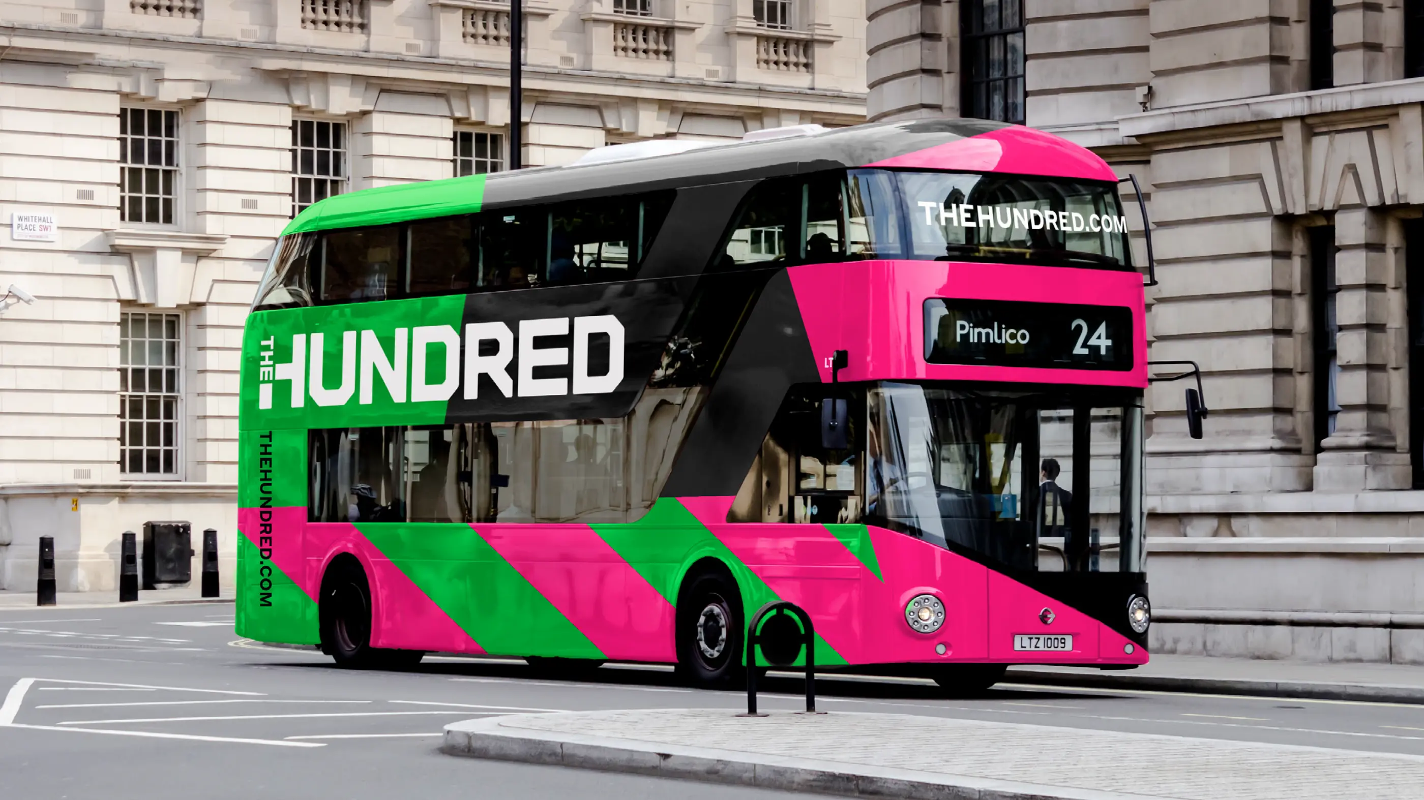
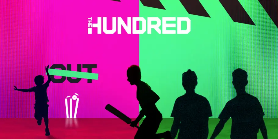
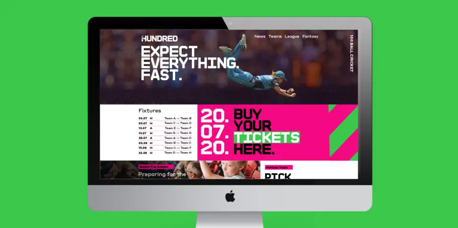
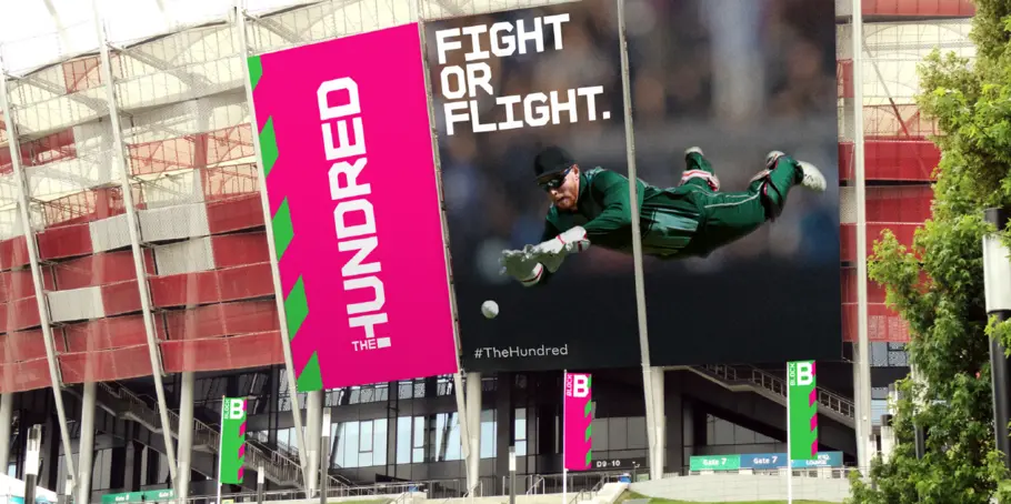
The England and Wales Cricket Board (ECB) have reimagined Cricket with the introduction of a new competition; ‘The Hundred’. Monotype collaborated with FutureBrand London to create a bold and confident typographic identity aimed at shifting perceptions to attract a wider audience to the game.
The Studio was asked to create a distinctive typeface for the brand, the scope of which extended to the players shirts, a junior participation programme called ‘Dynamos’ and the design of a bespoke typeface for the Manchester Originals team.


Designers
The Hundred.
In early 2018, a small focussed team of designers at FutureBrand London set out to name and create design concepts for the brand identity. The fonts would play an important role and needed to stand up and communicate the brands values of fearless energy, optimism, the core idea of revolutionary cricket. We were asked to help create a distinctive typeface for the brand, the scope of which extended to the players shirts, a junior participation programme called ‘Dynamos’ and the design of a bespoke typeface for the Manchester Originals team.
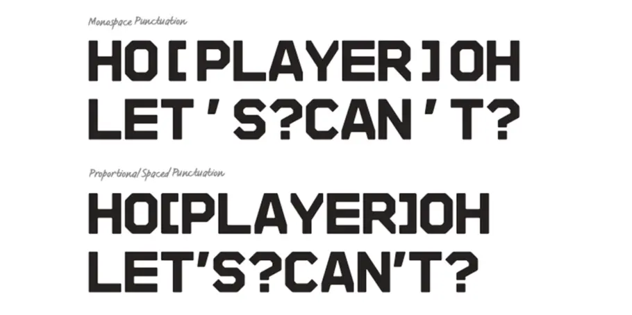
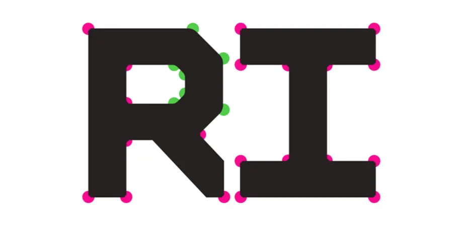
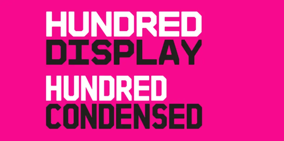
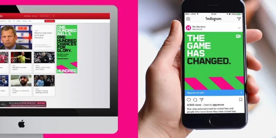
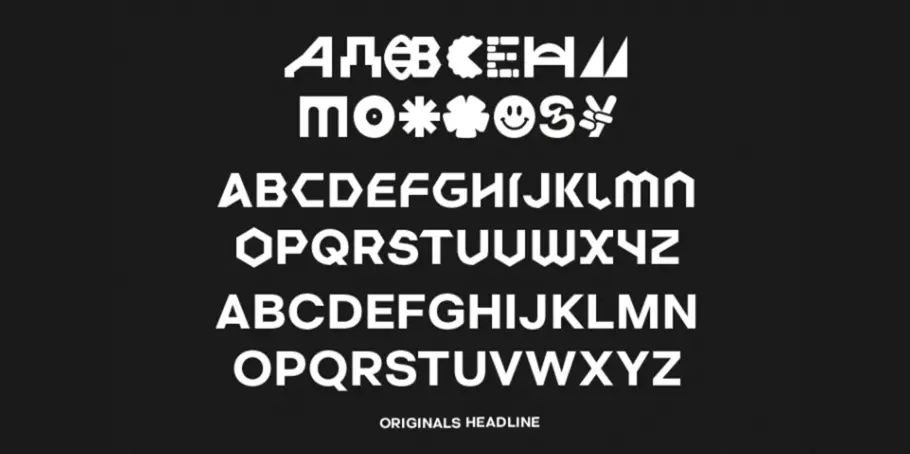
FutureBrand’s brief was clear: create a ‘mono-graphic’ headline typeface that can be set tight, to create blocks of stacked headings that ooze brand confidence. FutureBrand had spent a great deal of time researching type and we were in agreement that a distinctly solid, monospaced typeface that could imply the idea of a grid system would deliver a powerful branded voice. FutureBrand’s lively design system demanded a font with an impactful tone that also had to be readable and operate in short headlines. Establishing the correct letter proportions for the fonts wide ranging roles was vital.
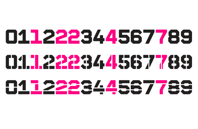
We chiselled into the letters and cut them off at the bounding box to create a sense of blocking, some gravitas and solidity. We were also mindful that the font needed to feel warm and family friendly in the spirit of the competitions audience. Warmth was added by short-cutting edges and softening rounded corner shapes. We explored multiple structures for the figures, of which we had solid and stencil versions for each. We looked at different ways to cut in and stencil, to get the balance right as a whole set, not only as individual letterforms.
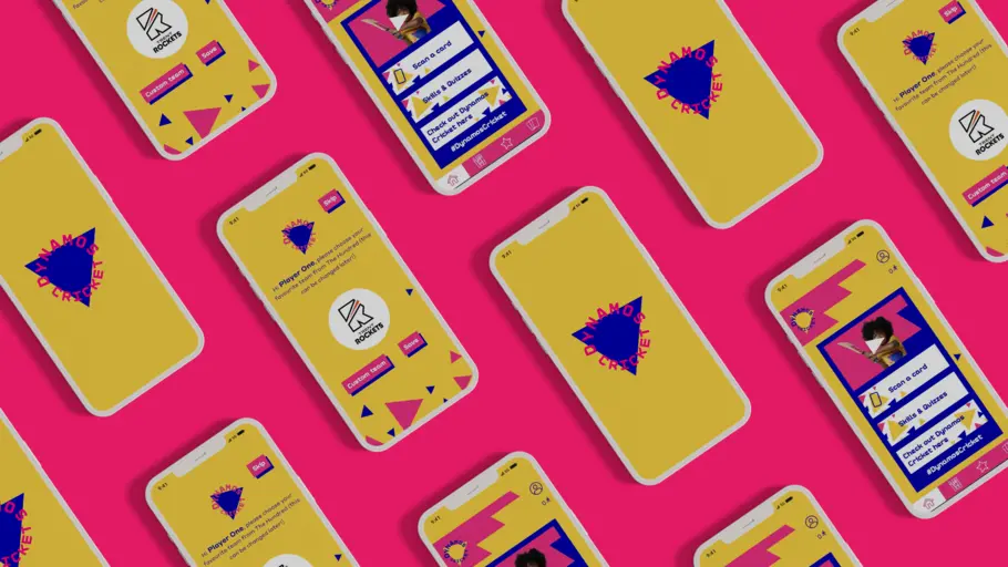
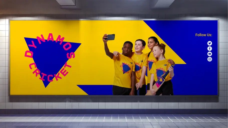
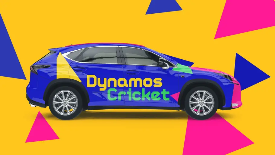
Dynamos Cricket.
The brand is built from the idea of energising the game of cricket for a new generation of players, and seeks to bring a confident urban attitude. We created a new typeface for the Dynamos brand, entitled ‘Dynamos Display’. This specific cut of the ECB Hundred font was created with a full lowercase to aid readability and comprehension for younger readers, whilst still maintaining a link back to the core brand. This font is used in short, sharp bursts to add drama to punchy headlines.
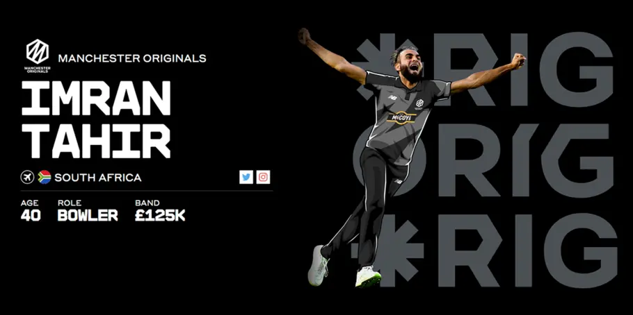
Manchester Originals.
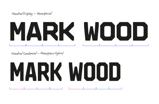
Each team in the competition has its own brand identity and we were lucky enough to work with FutureBrand on the design of a bespoke font for Manchester Originals. They coveted a typeface that would celebrate Manchester as “a global city of firsts”, a typographic identity that was bold and reflective of Manchester’s cultural heritage, as a city of innovators and creative power.

Phil is a Creative Type Director and type designer with many years of experience in the design and engineering of fonts for global brands. Working in collaboration with design studios and global clients, Phil understands the creative and business needs of brands looking to build continuity with type.