Daytona™
A highly readable sans serif.
A highly readable sans serif.
Inspiration for the Daytona™ typeface family came from a desire to provide the best fonts for use in televised sporting events. Jim Wasco, the typeface’s designer, drew the design as sturdy squared letters based on humanist shapes and proportions. Letters were designed with legibility in mind, kept narrow for economy of space, and inter-character spacing was established for easy reading. Daytona’s soft rounded corners also make for a friendly and appealing design.
Designteam
Foundry
Classification
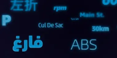
The Daytona™ typeface family grew out Jim Wasco’s desire to design a readable and legible typeface for video and on screen use. Because of its high levels of legibility, the Daytona family is additionally an ideal design for display usage in digital user interfaces and a wide range of print applications. Wasco drew each character with legibility as a primary goal, some of the letters having unique attributes to minimize the ambiguity.

Today, Wasco was an award-winning senior typeface designer at Monotype. His designs included the square-jawed Neue Aachen™ supremely elegant Elegy ™, geometric sans serif – with an un-geometric twist – Harmonia Sans ™ and the Daytona™ typeface.
We offer a number of ways for you to start working with our typefaces.

If you want to license Daytona to use with your brand or project we can help you.

An all-in-one solution for font discovery, expertise, collaboration and management.

If you want to purchase a single weight or the entire Daytona font family with a range of licencing choices.

Der Textsatz in Augmented und Virtual Reality bringt neue Herausforderungen an das Design mit sich, die sich von praktisch jedem anderen vorhandenen Medium deutlich unterscheiden. Steve Matteson, Creative Type Director bei Monotype, hat Fonts ausgewählt, die sowohl gut lesbar sind als auch mehrere Genres repräsentieren und zuverlässige Auswahlmöglichkeiten für AR/VR-Spiele, Apps oder Benutzeroberflächen bieten.