Type Faces: Meet Tom Foley.
Spotlights
Spotlights
Type Faces: Meet Tom Foley.
Welcome to our Type Faces series, where we’ll be sharing the stories of some of the fabulous people behind the type here at Monotype. From all around the globe and across the organization, our Monotype colleagues truly prove that, like Charles Nix, Senior Executive Creative Director at Monotype, always says, “We are ALL creative.”
In his role as Executive Creative Director, Tom Foley brings together deep creative insight, a passion for cultural identity, and a commitment to collaboration. From his early fascination with shop signs and calligraphy to his current role helping global brands navigate the complexities of typography, Tom’s work is grounded in meaning, storytelling, and human connection.
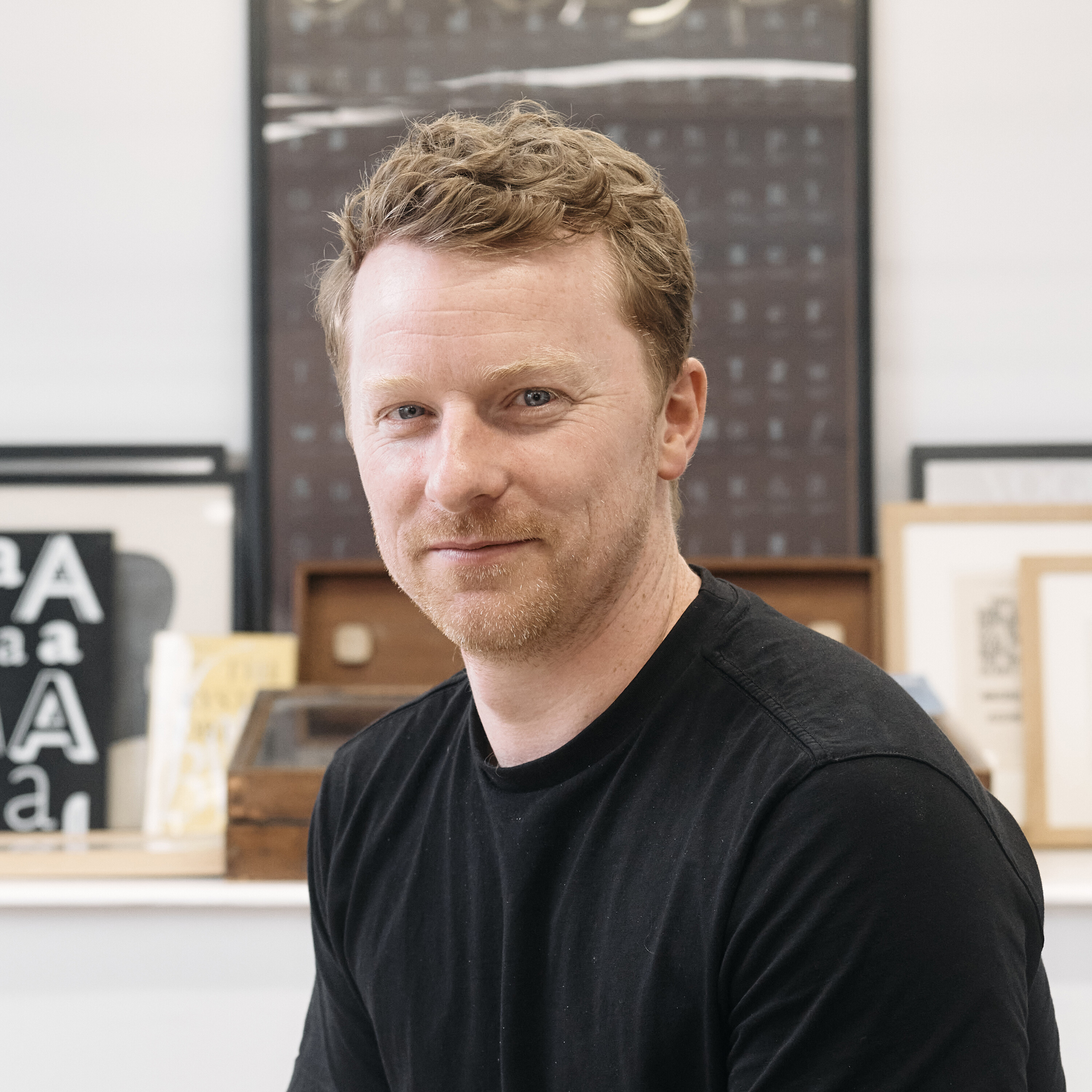
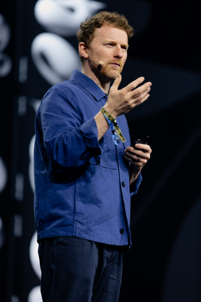
Portrait of Tom Foley.
What inspired you to pursue a career in typography?
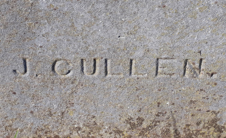
My uncle was a calligrapher and sign painter. Going back one generation further, my great-grandfather (my dad and uncle’s grandfather) was a stone mason and a letter carver. So my extended family has a long tradition of working with lettering.
A gravestone memorial carved by Tom’s great-grandfather, Jim Cullen, in the 1910s or 1920s. It’s difficult to date these, as headstones were often erected years, if not decades, after family grave plots were filled.
I was always fascinated by shop signs growing up. I remember being in primary school and asking my dad to teach me how to write in cursive — I was completely obsessed with how he wrote. Even as a kid, lettering was always part of my drawings.
I studied graphic design and communication design, and during my postgraduate studies at Central Saint Martins in London, I started researching Irish or uncial type — letterforms rooted in 5th century Christian manuscripts. That research took me much deeper into exploring how colonial powers have used typography to suppress culture.
Under British rule, type in Ireland was intentionally made to look antiquated to undermine the Irish language. But over time, that same style was reclaimed as part of Irish cultural and national identity and became the recognized form of Irish printed expression. That typographic arc — spanning more than 500 years — was the subject of my thesis, and the only way I could respond to it was by designing typefaces. That’s where it all started.
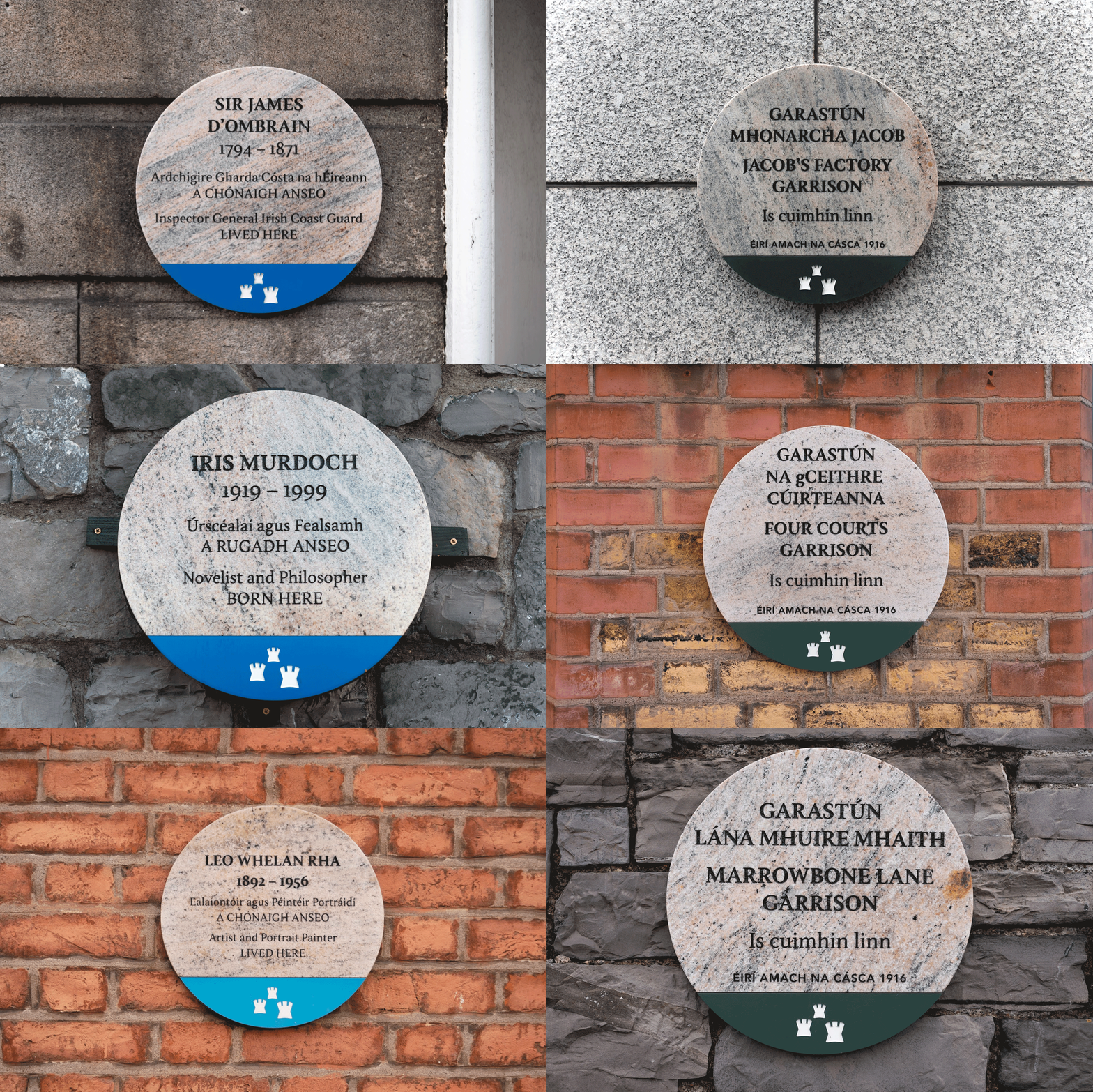
Tom’s first ever typeface, DCC Nib, in use on Dublin city council memorial plaques. Plaque scheme designed by Atelier David Smith. Typeface by Tom Foley.
Who or what inspires you?
Inspiration rarely strikes me as a sudden lightbulb moment. For me, things have to marinate. I’m drawn to simplicity — not in a reductionist way, but in the way truly skilled artists can distill their craft down to something beautifully refined.
The people closest to me are the ones who inspire me most: my wife, my son, my family, and close friends.
My son is only three, but he already has this incredible sense of imagination. We do a lot of role play — he assigns all the voices and I have to remember them. It’s ridiculous and brilliant and resets everything. If I’ve had a hard day or feel stressed, I just go downstairs and hang out with him, and it all melts away.
How does creativity fit into your life?
Creativity comes in waves for me. I’ll have a stretch where I play guitar or sketch every day, and then I won’t pick it up again for six months. But one constant is playing with my son. Whether we’re reading books or making up characters, that kind of creativity is always flowing.
I also believe the simple, everyday stuff is vital to creativity. Washing dishes, mowing the lawn — those kinds of one-dimensional tasks help clear space in your mind. When your day job involves solving complex creative problems, it’s the straightforward routines that create space for fresh inspiration.
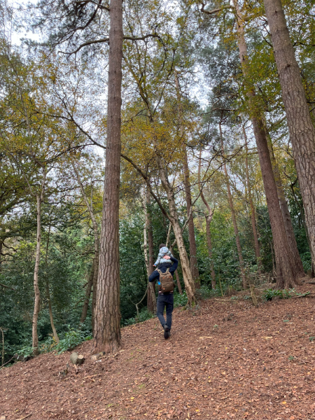
A walk in the woods with Tom’s son.
What book, song, or movie would you recommend and why?
There’s a song by The Gloaming called The Sailor’s Bonnet — it’s beautiful. My wife walked down the aisle to it, so it holds a special place for me.
In terms of books and films, I’d recommend Small Things Like These. It’s set not far from where I grew up in Ireland and tells the story of a coalman who uncovers abuse in a convent in the 1980s. When I watched the film, I could practically smell my hometown. The book is short but incredibly pure in its language. It hit me hard — in the best way.
What foods or traditions have you carried on in your family?
My wife is half Filipino, and my mother-in-law always brings or makes food when she visits. She’s been passing down her amazing cooking to our son, which I love. He’s three and already has this amazing palate thanks to her.
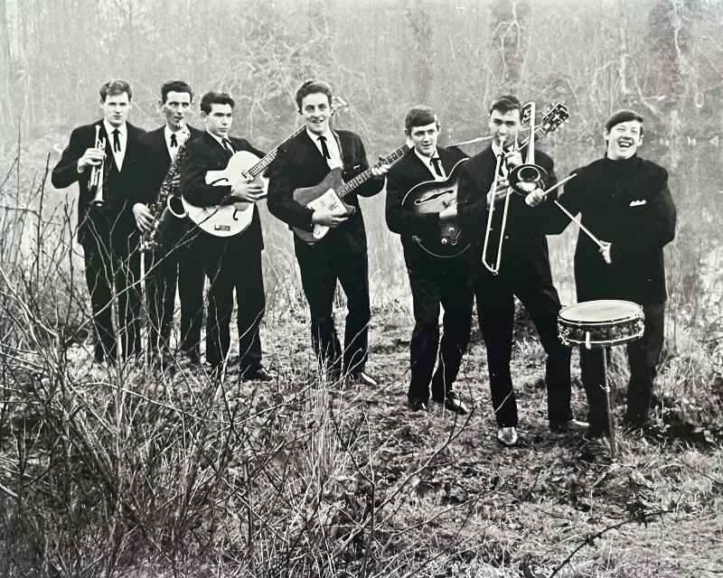
My dad passed away over 20 years ago, but he used to play guitar in a show band. Back then, show bands would learn the hits of the day and travel around playing them live before records were widely available. I play guitar now too, and my son loves listening to me play. It feels like something we’ve kept alive across generations.
The Embassy Showband, circa 1960s. Tom’s dad, center, was the band’s rhythm guitarist and lead singer. Tom’s brother still owns and plays his dad’s Gibson guitar.
What do you love about where you live?
I’ve lived in London since 2007. I first visited on a college trip and knew right away I wanted to live here, even though I couldn’t explain why at the time.
Growing up in Ireland in the ’80s and ’90s, the idea of moving to London wasn’t something people did unless they had to. But for me, London was full of possibility. It’s diverse, creative, and open in a way that allows people to fully be themselves. I felt more free here. And now, I look at my son and my nephews and see how much more freedom they have to express themselves compared to when I was their age. I couldn’t imagine living anywhere else.
What do you find interesting about typography?
Typography is one of the purest forms of human communication.
It expresses language, yes, but also culture, identity, context, and emotion. It’s tied to place, memory, and meaning in a way that few other visual mediums are.
Type is all around us — books, signs, screens. It constructs the visual world we live in. It’s changing and growing all the time, as our world changes and grows. We often take typography for granted. But, taking a step back, it’s easy to see how essential type is to identity — and how powerful it can be.
What do you love about your job?
So many things. At the core, I love solving problems — especially complex, strategic ones that go beyond designing type. My role pushes me to think creatively about business value, cultural relevance, and how type plays into broader design systems.
I’ve always had a creative foundation, but this role requires a higher-level application of that creativity. You go from designing within a defined set of rules to rethinking those rules entirely. How do we measure the value of type? How does it influence culture? How does it create meaning? These are the kinds of questions I get to explore — and I love that.
What’s the most exciting thing you’ve gotten to do at work?
Working with clients is the most rewarding part of my job. I get to collaborate with some of the best creative minds at the world’s most influential brands. That’s incredibly energizing. You learn so much just by working alongside people like that — it changes the way you think and shapes how your career evolves.
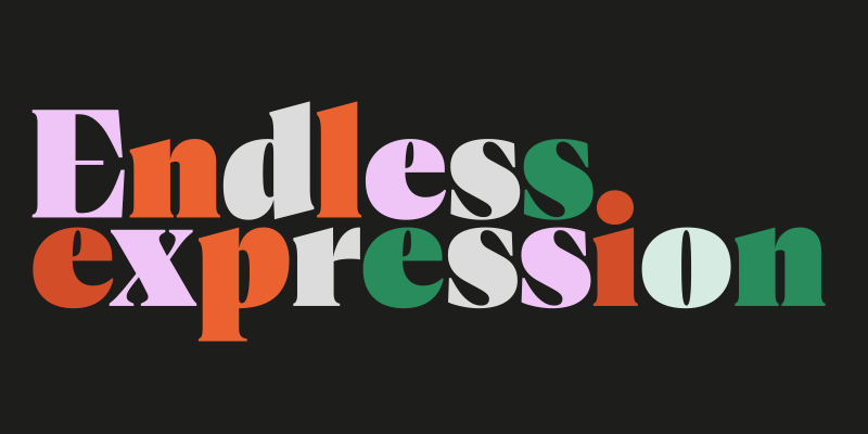
There have been some standout projects too. In 2022, I released Cotford, a retail typeface I designed at Monotype. It was a really introspective process, and even though I’ve done lots of high-profile work, that one was personally meaningful and introspective.
Cotford, designed by Tom while at Monotype. By Tom Foley and the Monotype Studio.
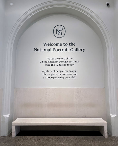
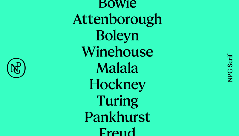
Another favorite was designing NPG Serif for the National Portrait Gallery in London, in collaboration with EDIT Agency.
NPG welcomes visitors to the National Portrait Gallery. Image courtesy of National Portrait Gallery and EDIT Studio.
The gallery was going through a major rebrand and refurbishment, and we created a typeface for wayfinding. From start to finish, it was a brilliant, rare project. It reminded me why I do this work.
NPG Serif, custom typeface for the National Portrait Gallery. Designed by Tom Foley and Jordan Bell. Credits: Brand design by EDIT. Brand strategy by Boardroom Consulting. Logo Design by Peter Horridge. Typeface design by Tom Foley and Jordon Bell.
Tell us about your role at Monotype.
I’m an Executive Creative Director. I’ve been in this role for a little over two years. I work closely with our global key account directors to support some of Monotype’s biggest clients — brands with really complex typographic needs.
Tom speaking at ADC Germany Festival in 2025.
I act as a creative consultant and strategist for these clients, helping them think through everything from type strategy to branding to workflows. Before this, I spent five years in the Studio team as a Creative Type Director. All four of us in the ECD role came through the Studio, so we share that type design background. It’s a great foundation for what we do now.
What’s a font you love and why?
Lexicon by Bram de Does. It’s a perfect typeface — beautiful, balanced, and full of nuance. De Does was a calligrapher and lettering artist, and that deep understanding of form and proportion comes through in the design.
What makes it special is that he drew the entire thing on paper before digitizing it, which is incredibly rare today. That process gave Lexicon this warmth and precision that’s hard to achieve in digital-native design. For me, it’s a case study in excellence — something you can learn from just by trying to replicate it.

Executive Creative Director
Tom Foley.
Tom Foley is an Executive Creative Director at Monotype, one of the largest providers of typography, technology, and expertise. In this role, Tom is responsible for leading a team of type designers creating fonts for the Monotype Library and corporate brands.


