Type Around the World – Get to Know Sofia, Bulgaria
Spotlights
Spotlights
Type Around the World – Get to Know Sofia, Bulgaria
In this recurring feature in our “Fonts Having a Moment” series, we’ll be exploring cities around the world through the dual lenses of culture and typography, guided by our friends at Monotype and some of our partner foundries. Join us on this exciting virtual journey!
This time, get to know Sofia, Bulgaria with Plamen Motev of Fontfabric.
Tell us a bit about yourself and your foundry.
I’m Plamen, the Creative & Operational Director at Fontfabric, which is a tidy job title for a fairly untidy mix of things that I manage: type, people, projects, strategy, and the occasional deadline fire. Fontfabric started in Sofia, Bulgaria in 2008 and grew from a local independent foundry into a studio whose retail fonts are used around the world. Alongside that, we create bespoke typefaces and language systems for global brands, including Lipton, KIKO Milano, Cummins, and Masimo.
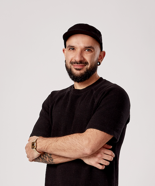
A portrait of Plamen.
I spend a lot of time connecting dots: between creative and business, between the design team and the client, and between a good-looking idea and something that actually works in the real world. I still stay close to the design itself, especially on key bespoke projects and some of our retail typefaces.
Tell us about your city. What do you love about it? What’s distinctive about it?
I like cities that don’t look art-directed. Sofia definitely doesn’t.
At street level, the city feels like a typographic scrapbook that nobody has bothered to tidy up. The historic Roman city of Serdica survives underneath Sofia’s modern center. Above it you find the grander European ambitions of the young capital, with socialist buildings and industrial lettering, improvised shopfronts from the transition years, glossy new identities, graffiti, stickers, and hand-painted signs. None of it was designed to work together, but somehow that is exactly why it does.
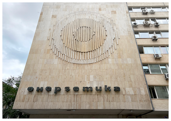
Retro signage on the facade of the Ministry of Energy, still preserved to this day.
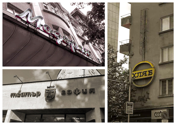
More retro signage. Photo taken by the guys from npoekmu.me, a local creative collective.
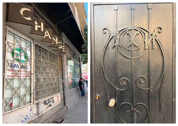
On the left: old commercial lettering surviving above a contemporary Sofia street, just one more layer in the city’s accidental visual archive. On the right: a solid metal door in central Sofia, marked only by the initials “Д.Ж.И.”
What I enjoy most are the details that don’t come with a plaque. An unfamiliar façade. A fading sign. Like the heavy metal door with the initials “Д.Ж.И.” — I don’t know whose initials they are, and I almost prefer it that way. Sofia leaves enough loose ends for you to invent a story before you learn the real one. The chaos can annoy me, too. Sofia is inconsistent, visually noisy, and often unfinished.
But I’ve come to realize that not being art-directed is one of its real advantages. It can still surprise you. The city doesn’t reveal itself through one grand image. It works more like a collage that changes every few meters.
For me, that is Sofia in one sentence: a city that can genuinely surprise you, if you let it.
Where would you take someone visiting your city for the first time to explore its creative heart?
I’d start in the part I love most, the old central neighborhood where our office is and where I actually spend my own time: KvARTal. First, a filter coffee from Cera Muse. Then I’d drift through the small streets around our office, where Roman history, religious landmarks, old façades, and very contemporary city life are compressed into a surprisingly small area. Within a few streets, you move through places shaped by very different periods, cultures, and religions, while the contemporary neighborhood keeps adding its own layer: ceramics studios, bookshops, galleries, tiny bars, new restaurants, and people turning old spaces into something else.
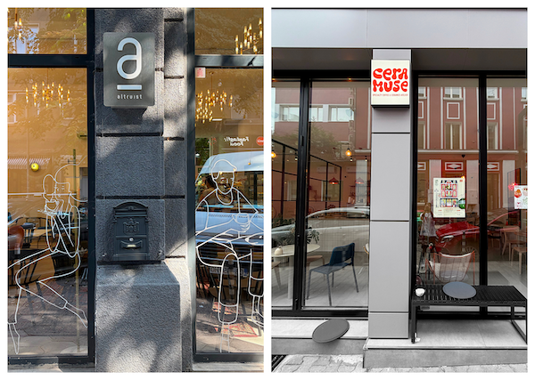
On the left: Altruist Specialty Coffee (using Plamen’s first font, Phenomena, as a prime element of its identity). On the right: Cera Muse, which sells specialty coffee and ceramics in KvARTal. A good place to start a slow walk through the neighborhood.
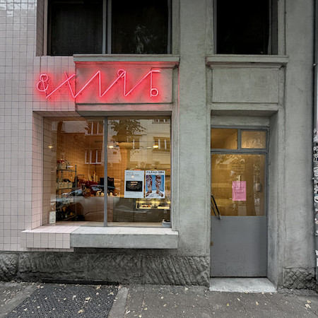
“&Хляб,” translated to “& bread” in English, is one of the best places to stop for a croissant or take a loaf of bread. It has the coolest sign and an industrial look.
I’d stop at Mahala to browse books and probably stay longer than planned. If we get hungry, I’d take the visitor somewhere that shows how culturally mixed this part of Sofia feels — maybe Pileto Fried Chicken Shop, or another small place we discover on the way. This is not a neighborhood that rewards discipline.
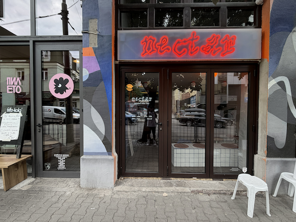
Pileto, at left, is one of those trendy places for foodies that you cannot miss.
I’d also make time for a few galleries, because a good Sofia day should involve at least one unexpected exhibition. Later, I’d go for a drink and some truffle popcorn at Ж Jazz Room (one of my favorite letters in the Cyrillic alphabet): a place that feels much better experienced than explained. And if the weather cooperates, I’d finish the day the way I like to finish my own weekends: somewhere on a hill, watching the sun go down over the city.
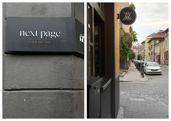
Two popular bars in the KvARTal neighborhood. The jazz bar on the right has the name “Zhe,” which is one of the most distinctive letters in the Cyrillic alphabet. Fun fact: this letter was first made as a logomark by the famous Stefan Kanchev, as a gift to the owner’s father.
The best way to explore Sofia is to leave some space in the plan. The most interesting place is often the one you didn’t know was around the next corner.
The best way to explore Sofia is to leave some space in the plan. The most interesting place is often the one you didn’t know was around the next corner.
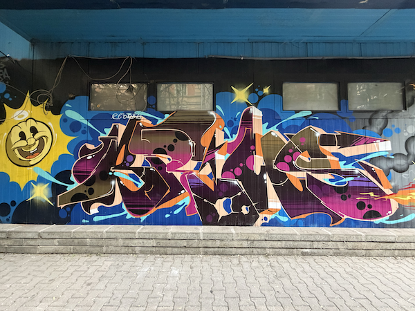
Street art is part of the everyday visual noise: sometimes illustration, sometimes lettering, usually both at once.
What’s a typeface that you think represents the spirit of your city and why?
Albertus Nova. But I’d want a Sofia cut of it.
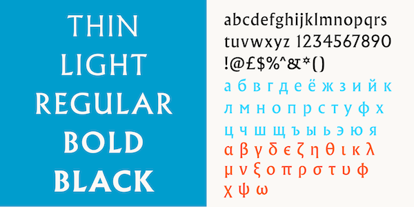
The Albertus Nova typeface.
The original Albertus grew out of Berthold Wolpe’s background in metal engraving, and you can still feel that in the cut terminals, flared details, and almost carved quality of the letters. It has a sense of history and civic presence, but it isn’t perfectly classical or polite. Toshi Omagari’s Albertus Nova brings that voice into the present, with a broader family, revived alternates, and Cyrillic. That combination already feels strangely appropriate for Sofia: old structure, contemporary redraw, a few unusual details left proudly visible.
But Sofia is more relaxed, more mixed, and less ceremonial than Albertus can sometimes feel. So, my imaginary Sofia cut would loosen its tie: a warmer lowercase, slightly more relaxed curves, and expressive Bulgarian Cyrillic.
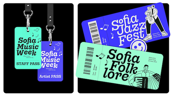
The Gonzaga typeface from Fontfabric.
If I choose from our own library, Gonzaga would be the other answer. It has a historical backbone, warmth, unusual forms and a strong Bulgarian Cyrillic. Gonzaga feels like Sofia on a Friday evening. Albertus Nova with a Sofia remix feels like the whole city across a century or two.